How to Design Web Forms That People Actually Want to Fill Out

A web form is a way for users to interact with your website by entering information. Well-designed web forms are essential for collecting data from users, such as contact information, orders, or feedback. However, poorly designed web forms can be frustrating and lead to users abandoning them.
In this blog post, We will discuss how to design user-friendly web forms. We will cover topics such as:
- The importance of user-friendly web forms
- The key elements of a user-friendly web form
- Common mistakes to avoid when designing web forms
- Tips for designing a user-friendly web form
The Importance of User-Friendly Web Forms
User-friendly web forms are important for a number of reasons. First, they can help to improve the user experience. When users find a web form easy to use, they are more likely to complete it. This can lead to increased conversions, such as more leads or sales.
Second, user-friendly web forms can help to reduce errors. When users are confused or frustrated by a web form, they are more likely to make mistakes. This can lead to lost data or wasted time.
Third, user-friendly web forms can help to improve your website's SEO ranking. Google takes into account the usability of your website when ranking it in search results. So, by designing user-friendly web forms, you can improve your website's chances of ranking higher in search results.
The Key Elements of a User-Friendly Web Form
There are a number of key elements that make up a user-friendly web form. These include:
- Clear and concise instructions: The instructions for filling out the form should be clear and concise. Users should be able to understand what information is required and how to enter it.
- Consistent formatting: The formatting of the form should be consistent throughout. This will make it easier for users to scan the form and find the information they need.
- Proper error messages: If a user makes a mistake, the form should provide clear and concise error messages. This will help the user to correct the mistake and complete the form.
- Responsive design: The form should be responsive, so it can be easily viewed and used on different devices.
- Security: The form should be secure, so that users' data is protected.

- Use clear and concise language.
- Use labels that accurately describe the information being requested.
- Keep labels short.
- Match field length and structure to the intended input.
- Form fields should look like form fields.
- Differentiate form fields from other elements.
- Use the appropriate input type and tag.
- Forms should be one column.
- Fields that logically go together should be inline.
- Omit unneeded fields.
- Make action buttons task-specific.
- Group labels with their inputs.
- Avoid all caps.
- Present checkboxes and radios vertically.
- Show all selection options if < 6.
- Show errors inline.
- Differentiate primary from secondary actions.

- Use jargon or technical terms.
- Use placeholders as labels.
- Make labels too long.
- Use different field lengths for the same type of input.
- Make form fields look like other elements on the page.
- Use the wrong input type or tag for the type of data being collected.
- Use multiple columns for forms with many fields.
- Separate fields that should be grouped together.
- Ask users for unnecessary information.
- Use generic action buttons like "Submit" and "Cancel."
- Separate labels from their corresponding input fields.
- Use all caps in labels.
- Present checkboxes and radios horizontally.
- Hide selection options if there are more than 6.
- Display errors in a separate location.
- Make primary and secondary actions look the same.
Common Mistakes to Avoid When Designing Web Forms
Here are some common mistakes to avoid when designing web forms:
- Using too many fields. This can make the form overwhelming and frustrating for users.
- Using confusing or unclear language. This can also make the form difficult to understand and complete.
- Using inappropriate form fields. This can lead to errors and frustration for users.
- Not providing clear and concise error messages. This can leave users confused and unsure how to correct their mistakes.
- Not making the form responsive. This can make it difficult for users to complete the form on mobile devices.
- Not using a secure form. This can put users' data at risk.
Tips for Designing a User-Friendly Web Form
Here are some tips for designing a user-friendly web form:
Keep it short and simple
One of the best ways to make your web form user-friendly is to keep it short and simple. This means only asking for the information you absolutely need, and using clear and concise language. A long and complicated form is more likely to be abandoned by users, so it's important to get to the point quickly.
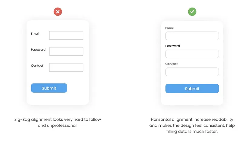
Image Source: Medium
Use a label
A label is a descriptive text that identifies an input field. It should be clear, concise, and accurate, and it should be placed directly above or next to the input field.

Image Source: Medium
Avoid using placeholders as a label. Placeholders are text that appears inside an input field when it is empty. They are not as effective as labels because they are not always visible, and they can be easily overlooked by users.
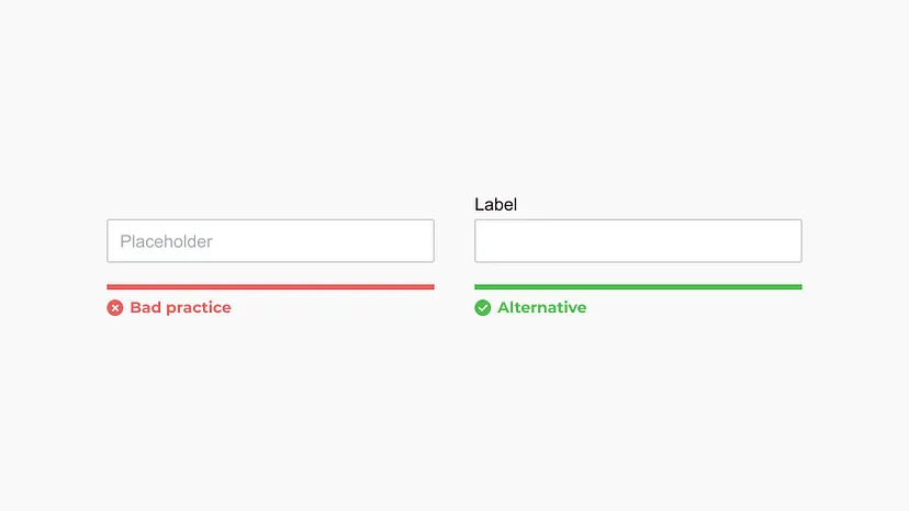
Image Source: Medium
Keep labels short. Long labels can be difficult to read and understand, so it is important to keep them as short as possible.
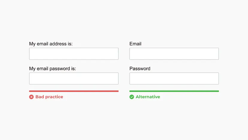
Image Source: Medium
Match field length and structure to the intended input. The length and structure of a label should match the type of input field it is associated with. For example, a label for a text field should be longer than a label for a checkbox.

Image Source: Medium
Form fields should look like form fields
Form fields should have a consistent look and feel. This will help users identify and understand the different types of fields on the form.
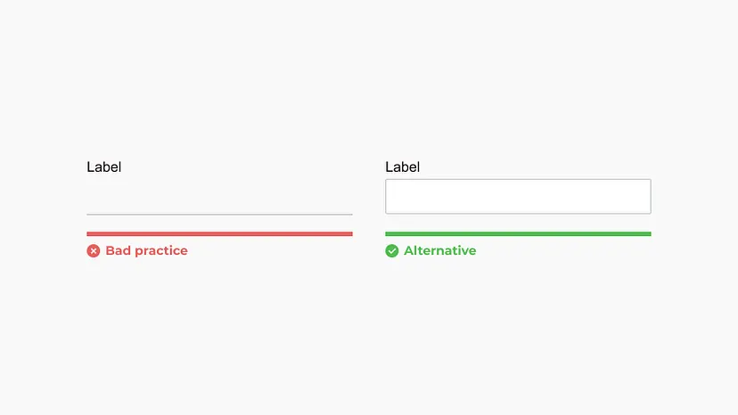
Image Source: Medium
Differentiate form fields from other elements. Form fields should be visually differentiated from other elements on the page, such as text and images. This can be done by using different colors, borders, or fonts.
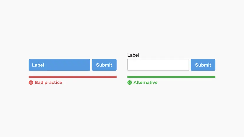
Image Source: Medium
Use the appropriate input type and tag. The input type and tag used for a form field should be appropriate for the type of data being collected. For example, a text field should be used to collect text input, and a checkbox should be used to collect a yes/no response.

Image Source: Medium
Forms should be one column
Forms should be laid out in a single column. This will make it easier for users to scan and complete the form.
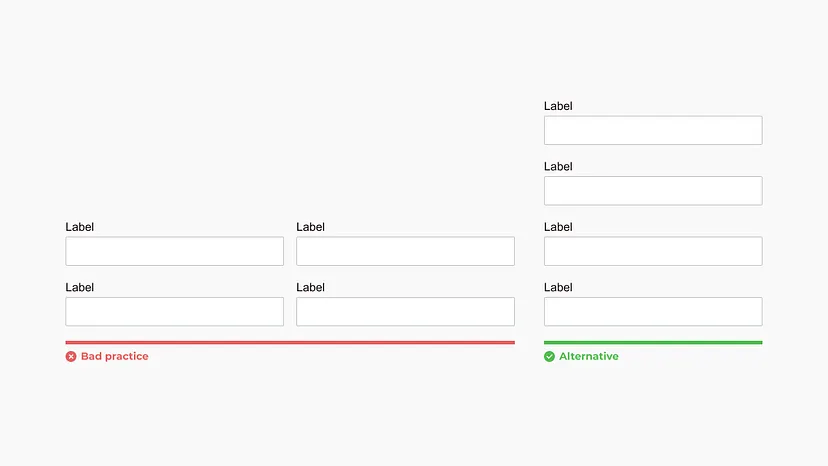
Image Source: Medium
Fields that logically go together should be inline. This will help users understand the relationship between the different fields.

Image Source: Medium
Omit unneeded fields. Only ask users for the information that is absolutely necessary. This will help to reduce the amount of time it takes to complete the form.
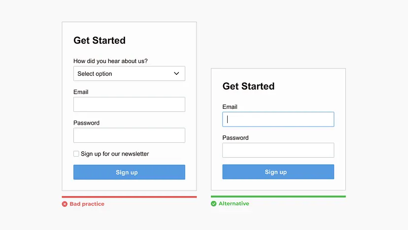
Image Source: Medium
Make action buttons task-specific
Action buttons should be clear and concise. They should tell users exactly what will happen when they click on the button.
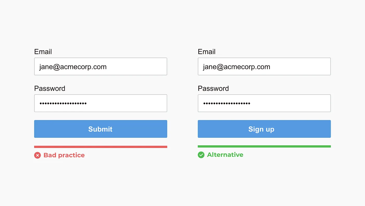
Image Source: Medium
Group labels with their inputs. Labels should be grouped with their corresponding input fields. This will help users to associate the label with the correct field.
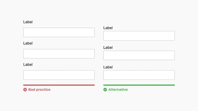
Image Source: Medium
Incorporate an indication of progress for multiple-step forms
Multiple-step forms can be daunting for users, so it is important to provide them with an indication of their progress. This can be done by using a progress bar, a series of steps, or a simple message that tells the user how many steps are left.
The progress indicator should be clear and concise, and it should be placed prominently on the form. It should also be updated dynamically as the user progresses through the form.
This will help users to stay on track and avoid getting lost. It will also make the form feel more manageable and less overwhelming.
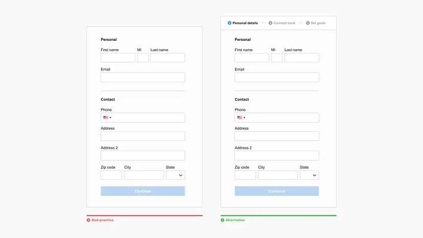
Image Source: Medium
Here are some specific tips for incorporating an indication of progress for multiple-step forms:
- Use a progress bar: A progress bar is a visual indicator that shows how far the user has progressed through the form. It can be a simple bar that fills up as the user completes each step, or it can be a more complex bar that shows the percentage of the form that has been completed.
- Use a series of steps: A series of steps is a text-based indicator that shows the user which step they are on and how many steps are left. This can be a simple list of steps, or it can be a more detailed explanation of each step.
- Use a simple message: A simple message can also be used to indicate the user's progress. This message could say something like "Step 1 of 3" or "You are halfway through the form."
By following these tips, you can design user-friendly web forms that will improve the user experience, reduce errors, and improve your website's SEO ranking.
Using CSS, we can style the form to make it more user-friendly. For example, we can add padding, borders, and background colors to the form controls to make them stand out. We can also use CSS to make the form responsive, so that it looks good on all screen sizes.
Designing user-friendly web forms is an essential part of web development. By keeping forms simple, using clear labels, organizing fields logically, using placeholder text, offering inline validation, providing clear error messages, and optimizing for mobile devices, you can improve the user experience and increase conversions on your website.
