Bootstrap 5 OTP Field with Autofocus and Validation
<!DOCTYPE html>
<html lang="en">
<head>
  <meta charset="utf-8">
  <meta name="viewport" content="width=device-width, initial-scale=1">
  <title> OTP Verify Mockup Example </title>
  <link rel='stylesheet' href='https://cdn.jsdelivr.net/npm/bootstrap@5.3.0/dist/css/bootstrap.min.css'>
</head>
<body class="container-fluid bg-body-tertiary d-block">
  <div class="row justify-content-center">
    <div class="col-12 col-md-6 col-lg-4" style="min-width: 500px;">
      <div class="card bg-white mb-5 mt-5 border-0" style="box-shadow: 0 12px 15px rgba(0, 0, 0, 0.02);">
        <div class="card-body p-5 text-center">
          <h4>Verify</h4>
          <p>Your code was sent to you via email</p>

          <div class="otp-field mb-4">
            <input type="number" />
            <input type="number" disabled />
            <input type="number" disabled />
            <input type="number" disabled />
            <input type="number" disabled />
            <input type="number" disabled />
          </div>

          <button class="btn btn-primary mb-3">
            Verify
          </button>

          <p class="resend text-muted mb-0">
            Didn't receive code? <a href="">Request again</a>
          </p>
        </div>
      </div>
    </div>
  </div>
</body>
</html>
.otp-field {
  flex-direction: row;
  column-gap: 10px;
  display: flex;
  align-items: center;
  justify-content: center;
}

.otp-field input {
  height: 45px;
  width: 42px;
  border-radius: 6px;
  outline: none;
  font-size: 1.125rem;
  text-align: center;
  border: 1px solid #ddd;
}
.otp-field input:focus {
  box-shadow: 0 1px 0 rgba(0, 0, 0, 0.1);
}
.otp-field input::-webkit-inner-spin-button,
.otp-field input::-webkit-outer-spin-button {
  display: none;
}

.resend {
  font-size: 12px;
}

.footer {
  position: absolute;
  bottom: 10px;
  right: 10px;
  color: black;
  font-size: 12px;
  text-align: right;
  font-family: monospace;
}

.footer a {
  color: black;
  text-decoration: none;
}
const inputs = document.querySelectorAll(".otp-field > input");
const button = document.querySelector(".btn");

window.addEventListener("load", () => inputs[0].focus());
button.setAttribute("disabled", "disabled");

inputs[0].addEventListener("paste", function (event) {
  event.preventDefault();

  const pastedValue = (event.clipboardData || window.clipboardData).getData(
    "text"
  );
  const otpLength = inputs.length;

  for (let i = 0; i < otpLength; i++) {
    if (i < pastedValue.length) {
      inputs[i].value = pastedValue[i];
      inputs[i].removeAttribute("disabled");
      inputs[i].focus;
    } else {
      inputs[i].value = ""; // Clear any remaining inputs
      inputs[i].focus;
    }
  }
});

inputs.forEach((input, index1) => {
  input.addEventListener("keyup", (e) => {
    const currentInput = input;
    const nextInput = input.nextElementSibling;
    const prevInput = input.previousElementSibling;

    if (currentInput.value.length > 1) {
      currentInput.value = "";
      return;
    }

    if (
      nextInput &&
      nextInput.hasAttribute("disabled") &&
      currentInput.value !== ""
    ) {
      nextInput.removeAttribute("disabled");
      nextInput.focus();
    }

    if (e.key === "Backspace") {
      inputs.forEach((input, index2) => {
        if (index1 <= index2 && prevInput) {
          input.setAttribute("disabled", true);
          input.value = "";
          prevInput.focus();
        }
      });
    }

    button.classList.remove("active");
    button.setAttribute("disabled", "disabled");

    const inputsNo = inputs.length;
    if (!inputs[inputsNo - 1].disabled && inputs[inputsNo - 1].value !== "") {
      button.classList.add("active");
      button.removeAttribute("disabled");

      return;
    }
  });
});
This Bootstrap 5 snippet provides a user-friendly and secure OTP (One-Time Password) field with autofocus and validation capabilities. It's ideal for implementing two-factor authentication or other security measures in your web applications. The OTP field is designed to be responsive and customizable, ensuring a seamless user experience across different devices.
Key Features:
- Autofocus: The OTP field automatically focuses on the first input box when the component is loaded, improving the user experience by eliminating the need for manual focusing.
- Validation: The component includes built-in validation to ensure that the entered OTP code matches the expected format and length.
- Customizable Styling: Easily modify the appearance of the OTP field using Bootstrap's CSS classes to match your website's design.
- Responsive Design: The OTP field adapts to different screen sizes, ensuring a consistent experience on various devices.
- Error Handling: The component provides visual feedback for invalid OTP entries, guiding users to enter the correct code.
Implementation:
- Include Bootstrap 5: Ensure you have Bootstrap 5 installed and configured in your project.
- Create the HTML Structure: Set up the basic HTML structure for the OTP field, including the input boxes and a submit button.
- Apply Bootstrap Classes: Use Bootstrap's CSS classes to style the OTP field, such as form-control, input-group, and btn.
- Add JavaScript for Autofocus and Validation: Implement JavaScript code to automatically focus on the first input box and validate the entered OTP code. You can use JavaScript libraries like jQuery or native JavaScript for this purpose.

Join Our Community Call-to-Action Banner Section With Tailwind CSS

Bootstrap 5 Responsive Service Pricing Table Block

Owl Carousel Responsive CSS-Only Team Section Showcase

Tailwind CSS Subscribe Container with Integrated Footer
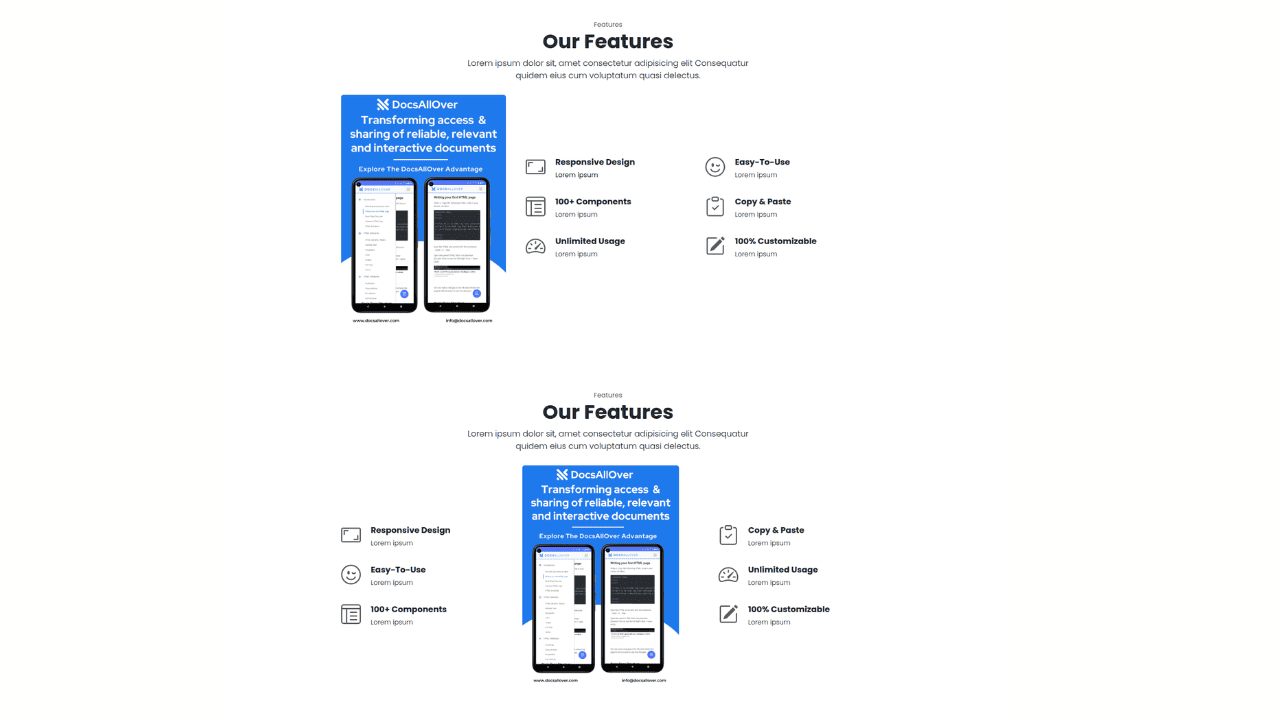
Responsive Bootstrap 5 Detailed Features Section
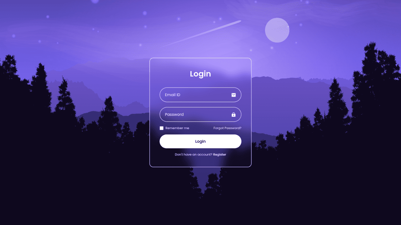
Responsive CSS-Only Glassmorphism Login Form with background image
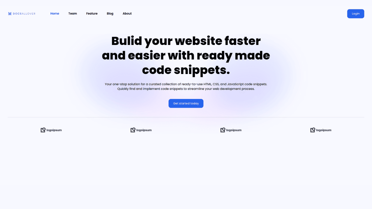
Responsive Tailwind CSS Hero Section and Adaptive Navbar
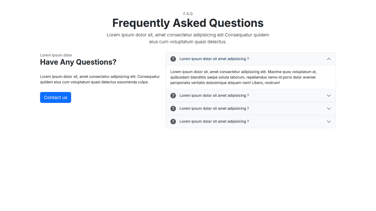
Responsive Bootstrap 5 Compact FAQ Accordion Display

Responsive CSS Only Services Section with Hover Effects
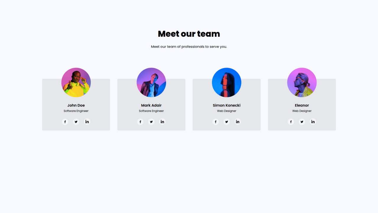
Responsive Tailwind CSS Team Members Display Showcase
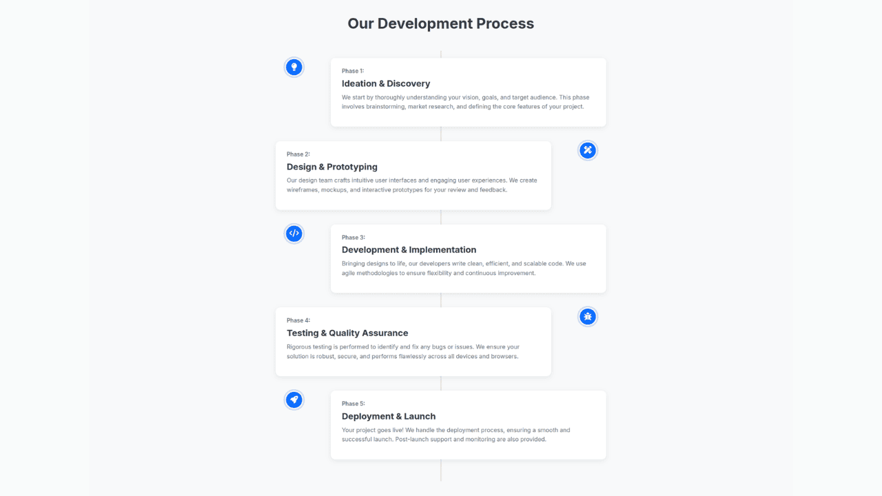
Responsive Bootstrap 5 Clear Process Flow Component
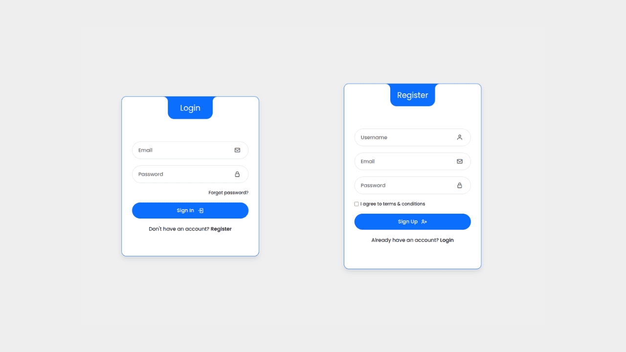
Responsive Interactive Login & Register Form with CSS & JS Transitions
Building Blocks for Your Web Pages
Explore a collection of pre-written HTML,CSS and Javascript
snippets to jumpstart your web development projects.
