<!doctype html>
<html>

<head>
    <meta charset='utf-8'>
    <meta name='viewport' content='width=device-width, initial-scale=1'>
    <title>Animated Range Slider</title>
</head>

<body>
    <div class="range">
        <div class="sliderValue">
            <span>100</span>
        </div>
        <div class="field">
            <div class="value left">
                0</div>
            <input type="range" min="10" max="200" value="100" steps="1">
            <div class="value right">
                200</div>
        </div>
    </div>
    <script type='text/javascript' src='https://cdn.jsdelivr.net/npm/popper.js@1.16.0/dist/umd/popper.min.js'></script>
</body>

</html>
@import url('https://fonts.googleapis.com/css?family=Poppins:400,500,600,700&display=swap');

* {
    margin: 0;
    padding: 0;
    box-sizing: border-box;
    font-family: 'Poppins', sans-serif;
}

html,
body {
    display: grid;
    height: 100%;
    text-align: center;
    place-items: center;
    background: #5271ff;
}

.range {
    height: 80px;
    width: 380px;
    background: #fff;
    border-radius: 10px;
    padding: 0 65px 0 45px;
    box-shadow: 2px 4px 8px rgba(0, 0, 0, 0.1);
}

.sliderValue {
    position: relative;
    width: 100%;
}

.sliderValue span {
    position: absolute;
    height: 45px;
    width: 45px;
    transform: translateX(-70%) scale(0);
    font-weight: 500;
    top: -40px;
    line-height: 55px;
    z-index: 2;
    color: #fff;
    transform-origin: bottom;
    transition: transform 0.3s ease-in-out;
}

.sliderValue span.show {
    transform: translateX(-70%) scale(1);
}

.sliderValue span:after {
    position: absolute;
    content: '';
    height: 100%;
    width: 100%;
    background: #5271ff;
    border: 3px solid #fff;
    z-index: -1;
    left: 50%;
    transform: translateX(-50%) rotate(45deg);
    border-bottom-left-radius: 50%;
    box-shadow: 0px 0px 8px rgba(0, 0, 0, 0.1);
    border-top-left-radius: 50%;
    border-top-right-radius: 50%;
}

.field {
    display: flex;
    align-items: center;
    justify-content: center;
    height: 100%;
    position: relative;
}

.field .value {
    position: absolute;
    font-size: 18px;
    color: #5271ff;
    font-weight: 600;
}

.field .value.left {
    left: -22px;
}

.field .value.right {
    right: -43px;
}

.range input {
    -webkit-appearance: none;
    width: 100%;
    height: 3px;
    background: #ddd;
    border-radius: 5px;
    outline: none;
    border: none;
    z-index: 2222;
}

.range input::-webkit-slider-thumb {
    -webkit-appearance: none;
    width: 20px;
    height: 20px;
    background: red;
    border-radius: 50%;
    background: #664AFF;
    border: 1px solid #664AFF;
    cursor: pointer;
}

.range input::-moz-range-thumb {
    -webkit-appearance: none;
    width: 20px;
    height: 20px;
    background: red;
    border-radius: 50%;
    background: #664AFF;
    border: 1px solid #664AFF;
    cursor: pointer;
}

.range input::-moz-range-progress {
    background: #664AFF; //this progress background is only shown on Firefox
}
const slideValue = document.querySelector("span");
const inputSlider = document.querySelector("input");
inputSlider.oninput = (() => {
    let value = inputSlider.value;
    slideValue.textContent = value;
    slideValue.style.left = (value / 2) + "%";
    slideValue.classList.add("show");
});
inputSlider.onblur = (() => {
    slideValue.classList.remove("show");
});
This snippet showcases a visually appealing and interactive range slider with smooth animations. The slider allows users to select a value within a specified range by dragging the handle. It's a versatile component that can be used for various purposes, such as adjusting settings, filtering content, or selecting a price range.
Key Features:
- Responsive Design: The slider adapts seamlessly to different screen sizes, ensuring a consistent user experience across devices.
- Customizable Styling: Easily modify the appearance of the slider using CSS to match your website's design and branding.
- Smooth Animations: The slider incorporates smooth animations when the handle is dragged, providing a visually pleasing experience.
- Real-time Value Display: The current value selected by the user is displayed in real-time, providing immediate feedback.
- Range Restriction: You can set minimum and maximum values to limit the range of selectable values.
Implementation:
- Create the HTML Structure: Set up the basic HTML structure for the slider, including the track, handle, and value display elements.
- Apply CSS Styles: Use CSS to style the slider's appearance, including the track, handle, and value display. Implement the necessary CSS for the smooth animations when the handle is dragged.
- Add JavaScript Functionality: Use JavaScript to handle the user's interaction with the slider, including mouse and touch events. Calculate the selected value based on the position of the handle and update the value display. You can also add event listeners to trigger actions when the value changes.
By following these steps, you can create a visually appealing and interactive range slider that enhances the user experience on your website.

Join Our Community Call-to-Action Banner Section With Tailwind CSS

Bootstrap 5 Responsive Service Pricing Table Block

Owl Carousel Responsive CSS-Only Team Section Showcase

Tailwind CSS Subscribe Container with Integrated Footer
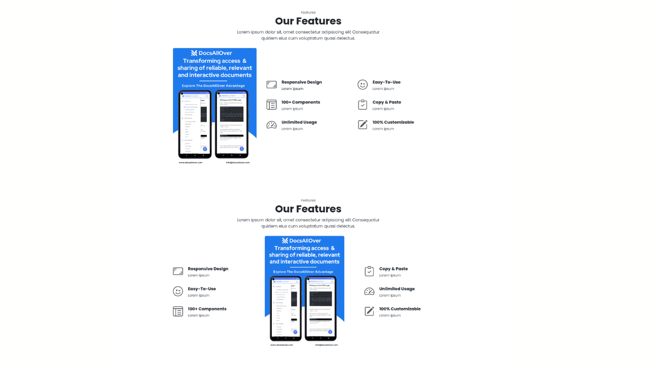
Responsive Bootstrap 5 Detailed Features Section

Responsive CSS-Only Glassmorphism Login Form with background image

Responsive Tailwind CSS Hero Section and Adaptive Navbar
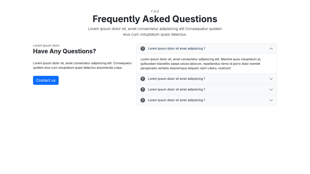
Responsive Bootstrap 5 Compact FAQ Accordion Display

Responsive CSS Only Services Section with Hover Effects

Responsive Tailwind CSS Team Members Display Showcase

Responsive Bootstrap 5 Clear Process Flow Component

Responsive Interactive Login & Register Form with CSS & JS Transitions
Building Blocks for Your Web Pages
Explore a collection of pre-written HTML,CSS and Javascript
snippets to jumpstart your web development projects.
