Responsive Feature Highlight Component with Tailwind CSS
<!doctype html>
<html>
<head>
  <meta charset="UTF-8">
  <meta name="viewport" content="width=device-width, initial-scale=1.0">
  <script src="https://cdn.tailwindcss.com"></script>
</head>
<body>
    <section class="">
        <div class="py-12 bg-white">
            <div class="max-w-7xl mx-auto px-4 sm:px-6 lg:px-8">

                <div class="lg:text-center">
                    <h2
                        class="font-heading mb-4 bg-orange-100 text-orange-800 px-4 py-2 rounded-lg md:w-64 md:mx-auto text-xs font-semibold tracking-widest text-black uppercase title-font">
                        Why choose us?
                    </h2>
                    <p class="font-heading mt-2 text-3xl leading-8 font-semibold tracking-tight text-gray-900 sm:text-4xl">
                        We know tech, we know finance. We are fintech experts.
                    </p>
                    <p class="mt-4 max-w-2xl text-lg text-gray-500 lg:mx-auto">
                        We know how to handle taxation for all the
                        countried we operate in. We care for our customers and help them manage cashflows.
                    </p>
                </div>

                <div class="mt-10">
                    <dl class="space-y-10 md:space-y-0 md:grid md:grid-cols-2 md:gap-x-8 md:gap-y-10">
                        <div class="relative">
                            <dt>
                                <div
                                    class="absolute flex items-center justify-center h-12 w-12 rounded-md bg-primary-500 text-white">
                                    <img src="https://www.svgrepo.com/show/503163/api-settings.svg" >
                                </div>
                                <p class="font-heading ml-16 text-lg leading-6 font-bold text-gray-700">Powerful API</p>
                            </dt>
                            <dd class="mt-2 ml-16 text-base text-gray-500">
                                Lorem ipsum, dolor sit amet consectetur
                                adipisicing elit. Maiores impedit perferendis suscipit eaque, iste dolor cupiditate
                                blanditiis ratione.
                            </dd>
                        </div>
                        <div class="relative">
                            <dt>
                                <div
                                    class="absolute flex items-center justify-center h-12 w-12 rounded-md bg-primary-500 text-white">
                                    <img src="https://www.svgrepo.com/show/503138/webpack.svg" >
                                </div>
                                <p class="font-heading ml-16 text-lg leading-6 font-bold text-gray-700">Easy to integrate
                                    SDK
                                </p>
                            </dt>
                            <dd class="mt-2 ml-16 text-base text-gray-500"> Lorem ipsum, dolor sit amet consectetur
                                adipisicing elit. Maiores impedit perferendis suscipit eaque, iste dolor cupiditate
                                blanditiis ratione.
                            </dd>
                        </div>
                        <div class="relative">
                            <dt>
                                <div
                                    class="absolute flex items-center justify-center h-12 w-12 rounded-md bg-primary-500 text-white">
                                    <img src="https://www.svgrepo.com/show/511771/dashboard-671.svg" >

                                </div>
                                <p class="font-heading ml-16 text-lg leading-6 font-bold text-gray-700">Low Transaction Cost
                                </p>
                            </dt>
                            <dd class="mt-2 ml-16 text-base text-gray-500"> Lorem ipsum, dolor sit amet consectetur
                                adipisicing elit. Maiores impedit perferendis suscipit eaque, iste dolor cupiditate
                                blanditiis ratione.
                            </dd>
                        </div>
                        <div class="relative">
                            <dt>
                                <div
                                    class="absolute flex items-center justify-center h-12 w-12 rounded-md bg-primary-500 text-white">
                                    <img src="https://www.svgrepo.com/show/76267/free-commercial-label.svg" >

                                </div>
                                <p class="font-heading ml-16 text-lg leading-6 font-bold text-gray-700">Powerful Dashboard
                                </p>
                            </dt>
                            <dd class="mt-2 ml-16 text-base text-gray-500"> Lorem ipsum, dolor sit amet consectetur
                                adipisicing elit. Maiores impedit perferendis suscipit eaque, iste dolor cupiditate
                                blanditiis ratione.
                            </dd>
                        </div>
                    </dl>
                </div>

            </div>
        </div>
    </section>
</body>
</html>
/* Doesn't require any CSS. */
//Doesn't require any JS.
This Tailwind CSS snippet showcases a visually appealing and responsive feature highlight component, designed to effectively showcase key product features or benefits. The component features a modern and clean design, with clear and concise messaging.
Key Features:
- Responsive Design: The component adapts seamlessly to different screen sizes, ensuring a consistent user experience across devices.
- Customizable Styling: Easily modify the appearance of the component using Tailwind CSS utility classes to match your website's design and branding.
- Clear and Concise Messaging: The component presents key features in a clear and concise manner, using concise language and strong visuals.
- Visual Appeal: The use of icons and images can enhance the visual appeal of the features and make them more engaging.
- Flexible Layout: The component can be easily customized to accommodate different layouts, such as a grid or a list.
Implementation:
- Include Tailwind CSS: Ensure you have Tailwind CSS installed and configured in your project.
- Create the HTML Structure: Set up the basic HTML structure for the feature highlight component, including the container, feature cards, and their content.
- Apply Tailwind CSS Classes: Use Tailwind CSS utility classes to style the component and its elements, such as feature-section, feature-card, feature-icon, feature-title, feature-description, and any other relevant classes.
- Customize as Needed: Modify the Tailwind CSS classes and HTML structure to customize the appearance and content of the feature highlight component according to your specific requirements.
By following these steps, you can create a visually appealing and informative feature highlight component that helps you showcase your product's key benefits.

Join Our Community Call-to-Action Banner Section With Tailwind CSS
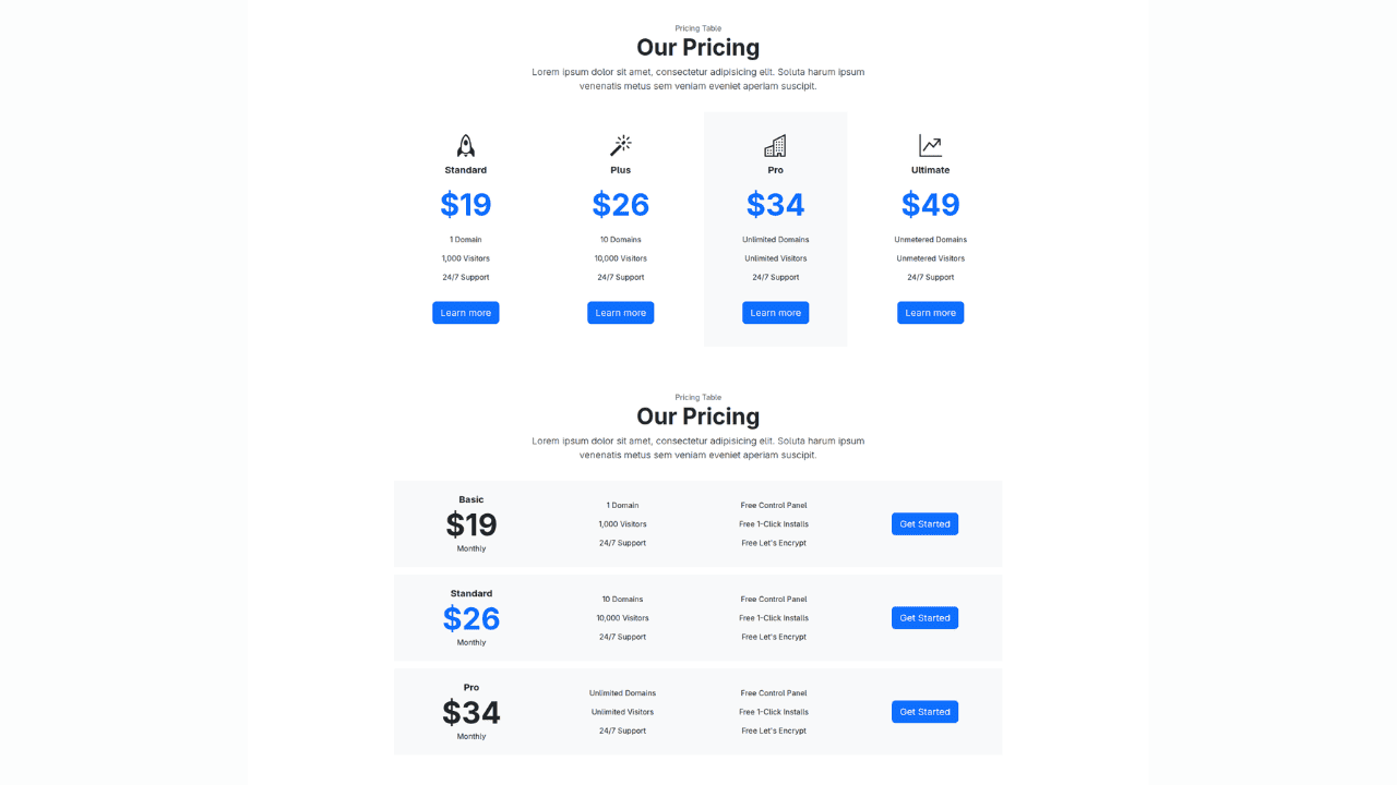
Bootstrap 5 Responsive Service Pricing Table Block

Owl Carousel Responsive CSS-Only Team Section Showcase
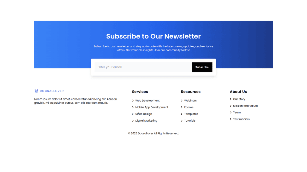
Tailwind CSS Subscribe Container with Integrated Footer
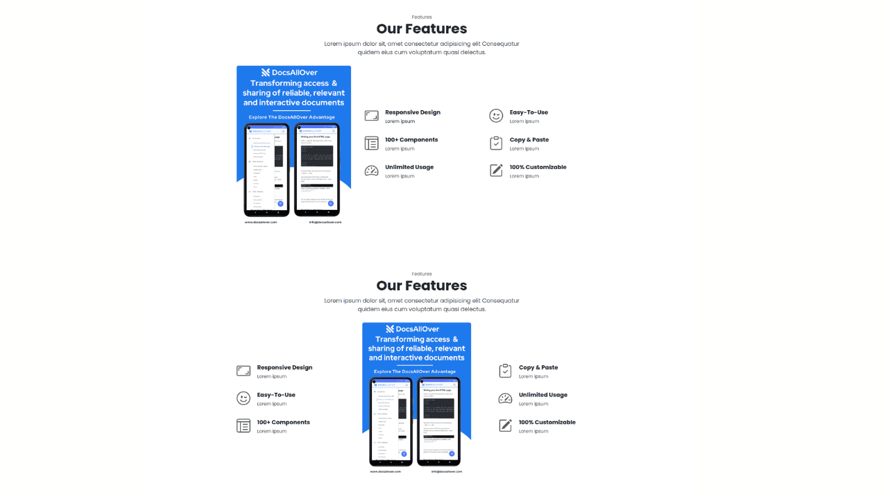
Responsive Bootstrap 5 Detailed Features Section
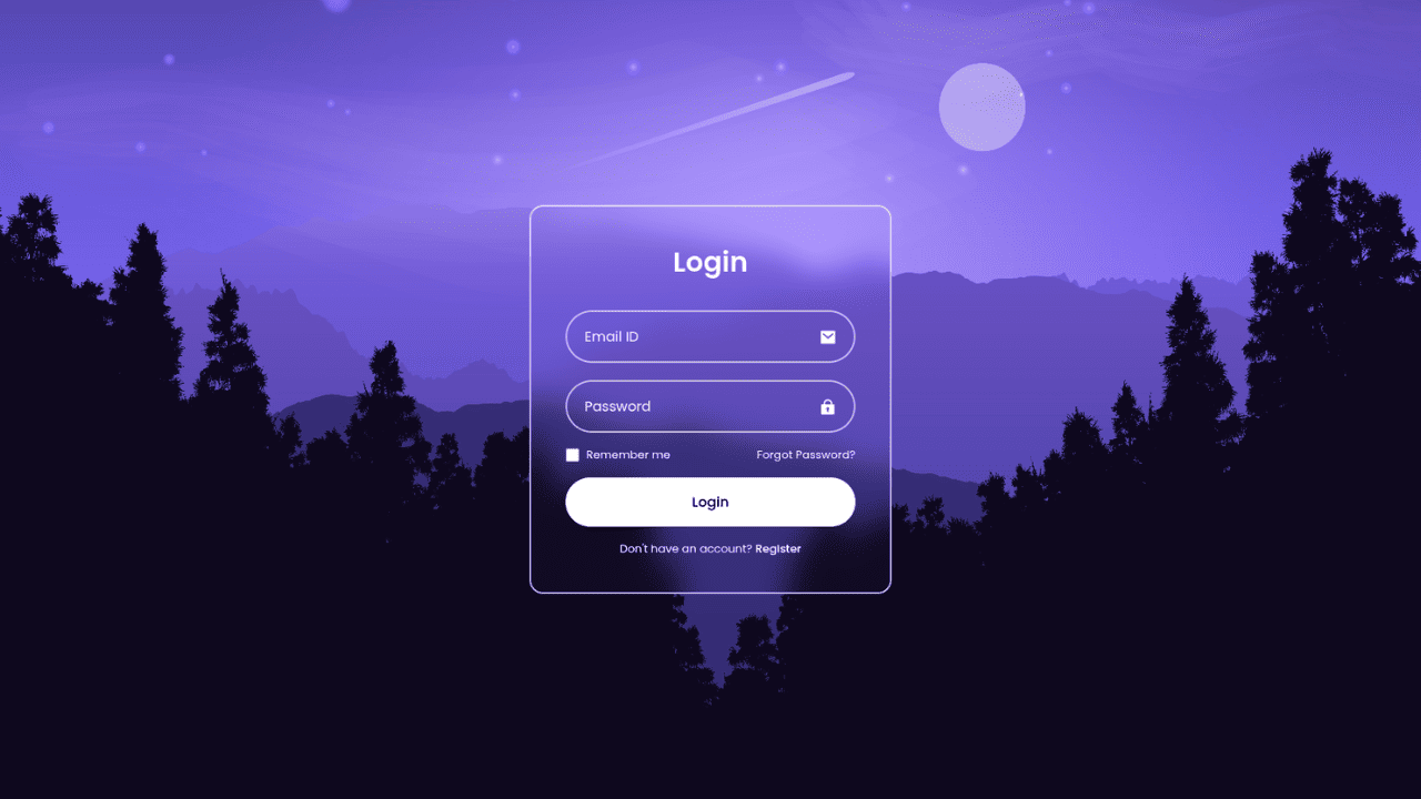
Responsive CSS-Only Glassmorphism Login Form with background image
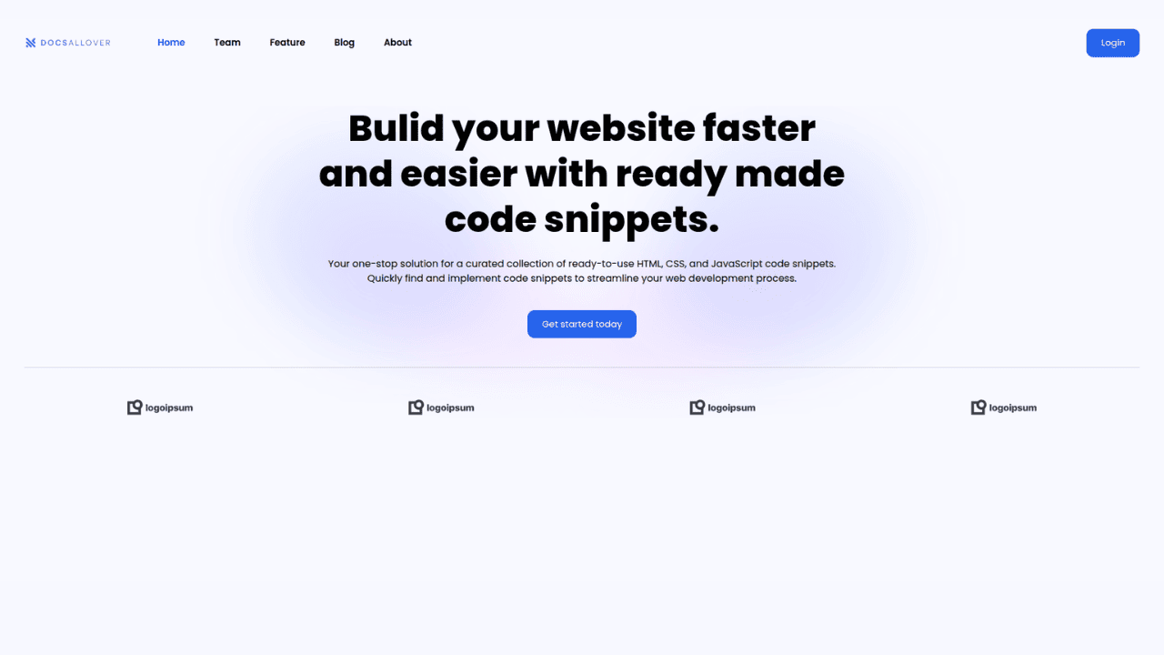
Responsive Tailwind CSS Hero Section and Adaptive Navbar
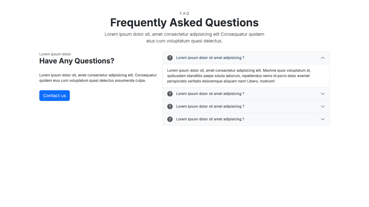
Responsive Bootstrap 5 Compact FAQ Accordion Display
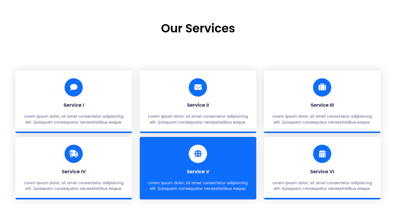
Responsive CSS Only Services Section with Hover Effects
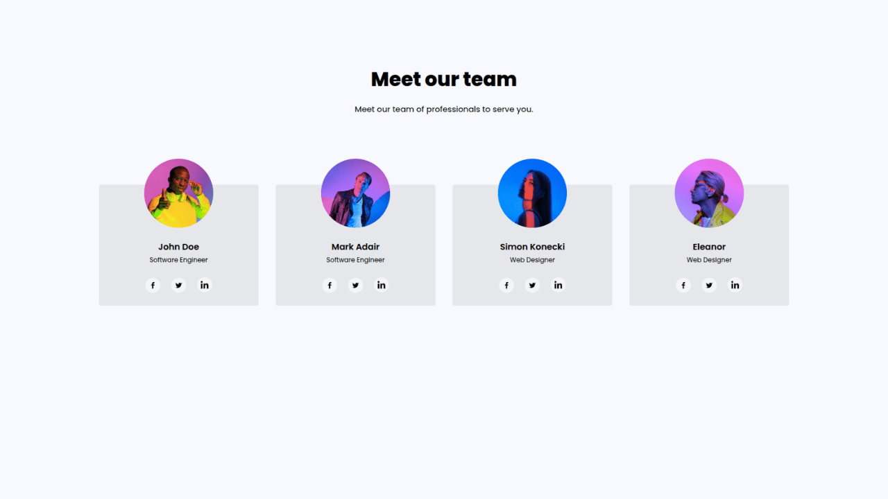
Responsive Tailwind CSS Team Members Display Showcase
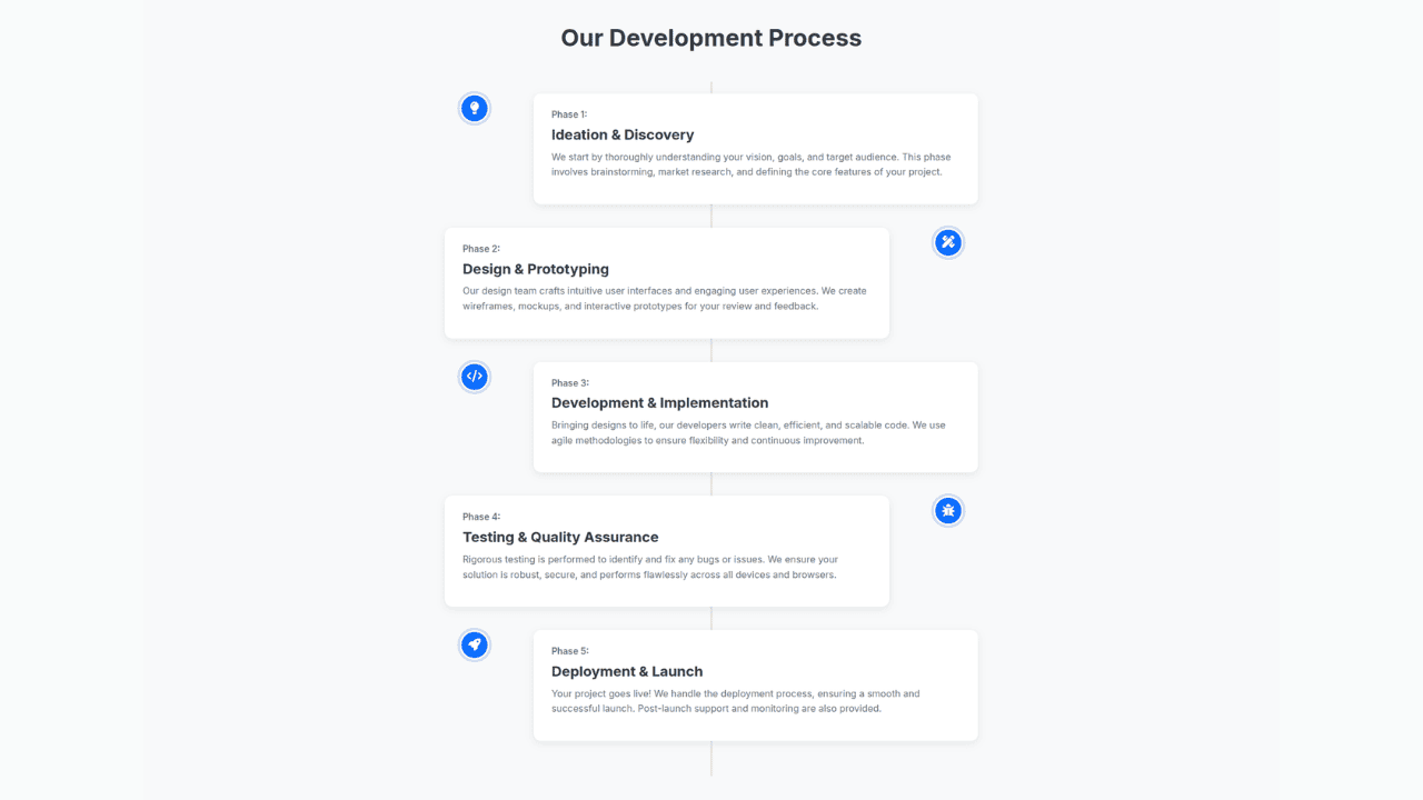
Responsive Bootstrap 5 Clear Process Flow Component
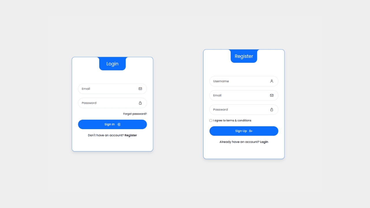
Responsive Interactive Login & Register Form with CSS & JS Transitions
Building Blocks for Your Web Pages
Explore a collection of pre-written HTML,CSS and Javascript
snippets to jumpstart your web development projects.
