Elevate Web Design with Bootstrap for Responsive and User-Centric UI/UX
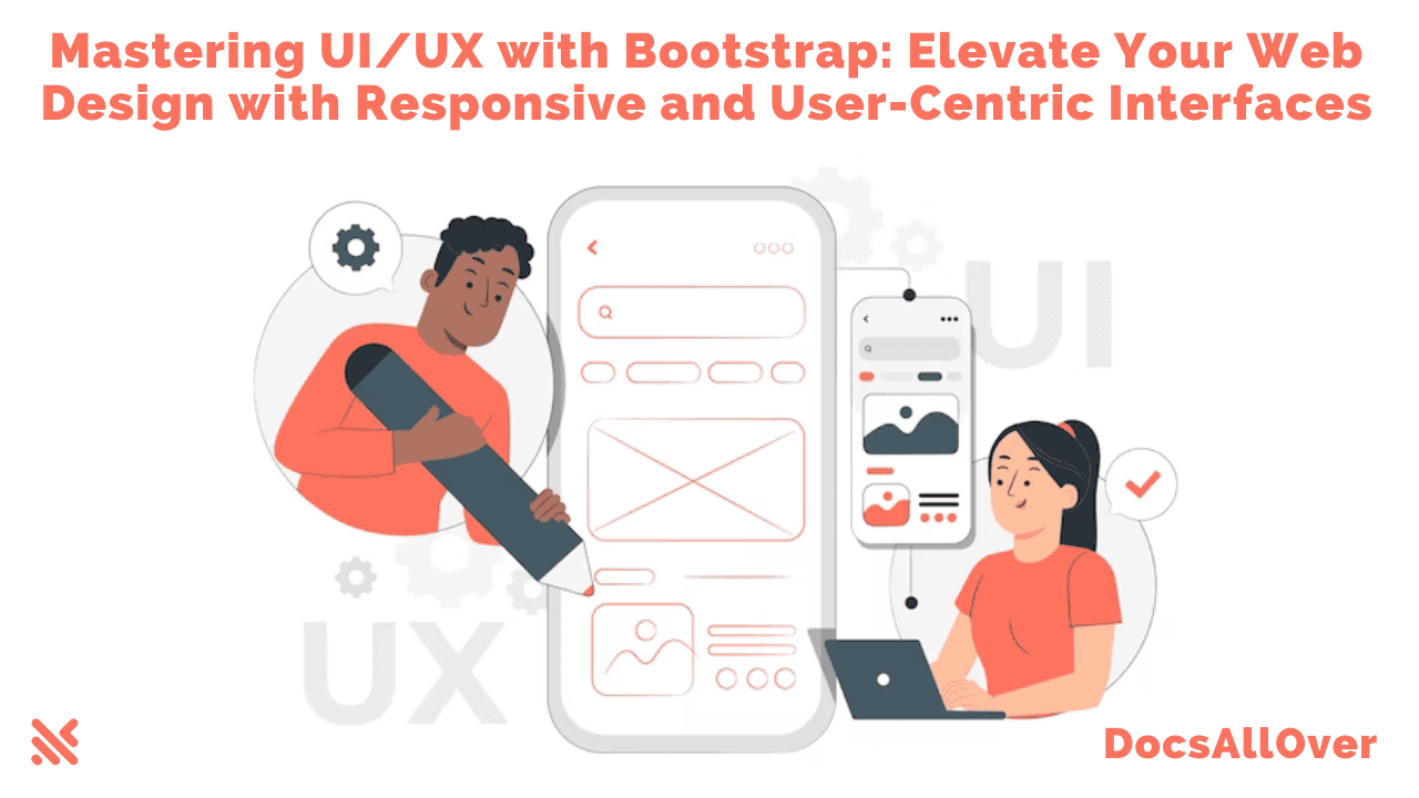
UI (User Interface) and UX (User Experience) are crucial elements in web design, shaping how users interact with and perceive a website. By incorporating Bootstrap, a powerful front-end framework, you can enhance the UI/UX of your web projects. In this blog, we will delve into the world of UI/UX design, explore the key principles, and learn how to create responsive and user-centric interfaces using Bootstrap.
Section 1: Understanding UI/UX Design:
Defining UI and UX: Exploring the difference between UI and UX, where UI focuses on the visual aspects and UX focuses on the overall user experience.
Importance of UI/UX: Discussing the significance of UI/UX design in capturing user attention, improving usability, and driving user engagement.
UI/UX Principles: Explaining essential principles such as simplicity, consistency, intuitive navigation, clear visual hierarchy, and effective use of colors and typography.
Section 2: Introduction to Bootstrap:
Overview of Bootstrap: Providing an overview of Bootstrap, a popular front-end framework developed by Twitter.
Key Features of Bootstrap: Highlighting features like responsive grid system, pre-styled components, CSS utilities, and extensive documentation.
Advantages of Using Bootstrap: Discussing the advantages of leveraging Bootstrap, including time-saving development, mobile-first approach, and cross-browser compatibility.
Section 3: Creating Responsive UI/UX with Bootstrap:
Utilizing Bootstrap's Grid System: Demonstrating how to create a responsive layout using Bootstrap's grid classes, enabling content to adapt to different screen sizes.
Responsive Navigation: Implementing a responsive navigation bar using Bootstrap's navbar component, which collapses into a mobile-friendly menu on smaller screens.
Customizing Bootstrap Components: Exploring how to customize Bootstrap's components to match the branding and design requirements of your project.
Responsive Images and Media: Optimizing images and media elements to ensure they scale and adapt gracefully across various devices using Bootstrap's responsive classes.
Form Validation and Feedback: Incorporating Bootstrap's form validation classes and feedback components to enhance the user experience during form submission.
Mobile-Friendly Typography: Ensuring legible and readable text on smaller devices by utilizing Bootstrap's typography classes and responsive font sizes.
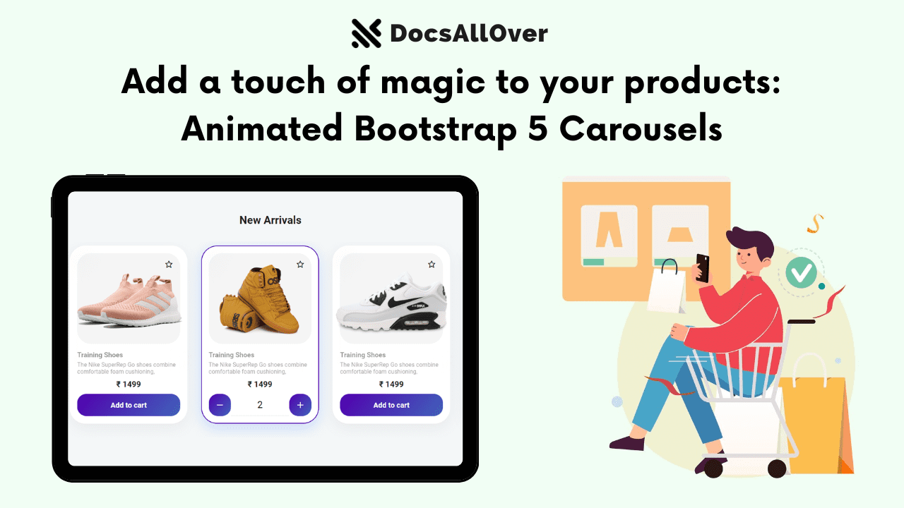
Section 4: Example: Responsive Product Showcase Page:
Design Concept: Creating a responsive product showcase page with a hero section, product grid, and product details section.
HTML Structure: Breaking down the HTML structure of the page, including the use of Bootstrap classes for responsive layout and components.
CSS Styling: Applying CSS styles to enhance the design, such as customizing colors, typography, and adding animations.
Responsiveness: Implementing media queries and utilizing Bootstrap's responsive classes to ensure the page adapts well to different screen sizes.
User Interaction: Incorporating UI/UX elements like hover effects, interactive buttons, and smooth transitions to enhance user engagement.
In this example, we have created a responsive product showcase page using Bootstrap's grid system and components. The page consists of a hero section with a background image, followed by a section containing product cards displayed in a responsive grid layout.
The HTML structure utilizes Bootstrap's container, row, and column classes to create a responsive layout. The CSS styles customize the appearance of the hero section and product cards. The media query in the CSS applies additional styling for smaller screens.
Remember to replace the image URLs (hero-image.jpg, product1.jpg, etc.) with the actual image URLs for your products.
With this code example, you can create a responsive and visually appealing product showcase page using Bootstrap. Feel free to customize the styles, add more content, and further enhance the UI/UX of your web design.
Conclusion:
Mastering UI/UX design is essential for creating visually appealing and user-friendly websites. By leveraging the power of Bootstrap, you can streamline the UI/UX design process and create responsive interfaces that deliver exceptional user experiences. The combination of Bootstrap's responsive grid system, pre-designed components, and extensive customization options empowers web designers to create stunning and intuitive interfaces.
Remember, UI/UX design is a continuous learning process. Stay updated with the latest UI/UX trends, conduct user research, and iterate on your designs based on user feedback. With Bootstrap as your ally, you have a versatile toolkit to elevate your UI/UX designs and create web experiences that leave a lasting impression on your users.
So, start your journey into the world of UI/UX design with Bootstrap, and unlock the potential to create beautiful and user-centric web interfaces that captivate and engage your audience!

