Animated Bootstrap 5 Modal Success & Error Example
<!DOCTYPE html>
<html lang="en">

<head>
	<meta charset="utf-8">
	<meta name="viewport" content="width=device-width, initial-scale=1">
	<title>Animated Bootstrap 5 Modal Success and Error Example </title>
	<link rel='stylesheet' href='https://cdnjs.cloudflare.com/ajax/libs/bootstrap/5.0.2/css/bootstrap.min.css'>
</head>

<body>
	<div class="container  p-5">
		<div class="row">
			<div class="col-12 text-center">
				<button type="button" class="btn btn-success m-1" data-bs-toggle="modal"
					data-bs-target="#statusSuccessModal">Success Modal</button>
				<button type="button" class="btn btn-danger m-1" data-bs-toggle="modal"
					data-bs-target="#statusErrorsModal">Error Modal</button>
			</div>


			<div class="modal fade" id="statusErrorsModal" tabindex="-1" role="dialog" data-bs-backdrop="static"
				data-bs-keyboard="false">
				<div class="modal-dialog modal-dialog-centered modal-sm" role="document">
					<div class="modal-content">
						<div class="modal-body text-center p-lg-4">
							<svg version="1.1" xmlns="http://www.w3.org/2000/svg" viewBox="0 0 130.2 130.2">
								<circle class="path circle" fill="none" stroke="#db3646" stroke-width="6"
									stroke-miterlimit="10" cx="65.1" cy="65.1" r="62.1" />
								<line class="path line" fill="none" stroke="#db3646" stroke-width="6"
									stroke-linecap="round" stroke-miterlimit="10" x1="34.4" y1="37.9" x2="95.8"
									y2="92.3" />
								<line class="path line" fill="none" stroke="#db3646" stroke-width="6"
									stroke-linecap="round" stroke-miterlimit="10" x1="95.8" y1="38" X2="34.4"
									y2="92.2" />
							</svg>
							<h4 class="text-danger mt-3">Invalid email!</h4>
							<p class="mt-3">This email is already registered, please login.</p>
							<button type="button" class="btn btn-sm mt-3 btn-danger" data-bs-dismiss="modal">Ok</button>
						</div>
					</div>
				</div>
			</div>
			<div class="modal fade" id="statusSuccessModal" tabindex="-1" role="dialog" data-bs-backdrop="static"
				data-bs-keyboard="false">
				<div class="modal-dialog modal-dialog-centered modal-sm" role="document">
					<div class="modal-content">
						<div class="modal-body text-center p-lg-4">
							<svg version="1.1" xmlns="http://www.w3.org/2000/svg" viewBox="0 0 130.2 130.2">
								<circle class="path circle" fill="none" stroke="#198754" stroke-width="6"
									stroke-miterlimit="10" cx="65.1" cy="65.1" r="62.1" />
								<polyline class="path check" fill="none" stroke="#198754" stroke-width="6"
									stroke-linecap="round" stroke-miterlimit="10"
									points="100.2,40.2 51.5,88.8 29.8,67.5 " />
							</svg>
							<h4 class="text-success mt-3">Oh Yeah!</h4>
							<p class="mt-3">You have successfully registered and logged in.</p>
							<button type="button" class="btn btn-sm mt-3 btn-success"
								data-bs-dismiss="modal">Ok</button>
						</div>
					</div>
				</div>
			</div>
		</div>
	</div>
	<script src='https://cdnjs.cloudflare.com/ajax/libs/jquery/3.6.0/jquery.min.js'></script>
	<script src='https://cdnjs.cloudflare.com/ajax/libs/twitter-bootstrap/5.2.0/js/bootstrap.min.js'></script>
</body>

</html>
.modal#statusSuccessModal .modal-content,
.modal#statusErrorsModal .modal-content {
    border-radius: 30px;
}

.modal#statusSuccessModal .modal-content svg,
.modal#statusErrorsModal .modal-content svg {
    width: 100px;
    display: block;
    margin: 0 auto;
}

.modal#statusSuccessModal .modal-content .path,
.modal#statusErrorsModal .modal-content .path {
    stroke-dasharray: 1000;
    stroke-dashoffset: 0;
}

.modal#statusSuccessModal .modal-content .path.circle,
.modal#statusErrorsModal .modal-content .path.circle {
    -webkit-animation: dash 0.9s ease-in-out;
    animation: dash 0.9s ease-in-out;
}

.modal#statusSuccessModal .modal-content .path.line,
.modal#statusErrorsModal .modal-content .path.line {
    stroke-dashoffset: 1000;
    -webkit-animation: dash 0.95s 0.35s ease-in-out forwards;
    animation: dash 0.95s 0.35s ease-in-out forwards;
}

.modal#statusSuccessModal .modal-content .path.check,
.modal#statusErrorsModal .modal-content .path.check {
    stroke-dashoffset: -100;
    -webkit-animation: dash-check 0.95s 0.35s ease-in-out forwards;
    animation: dash-check 0.95s 0.35s ease-in-out forwards;
}

@-webkit-keyframes dash {
    0% {
        stroke-dashoffset: 1000;
    }

    100% {
        stroke-dashoffset: 0;
    }
}

@keyframes dash {
    0% {
        stroke-dashoffset: 1000;
    }

    100% {
        stroke-dashoffset: 0;
    }
}

@-webkit-keyframes dash {
    0% {
        stroke-dashoffset: 1000;
    }

    100% {
        stroke-dashoffset: 0;
    }
}

@keyframes dash {
    0% {
        stroke-dashoffset: 1000;
    }

    100% {
        stroke-dashoffset: 0;
    }
}

@-webkit-keyframes dash-check {
    0% {
        stroke-dashoffset: -100;
    }

    100% {
        stroke-dashoffset: 900;
    }
}

@keyframes dash-check {
    0% {
        stroke-dashoffset: -100;
    }

    100% {
        stroke-dashoffset: 900;
    }
}

.box00 {
    width: 100px;
    height: 100px;
    border-radius: 50%;
}
//Doesn't require any JS.
This Bootstrap 5 snippet showcases two animated modal components designed to provide visual feedback to users based on the outcome of an action. The success modal displays a positive message with a checkmark icon, while the error modal displays a negative message with a cross icon. Both modals feature a clean and modern design with smooth animations.
Key Features:
- Animated Transitions: The modals incorporate smooth animations for a visually engaging and user-friendly experience.
- Customizable Styling: Easily modify the appearance of the modals using Bootstrap's CSS classes to match your website's design and branding.
- Clear Messages: The modals display clear and concise messages to inform users of the success or failure of an action.
- Customizable Icons: You can customize the icons used in the modals to match your website's branding or preferences.
- Closable Modals: The modals can be closed by clicking outside of them or by clicking a designated close button.
Implementation:
- Include Bootstrap 5: Ensure you have Bootstrap 5 installed and configured in your project.
- Create the HTML Structure: Set up the basic HTML structure for the modals, including the container, modal content, and close button.
- Apply Bootstrap Classes: Use Bootstrap's CSS classes to style the modals and their elements, such as modal, modal-dialog, modal-content, modal-body and any other relevant classes.
- Add JavaScript for Functionality: Implement JavaScript code to trigger the modal display based on specific conditions (e.g., successful form submission, error handling). You can also customize the animation timing and other aspects of the modal's behavior.
Join Our Community Call-to-Action Banner Section With Tailwind CSS

Bootstrap 5 Responsive Service Pricing Table Block

Owl Carousel Responsive CSS-Only Team Section Showcase

Tailwind CSS Subscribe Container with Integrated Footer
Responsive Bootstrap 5 Detailed Features Section
Responsive CSS-Only Glassmorphism Login Form with background image
Responsive Tailwind CSS Hero Section and Adaptive Navbar
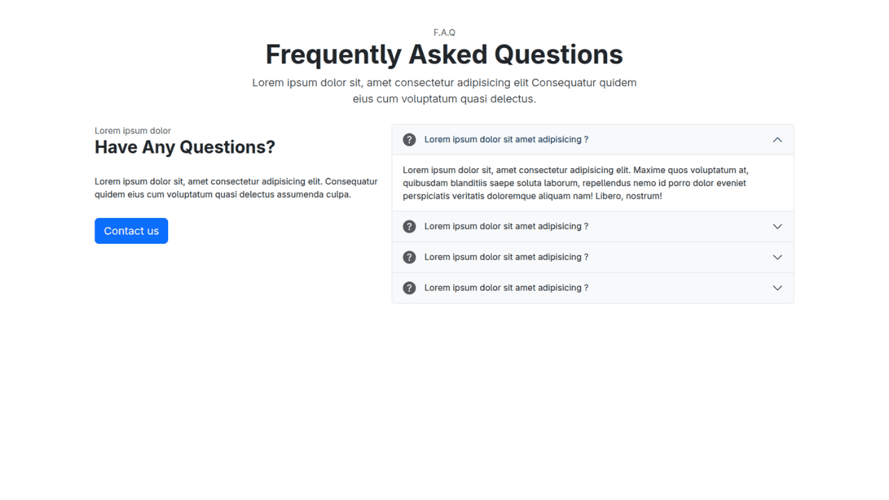
Responsive Bootstrap 5 Compact FAQ Accordion Display

Responsive CSS Only Services Section with Hover Effects
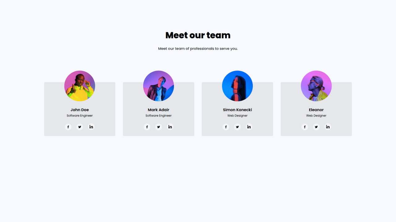
Responsive Tailwind CSS Team Members Display Showcase
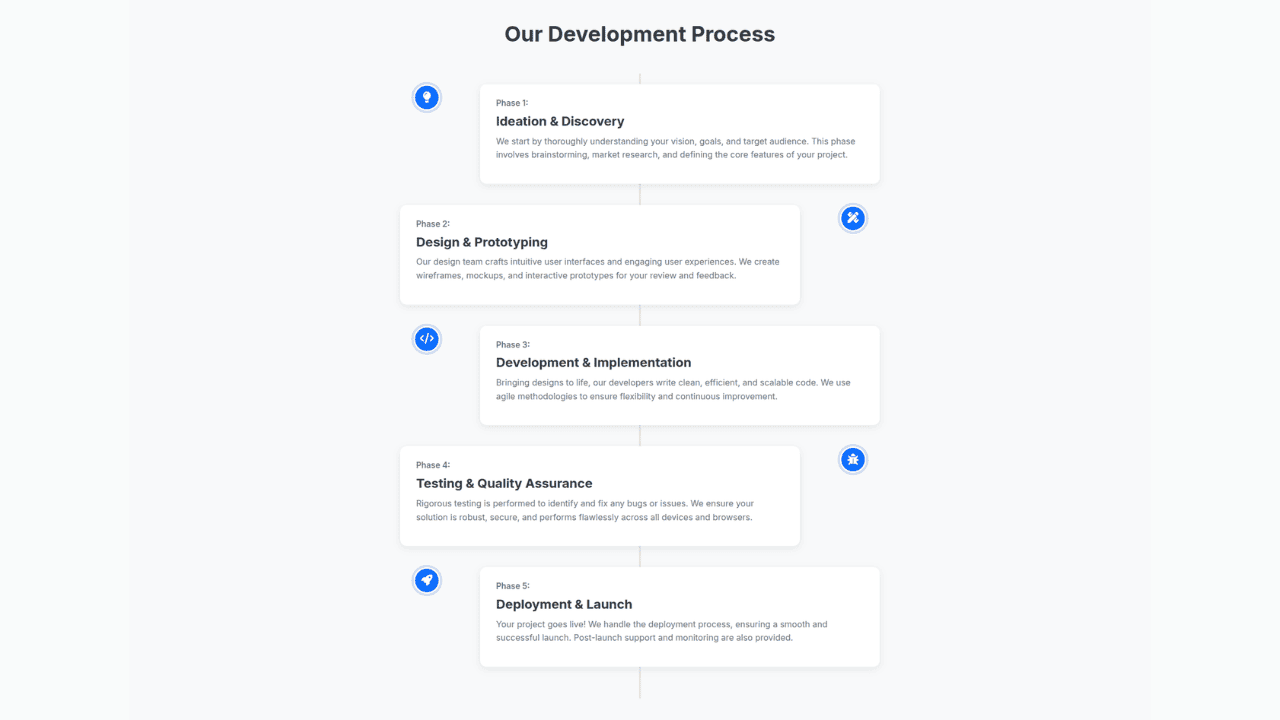
Responsive Bootstrap 5 Clear Process Flow Component
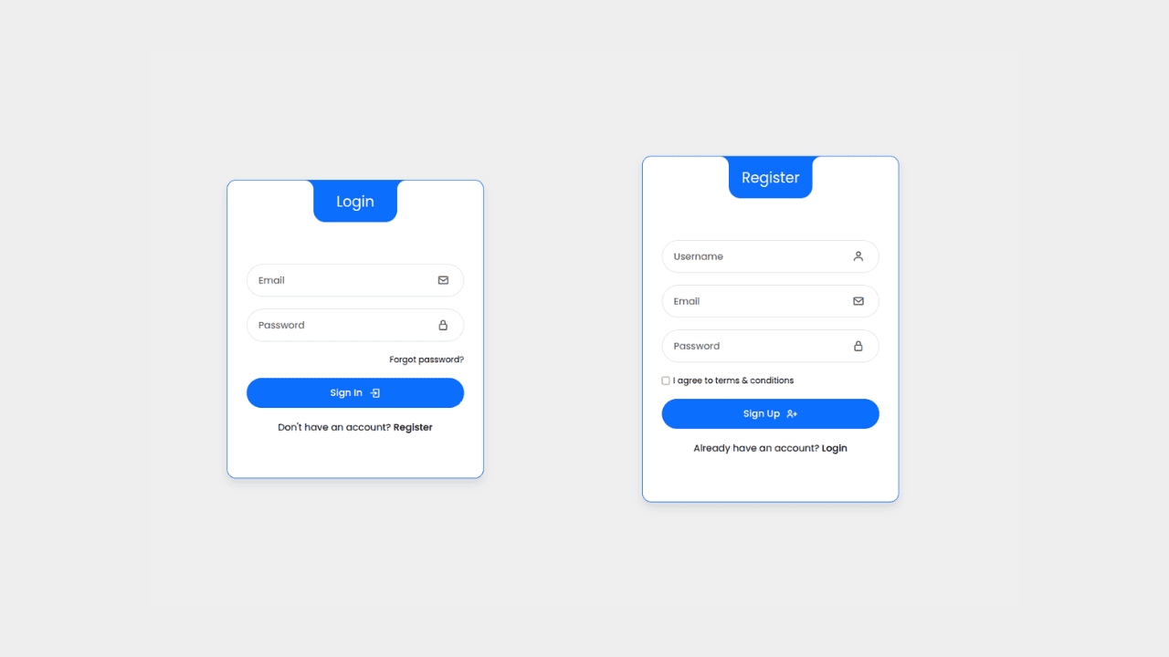
Responsive Interactive Login & Register Form with CSS & JS Transitions
Building Blocks for Your Web Pages
Explore a collection of pre-written HTML,CSS and Javascript
snippets to jumpstart your web development projects.
