<!doctype html>
<html>

<head>
    <meta charset="utf-8">
    <meta name="viewport" content="width=device-width, initial-scale=1">
    <title>Modern CSS Only Loading Spinners Collection</title>
</head>

<body>
    <div class="spinner-1"></div>
    <div class="spinner-2"></div>
    <div class="spinner-3"></div>
    <div class="spinner-4"></div>
    <div class="spinner-5"></div>
    <div class="spinner-6"></div>
    <div class="spinner-7"></div>
    <div class="spinner-8"></div>
    <div class="spinner-9"></div>
    <div class="spinner-10"></div>
    <script type="text/javascript" src="https://cdn.jsdelivr.net/npm/popper.js@1.16.0/dist/umd/popper.min.js"></script>
</body>

</html>
.spinner-1 {
    width: 50px;
    height: 50px;
    border-radius: 50%;
    padding: 6px;
    background:
        conic-gradient(from 135deg at top, currentColor 90deg, #0000 0) 0 calc(50% - 4px)/17px 8.5px,
        radial-gradient(farthest-side at bottom left, #0000 calc(100% - 6px), currentColor calc(100% - 5px) 99%, #0000) top right/50% 50% content-box content-box,
        radial-gradient(farthest-side at top, #0000 calc(100% - 6px), currentColor calc(100% - 5px) 99%, #0000) bottom /100% 50% content-box content-box;
    background-repeat: no-repeat;
    animation: s1 1s infinite linear;
}

@keyframes s1 {
    100% {
        transform: rotate(1turn)
    }
}

.spinner-2 {
    width: 50px;
    height: 50px;
    display: grid;
}

.spinner-2::before,
.spinner-2::after {
    content: "";
    grid-area: 1/1;
    --c: radial-gradient(farthest-side, #25b09b 92%, #0000);
    background:
        var(--c) 50% 0,
        var(--c) 50% 100%,
        var(--c) 100% 50%,
        var(--c) 0 50%;
    background-size: 12px 12px;
    background-repeat: no-repeat;
    animation: s2 1s infinite;
}

.spinner-2::before {
    margin: 4px;
    filter: hue-rotate(45deg);
    background-size: 8px 8px;
    animation-timing-function: linear
}

@keyframes s2 {
    100% {
        transform: rotate(.5turn)
    }
}

.spinner-3 {
    width: 50px;
    height: 50px;
    border-radius: 50%;
    background:
        radial-gradient(farthest-side, #ffa516 94%, #0000) top/8px 8px no-repeat,
        conic-gradient(#0000 30%, #ffa516);
    -webkit-mask: radial-gradient(farthest-side, #0000 calc(100% - 8px), #000 0);
    animation: s3 1s infinite linear;
}

@keyframes s3 {
    100% {
        transform: rotate(1turn)
    }
}

.spinner-4 {
    width: 50px;
    height: 50px;
    display: grid;
    animation: s4 4s infinite;
}

.spinner-4::before,
.spinner-4::after {
    content: "";
    grid-area: 1/1;
    border: 8px solid;
    border-radius: 50%;
    border-color: red red #0000 #0000;
    mix-blend-mode: darken;
    animation: s4 1s infinite linear;
}

.spinner-4::after {
    border-color: #0000 #0000 blue blue;
    animation-direction: reverse;
}

@keyframes s4 {
    100% {
        transform: rotate(1turn)
    }
}


.spinner-5 {
    width: 50px;
    height: 50px;
    display: grid;
    border: 4px solid #0000;
    border-radius: 50%;
    border-right-color: #25b09b;
    animation: s5 1s infinite linear;
}

.spinner-5::before,
.spinner-5::after {
    content: "";
    grid-area: 1/1;
    margin: 2px;
    border: inherit;
    border-radius: 50%;
    animation: s5 2s infinite;
}

.spinner-5::after {
    margin: 8px;
    animation-duration: 3s;
}

@keyframes s5 {
    100% {
        transform: rotate(1turn)
    }
}

.spinner-6 {
    width: 50px;
    height: 50px;
    display: grid;
    border: 4px solid #0000;
    border-radius: 50%;
    border-color: #ccc #0000;
    animation: s6 1s infinite linear;
}

.spinner-6::before,
.spinner-6::after {
    content: "";
    grid-area: 1/1;
    margin: 2px;
    border: inherit;
    border-radius: 50%;
}

.spinner-6::before {
    border-color: #f03355 #0000;
    animation: inherit;
    animation-duration: .5s;
    animation-direction: reverse;
}

.spinner-6::after {
    margin: 8px;
}

@keyframes s6 {
    100% {
        transform: rotate(1turn)
    }
}

.spinner-7 {
    width: 70px;
    height: 70px;
    background:
        radial-gradient(farthest-side, #ffa516 90%, #0000) center/16px 16px,
        radial-gradient(farthest-side, green 90%, #0000) bottom/12px 12px;
    background-repeat: no-repeat;
    animation: s7 1s infinite linear;
    position: relative;
}

.spinner-7::before {
    content: "";
    position: absolute;
    width: 8px;
    height: 8px;
    inset: auto 0 16px;
    margin: auto;
    background: #ccc;
    border-radius: 50%;
    transform-origin: 50% calc(100% + 10px);
    animation: inherit;
    animation-duration: 0.5s;
}


@keyframes s7 {
    100% {
        transform: rotate(1turn)
    }
}


.spinner-8 {
    width: 50px;
    height: 50px;
    --c: radial-gradient(farthest-side, #514b82 92%, #0000);
    background:
        var(--c) 50% 0,
        var(--c) 50% 100%,
        var(--c) 100% 50%,
        var(--c) 0 50%;
    background-size: 10px 10px;
    background-repeat: no-repeat;
    animation: s8 1s infinite;
    position: relative;
}

.spinner-8::before {
    content: "";
    position: absolute;
    inset: 0;
    margin: 3px;
    background: repeating-conic-gradient(#0000 0 35deg, #514b82 0 90deg);
    -webkit-mask: radial-gradient(farthest-side, #0000 calc(100% - 3px), #000 0);
    border-radius: 50%;
}

@keyframes s8 {
    100% {
        transform: rotate(.5turn)
    }
}

.spinner-9 {
    width: 50px;
    height: 50px;
    display: grid;
    color: #854f1d;
    background: radial-gradient(farthest-side, currentColor calc(100% - 6px), #0000 calc(100% - 5px) 0);
    -webkit-mask: radial-gradient(farthest-side, #0000 calc(100% - 13px), #000 calc(100% - 12px));
    border-radius: 50%;
    animation: s9 2s infinite linear;
}

.spinner-9::before,
.spinner-9::after {
    content: "";
    grid-area: 1/1;
    background:
        linear-gradient(currentColor 0 0) center,
        linear-gradient(currentColor 0 0) center;
    background-size: 100% 10px, 10px 100%;
    background-repeat: no-repeat;
}

.spinner-9::after {
    transform: rotate(45deg);
}

@keyframes s9 {
    100% {
        transform: rotate(1turn)
    }
}

.spinner-10 {
    width: 50px;
    height: 50px;
    border-radius: 50%;
    border: 8px solid #514b82;
    animation:
        s10-1 0.8s infinite linear alternate,
        s10-2 1.6s infinite linear;
}

@keyframes s10-1 {
    0% {
        clip-path: polygon(50% 50%, 0 0, 50% 0%, 50% 0%, 50% 0%, 50% 0%, 50% 0%)
    }

    12.5% {
        clip-path: polygon(50% 50%, 0 0, 50% 0%, 100% 0%, 100% 0%, 100% 0%, 100% 0%)
    }

    25% {
        clip-path: polygon(50% 50%, 0 0, 50% 0%, 100% 0%, 100% 100%, 100% 100%, 100% 100%)
    }

    50% {
        clip-path: polygon(50% 50%, 0 0, 50% 0%, 100% 0%, 100% 100%, 50% 100%, 0% 100%)
    }

    62.5% {
        clip-path: polygon(50% 50%, 100% 0, 100% 0%, 100% 0%, 100% 100%, 50% 100%, 0% 100%)
    }

    75% {
        clip-path: polygon(50% 50%, 100% 100%, 100% 100%, 100% 100%, 100% 100%, 50% 100%, 0% 100%)
    }

    100% {
        clip-path: polygon(50% 50%, 50% 100%, 50% 100%, 50% 100%, 50% 100%, 50% 100%, 0% 100%)
    }
}

@keyframes s10-2 {
    0% {
        transform: scaleY(1) rotate(0deg)
    }

    49.99% {
        transform: scaleY(1) rotate(135deg)
    }

    50% {
        transform: scaleY(-1) rotate(0deg)
    }

    100% {
        transform: scaleY(-1) rotate(-135deg)
    }
}


/**/
body {
    display: grid;
    grid-template-columns: repeat(auto-fit, minmax(250px, 1fr));
    grid-auto-rows: 130px;
    place-items: center;
}

* {
    box-sizing: border-box;
}
//Doesn't require any JS.
This snippet showcases a collection of visually appealing CSS3 loading animations designed to enhance the user experience and provide feedback during loading processes. These animations offer a variety of styles and effects, allowing you to choose the most suitable one for your web project.
Key Features:
- Responsive Design: The loading animations adapt seamlessly to different screen sizes, ensuring a consistent appearance across devices.
- Customizable Styling: Easily modify the appearance of the animations using CSS to match your website's design and branding.
- Diverse Effects: The collection includes various animation styles, such as dots, circles, lines, and other visual elements.
- Lightweight and Efficient: The animations are designed to be lightweight and perform efficiently, minimizing impact on page loading times.
Implementation:
- Create the HTML Structure: Set up the basic HTML structure for the loading animations, including the container and individual animation elements.
- Apply CSS Styles: Use CSS to style each animation, defining the keyframes, timing, and other properties that determine the animation's appearance and behavior. You can customize the colors, sizes, and effects to match your website's design.

Join Our Community Call-to-Action Banner Section With Tailwind CSS

Bootstrap 5 Responsive Service Pricing Table Block

Owl Carousel Responsive CSS-Only Team Section Showcase

Tailwind CSS Subscribe Container with Integrated Footer
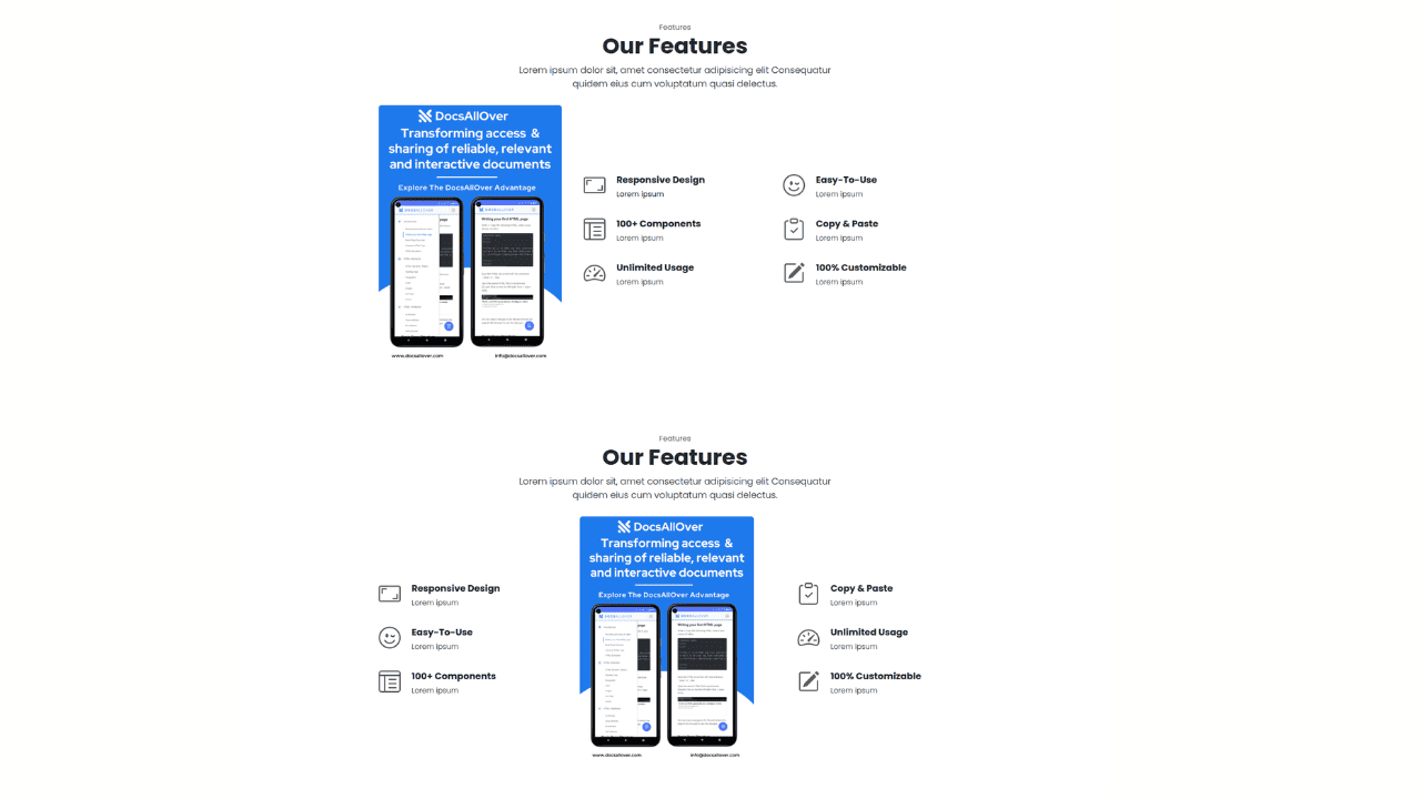
Responsive Bootstrap 5 Detailed Features Section

Responsive CSS-Only Glassmorphism Login Form with background image

Responsive Tailwind CSS Hero Section and Adaptive Navbar
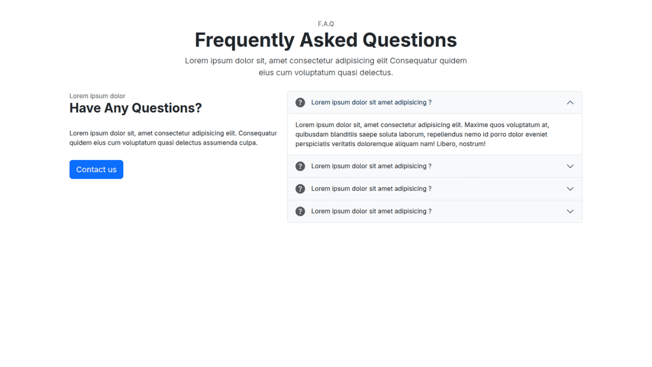
Responsive Bootstrap 5 Compact FAQ Accordion Display

Responsive CSS Only Services Section with Hover Effects

Responsive Tailwind CSS Team Members Display Showcase

Responsive Bootstrap 5 Clear Process Flow Component
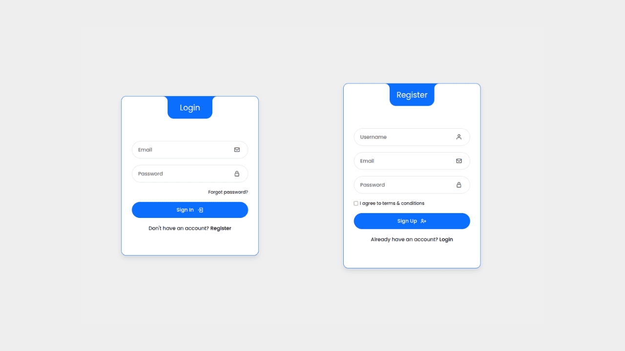
Responsive Interactive Login & Register Form with CSS & JS Transitions
Building Blocks for Your Web Pages
Explore a collection of pre-written HTML,CSS and Javascript
snippets to jumpstart your web development projects.
