<!doctype html>
<html>

<head>
    <meta charset="utf-8">
    <meta name="viewport" content="width=device-width, initial-scale=1">
    <title>Responsive CSS Only Smooth Sliding Tab Transitions</title>
</head>

<body>
    <div class="container">
        <div class="tabs">
            <input type="radio" id="radio-1" name="tabs" checked />
            <label class="tab" for="radio-1">Home<span class="notification">2</span></label>
            <input type="radio" id="radio-2" name="tabs" />
            <label class="tab" for="radio-2">About Us</label>
            <input type="radio" id="radio-3" name="tabs" />
            <label class="tab" for="radio-3">Contact Us</label>
            <span class="glider"></span>
        </div>
    </div>
    <script type="text/javascript" src="https://cdn.jsdelivr.net/npm/popper.js@1.16.0/dist/umd/popper.min.js"></script>
</body>

</html>
@import url("https://fonts.googleapis.com/css2?family=Inter:wght@400;500;600&display=swap");

:root {
    --primary-color: #185ee0;
    --secondary-color: #e6eef9;
}

*,
*:after,
*:before {
    box-sizing: border-box;
}

body {
    font-family: "Inter", sans-serif;
    background-color: rgba(230, 238, 249, 0.5);
}

.container {
    position: absolute;
    left: 0;
    top: 0;
    right: 0;
    bottom: 0;
    display: flex;
    align-items: center;
    justify-content: center;
}

.tabs {
    display: flex;
    position: relative;
    background-color: #fff;
    box-shadow: 0 0 1px 0 rgba(24, 94, 224, 0.15), 0 6px 12px 0 rgba(24, 94, 224, 0.15);
    padding: 0.75rem;
    border-radius: 99px;
}

.tabs * {
    z-index: 2;
}

input[type=radio] {
    display: none;
}

.tab {
    display: flex;
    align-items: center;
    justify-content: center;
    height: 54px;
    width: 200px;
    font-size: 1.25rem;
    font-weight: 500;
    border-radius: 99px;
    cursor: pointer;
    transition: color 0.15s ease-in;
}

.notification {
    display: flex;
    align-items: center;
    justify-content: center;
    width: 2rem;
    height: 2rem;
    margin-left: 0.75rem;
    border-radius: 50%;
    background-color: var(--secondary-color);
    transition: 0.15s ease-in;
}

input[type=radio]:checked+label {
    color: var(--primary-color);
}

input[type=radio]:checked+label>.notification {
    background-color: var(--primary-color);
    color: #fff;
}

input[id=radio-1]:checked~.glider {
    transform: translateX(0);
}

input[id=radio-2]:checked~.glider {
    transform: translateX(100%);
}

input[id=radio-3]:checked~.glider {
    transform: translateX(200%);
}

.glider {
    position: absolute;
    display: flex;
    height: 54px;
    width: 200px;
    background-color: var(--secondary-color);
    z-index: 1;
    border-radius: 99px;
    transition: 0.25s ease-out;
}

@media (max-width: 700px) {
    .tabs {
        transform: scale(0.6);
    }
}
//Doesn't require any JS.
This CSS snippet showcases a clean, responsive, and interactive set of tabbed content sections with smooth sliding transitions, all achieved using CSS only. It provides an elegant way to organize and display content, enhancing the user experience without relying on JavaScript for core animation.
Key Features:
- Responsive Design: The tabs and their content adapt seamlessly to different screen sizes, ensuring optimal viewing and interaction on desktops, tablets, and mobile devices.
- Smooth Sliding Transitions: Utilizes pure CSS transitions to create a fluid and visually appealing animation when switching between tabs.
- CSS-Only Implementation: Achieves all animations and tab switching functionality purely with CSS, reducing dependencies and improving performance.
- Customizable Styling: Easily modify the appearance of the tabs, content areas, and transition effects using standard CSS properties to match your website's design.
Implementation:
- Create the HTML Structure: Set up the basic HTML structure for the tabs, including input elements (like radio buttons or checkboxes) for controlling tab state, labels for the tab headers, and corresponding content areas.
- Apply CSS Styles: Use CSS to style the tab headers, content panes, and the underlying mechanism that controls the sliding effect. Crucially, apply transition properties to the relevant elements that will move or change when a tab is selected.
- Implement CSS Selectors: Use CSS selectors (e.g., :checked + label or sibling selectors) to define the styles and positions of the tabs and content panes when a specific tab is active, triggering the transitions.
By following these steps, you can create a fully responsive and visually engaging tabbed content interface with smooth sliding animations, enhancing content organization and user interaction on your website using only CSS.

Join Our Community Call-to-Action Banner Section With Tailwind CSS

Bootstrap 5 Responsive Service Pricing Table Block

Owl Carousel Responsive CSS-Only Team Section Showcase

Tailwind CSS Subscribe Container with Integrated Footer
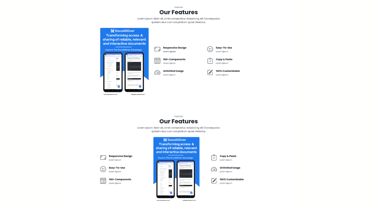
Responsive Bootstrap 5 Detailed Features Section

Responsive CSS-Only Glassmorphism Login Form with background image
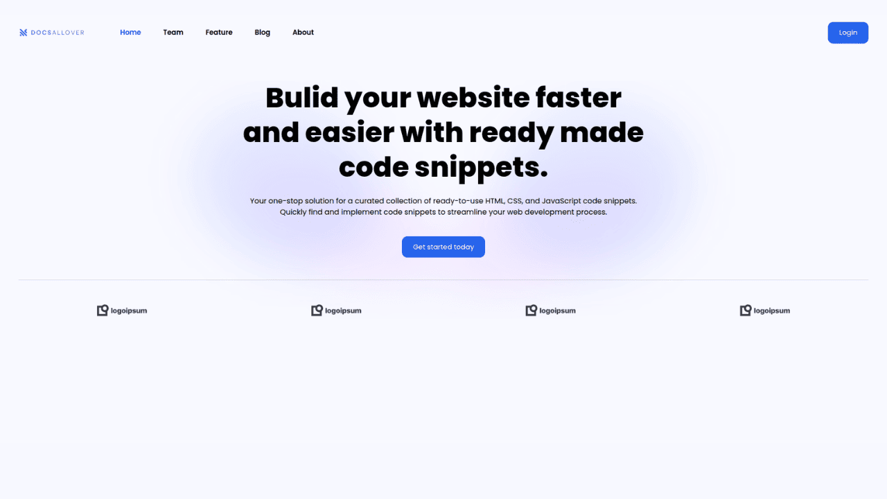
Responsive Tailwind CSS Hero Section and Adaptive Navbar
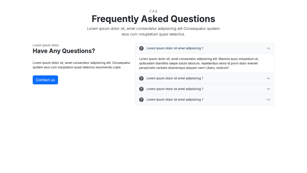
Responsive Bootstrap 5 Compact FAQ Accordion Display

Responsive CSS Only Services Section with Hover Effects
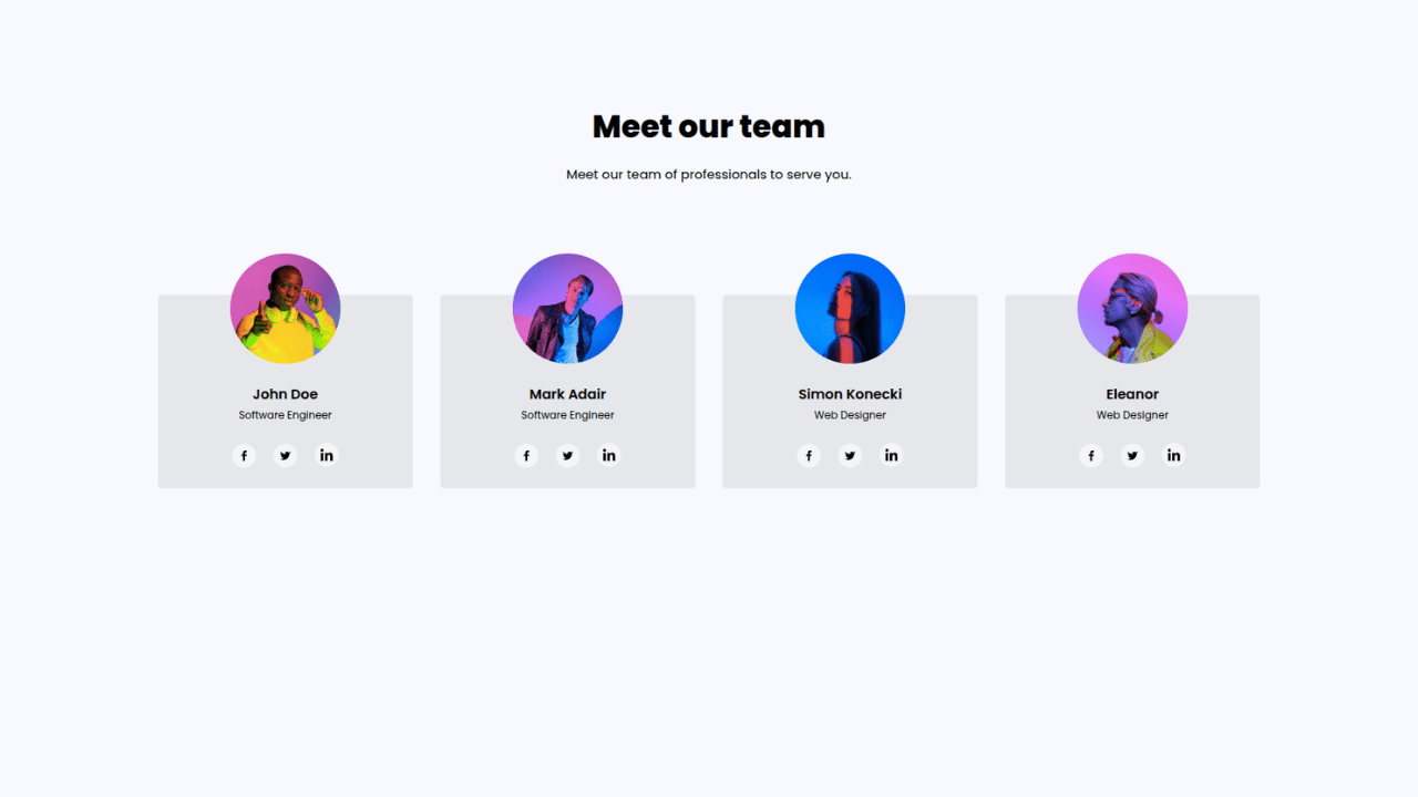
Responsive Tailwind CSS Team Members Display Showcase
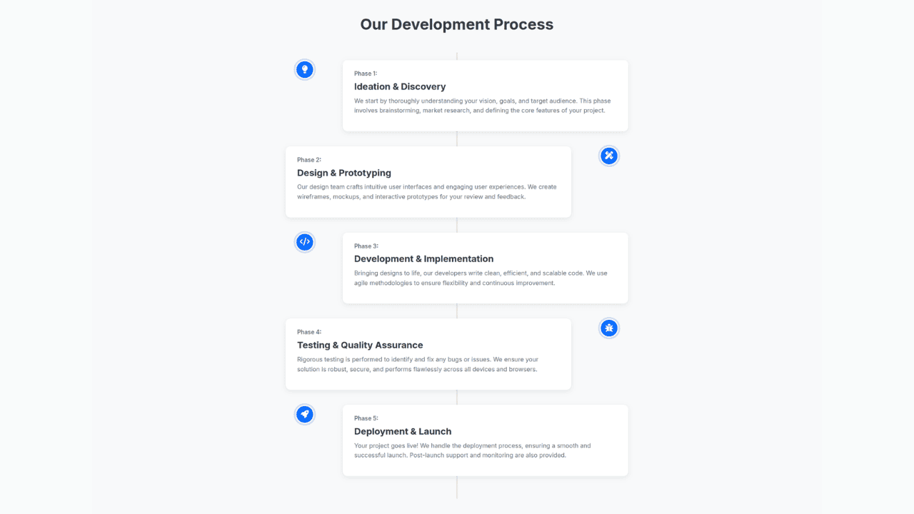
Responsive Bootstrap 5 Clear Process Flow Component
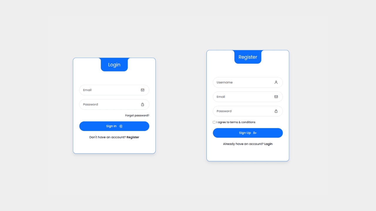
Responsive Interactive Login & Register Form with CSS & JS Transitions
Building Blocks for Your Web Pages
Explore a collection of pre-written HTML,CSS and Javascript
snippets to jumpstart your web development projects.
