Responsive CSS3 Timeline Design With Hover Effects
<!doctype html>
<html>

<head>
    <meta charset='utf-8'>
    <meta name='viewport' content='width=device-width, initial-scale=1'>
    <title>CSS Timeline</title>
</head>

<body>
    <div class="timeline">
        <ul>
            <li>
                <span>3rd January 2022</span>
                <div class="content">
                    <h3>What Is Lorem Ipsum?</h3>
                    <p>
                        Lorem Ipsum is simply dummy text of the printing and typesetting industry. Lorem Ipsum has been
                        the industry's standard dummy text ever since the 1500s.
                    </p>
                </div>
            </li>
            <li>
                <span>21st Jun 2019</span>
                <div class="content">
                    <h3>What Is Lorem Ipsum?</h3>
                    <p>
                        Lorem Ipsum is simply dummy text of the printing and typesetting industry.
                    </p>
                </div>
            </li>
            <li>
                <span>15th April 2018</span>
                <div class="content">
                    <h3>What Is Lorem Ipsum?</h3>
                    <p>
                        Lorem Ipsum is simply dummy text of the printing and typesetting industry.
                    </p>
                </div>
            </li>
            <li>
                <span>22nd Mars 2017</span>
                <div class="content">
                    <h3>What Is Lorem Ipsum?</h3>
                    <p>
                        Lorem Ipsum is simply dummy text of the printing and typesetting industry. Lorem Ipsum has been
                        the industry's standard.
                    </p>
                </div>
            </li>
        </ul>
    </div>
    <script type='text/javascript' src='https://cdn.jsdelivr.net/npm/popper.js@1.16.0/dist/umd/popper.min.js'></script>
</body>

</html>
@import url('https://fonts.googleapis.com/css2?family=Poppins&display=swap');

*,
html,
body {
    padding: 0px;
    margin: 0px;
    box-sizing: border-box;
    font-family: 'Poppins', sans-serif;
    perspective: 800px;
}

body {
    background-color: #227093;
    width: 100%;
    min-height: 100vh;
    display: flex;
    justify-content: center;
    align-items: center;
}

.timeline {
    width: 800px;
    background-color: #072736;
    color: #fff;
    padding: 30px 20px;
    box-shadow: 0px 0px 10px rgba(0, 0, 0, .5);
}

.timeline ul {
    list-style-type: none;
    border-left: 2px solid #094a68;
    padding: 10px 5px;
}

.timeline ul li {
    padding: 20px 20px;
    position: relative;
    cursor: pointer;
    transition: .5s;
}

.timeline ul li span {
    display: inline-block;
    background-color: #1685b8;
    border-radius: 25px;
    padding: 2px 5px;
    font-size: 15px;
    text-align: center;
}

.timeline ul li .content h3 {
    color: #34ace0;
    font-size: 17px;
    padding-top: 5px;
}

.timeline ul li .content p {
    padding: 5px 0px 15px 0px;
    font-size: 15px;
}

.timeline ul li:before {
    position: absolute;
    content: '';
    width: 10px;
    height: 10px;
    background-color: #34ace0;
    border-radius: 50%;
    left: -11px;
    top: 28px;
    transition: .5s;
}

.timeline ul li:hover {
    background-color: #071f2a;
}

.timeline ul li:hover:before {
    background-color: #0F0;
    box-shadow: 0px 0px 10px 2px #0F0;
}

@media (max-width:300px) {
    .timeline {
        width: 100%;
        padding: 30px 5px 30px 10px;
    }

    .timeline ul li .content h3 {
        color: #34ace0;
        font-size: 15px;
    }

}
//Doesn't require any JS.
This CSS3 snippet showcases a visually appealing and interactive timeline design, perfect for displaying a sequence of events or milestones. The timeline is fully responsive, ensuring a consistent user experience across different screen sizes.
Key Features:
- Responsive Design: The timeline adapts seamlessly to various screen sizes, providing a consistent user experience on desktops, tablets, and mobile devices.
- Customizable Styling: Easily modify the appearance of the timeline using CSS to match your website's design and branding.
- Clear Timeline Structure: The timeline clearly displays a sequence of events, including dates and descriptions.
- Hover Effects: Engaging hover effects highlight specific events when the user's cursor hovers over them, enhancing the user experience.
- Vertical and Horizontal Layouts: The timeline can be configured to display in either a vertical or horizontal layout, depending on your specific needs.
Implementation:
- Create the HTML Structure: Set up the basic HTML structure for the timeline, including the container, timeline items, and their content.
- Apply CSS Styles: Use CSS to style the timeline elements, such as the container, timeline items, markers, labels, and content. Customize the colors, fonts, and spacing to match your website's design. Implement CSS for the hover effects, which can involve changing colors, adding shadows, or animating elements.
By following these steps, you can create a visually appealing and informative timeline that enhances the user experience on your website.

Join Our Community Call-to-Action Banner Section With Tailwind CSS
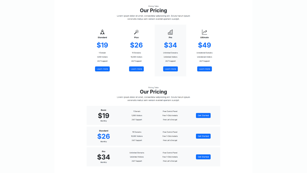
Bootstrap 5 Responsive Service Pricing Table Block

Owl Carousel Responsive CSS-Only Team Section Showcase

Tailwind CSS Subscribe Container with Integrated Footer
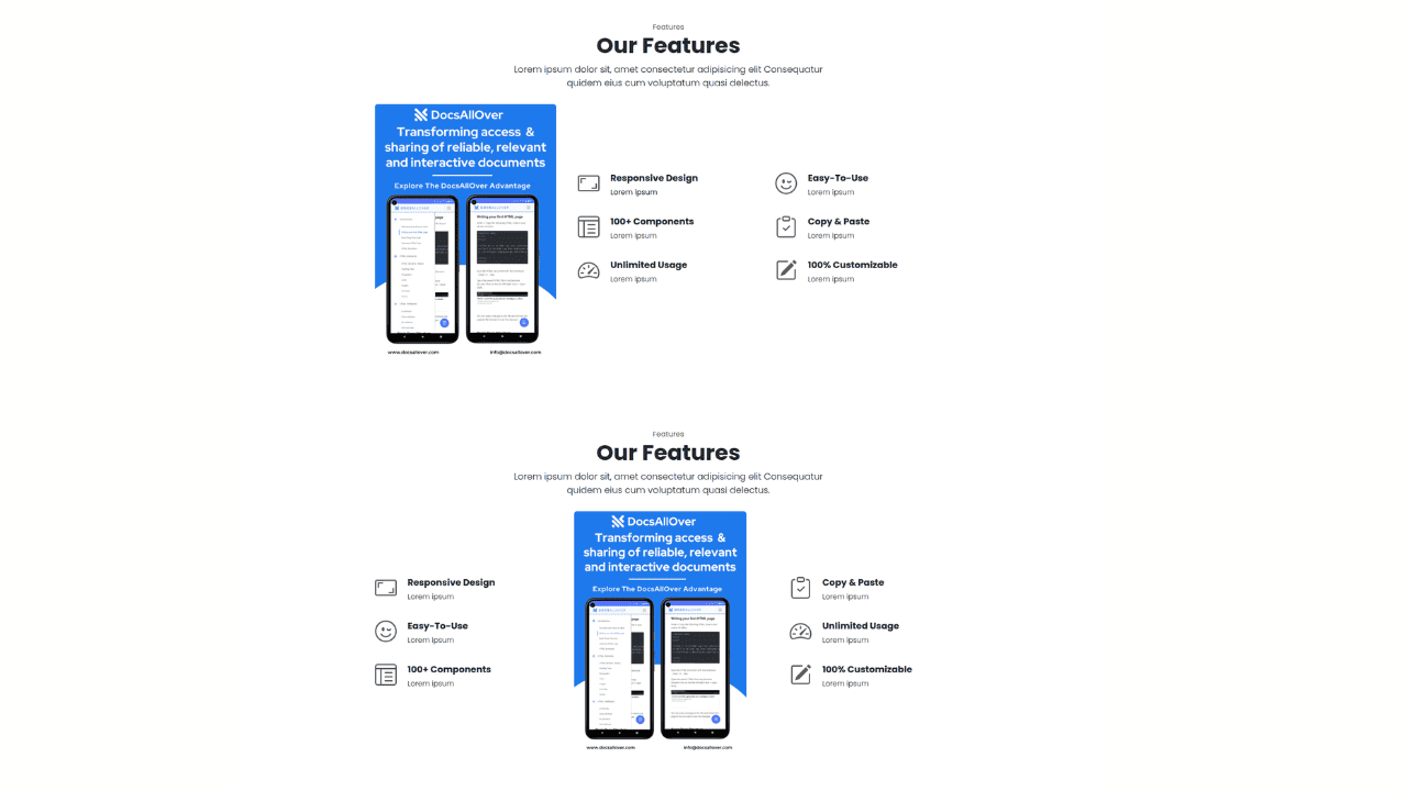
Responsive Bootstrap 5 Detailed Features Section

Responsive CSS-Only Glassmorphism Login Form with background image
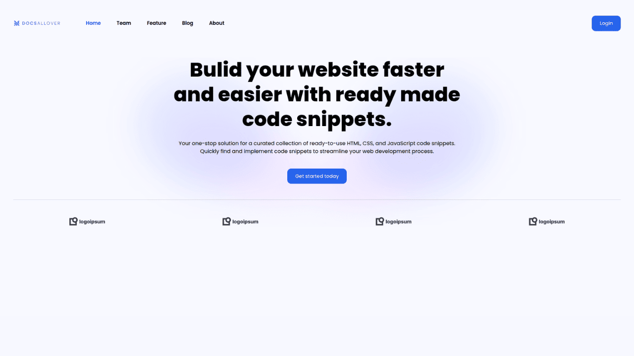
Responsive Tailwind CSS Hero Section and Adaptive Navbar
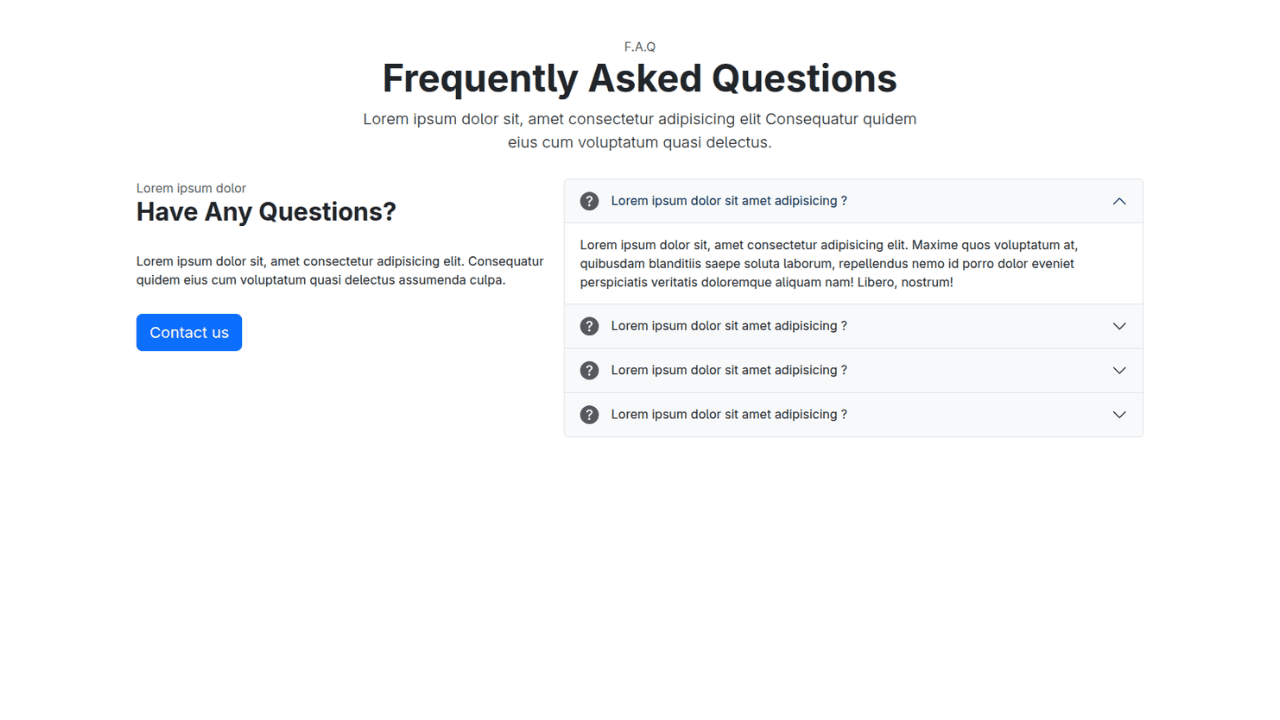
Responsive Bootstrap 5 Compact FAQ Accordion Display
Responsive CSS Only Services Section with Hover Effects
Responsive Tailwind CSS Team Members Display Showcase
Responsive Bootstrap 5 Clear Process Flow Component
Responsive Interactive Login & Register Form with CSS & JS Transitions
Building Blocks for Your Web Pages
Explore a collection of pre-written HTML,CSS and Javascript
snippets to jumpstart your web development projects.
