Stylish CSS Toast Notification With Animated Progress Bar
<!doctype html>
<html>
<head>
<meta charset="utf-8">
<meta name="viewport" content="width=device-width, initial-scale=1">
<title>Stylish CSS Toast Notification With Animated Progress Bar</title>
<link rel="stylesheet" href="https://cdnjs.cloudflare.com/ajax/libs/font-awesome/6.0.0/css/all.min.css">
<link rel="stylesheet"
href="https://fonts.googleapis.com/css2?family=Poppins:wght@300;400;500;600;700&display=swap">
</head>
<body>
<div class="toast active">
<div class="toast-content">
<i class="fas fa-solid fa-check check"></i>
<div class="message">
<span class="text text-1">Success</span>
<span class="text text-2">Your changes has been saved</span>
</div>
</div>
<i class="fa-solid fa-xmark close"></i>
<div class="progress active"></div>
</div>
<button>Show Toast</button>
<script type="text/javascript" src="https://cdn.jsdelivr.net/npm/popper.js@1.16.0/dist/umd/popper.min.js"></script>
</body>
</html>
* {
    margin: 0;
    padding: 0;
    box-sizing: border-box;
    font-family: "Poppins", sans-serif;
}

body {
    height: 100vh;
    display: flex;
    align-items: center;
    justify-content: center;
    background-color: #f4f7ff;
    overflow: hidden;
}

.toast {
    position: absolute;
    top: 25px;
    right: 30px;
    border-radius: 12px;
    background: #fff;
    padding: 20px 35px 20px 25px;
    box-shadow: 0 6px 20px -5px rgba(0, 0, 0, 0.1);
    overflow: hidden;
    transform: translateX(calc(100% + 30px));
    transition: all 0.5s cubic-bezier(0.68, -0.55, 0.265, 1.35);
}

.toast.active {
    transform: translateX(0%);
}

.toast .toast-content {
    display: flex;
    align-items: center;
}

.toast-content .check {
    display: flex;
    align-items: center;
    justify-content: center;
    height: 35px;
    min-width: 35px;
    background-color: #2770ff;
    color: #fff;
    font-size: 20px;
    border-radius: 50%;
}

.toast-content .message {
    display: flex;
    flex-direction: column;
    margin: 0 20px;
}

.message .text {
    font-size: 16px;
    font-weight: 400;
    color: #666666;
}

.message .text.text-1 {
    font-weight: 600;
    color: #333;
}

.toast .close {
    position: absolute;
    top: 10px;
    right: 15px;
    padding: 5px;
    cursor: pointer;
    opacity: 0.7;
}

.toast .close:hover {
    opacity: 1;
}

.toast .progress {
    position: absolute;
    bottom: 0;
    left: 0;
    height: 3px;
    width: 100%;

}

.toast .progress:before {
    content: "";
    position: absolute;
    bottom: 0;
    right: 0;
    height: 100%;
    width: 100%;
    background-color: #2770ff;
}

.progress.active:before {
    animation: progress 5s linear forwards;
}

@keyframes progress {
    100% {
        right: 100%;
    }
}

button {
    padding: 12px 20px;
    font-size: 20px;
    outline: none;
    border: none;
    background-color: #2770ff;
    color: #fff;
    border-radius: 6px;
    cursor: pointer;
    transition: 0.3s;
}

button:hover {
    background-color: #2770ff;
}

.toast.active~button {
    pointer-events: none;
}
const button = document.querySelector("button"),
    toast = document.querySelector(".toast");
closeIcon = document.querySelector(".close"),
    progress = document.querySelector(".progress");

let timer1, timer2;

button.addEventListener("click", () => {
    toast.classList.add("active");
    progress.classList.add("active");

    timer1 = setTimeout(() => {
        toast.classList.remove("active");
    }, 5000);

    timer2 = setTimeout(() => {
        progress.classList.remove("active");
    }, 5300);
});

closeIcon.addEventListener("click", () => {
    toast.classList.remove("active");

    setTimeout(() => {
        progress.classList.remove("active");
    }, 300);

    clearTimeout(timer1);
    clearTimeout(timer2);
});
This snippet creates a stylish and highly informative toast notification, designed purely with CSS to provide clear messages along with a visual progress bar. The animated progress bar offers intuitive feedback on the notification's duration, ensuring a user-friendly and visually appealing experience.
Key Features:
- Customizable Styling: Easily modify the appearance of the toast notification and progress bar using pure CSS to align with your website's design and branding.
- Animated Progress Bar: Features a smooth, animated progress bar that visually indicates the remaining display time of the notification.
- Clear Messaging: Allows for the concise and clear display of short messages, alerts, or confirmations.
- Pure CSS Implementation: Achieves animation and styling without the need for JavaScript for core functionality (though JS can be used for triggering).
Implementation:
- Create the HTML Structure: Set up the basic HTML structure for the toast notification, including a container for the message and a separate element for the progress bar.
- Apply CSS Styling: Use CSS to style the various elements of the toast notification (background, text, padding, border-radius) and the progress bar (width, color, animation properties).
- Implement CSS Animations: Define CSS @keyframes for the progress bar's animation to create a smooth visual countdown. You might also add animations for the toast's entry and exit.
By following these steps, you can create a fully customizable and visually engaging toast notification with an animated progress bar that effectively communicates information and enhances the user experience on your website. visitors.
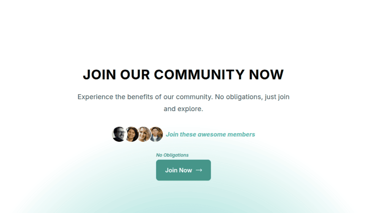
Join Our Community Call-to-Action Banner Section With Tailwind CSS
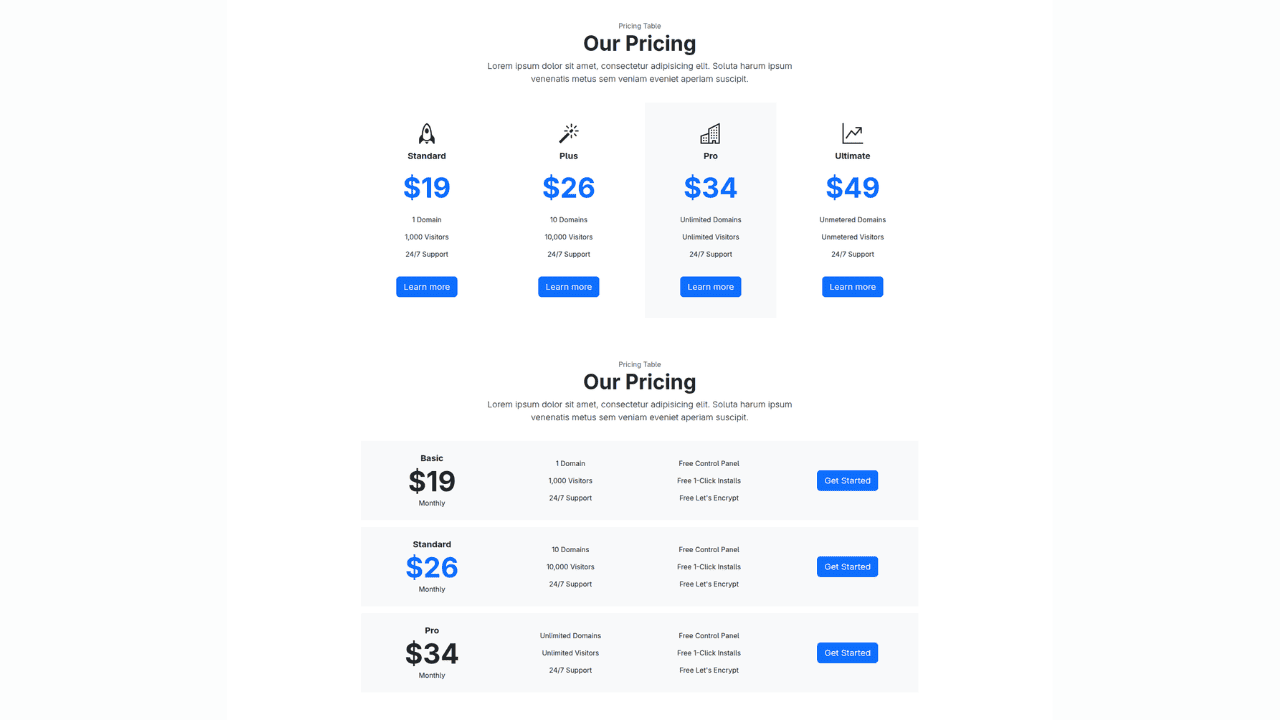
Bootstrap 5 Responsive Service Pricing Table Block

Owl Carousel Responsive CSS-Only Team Section Showcase
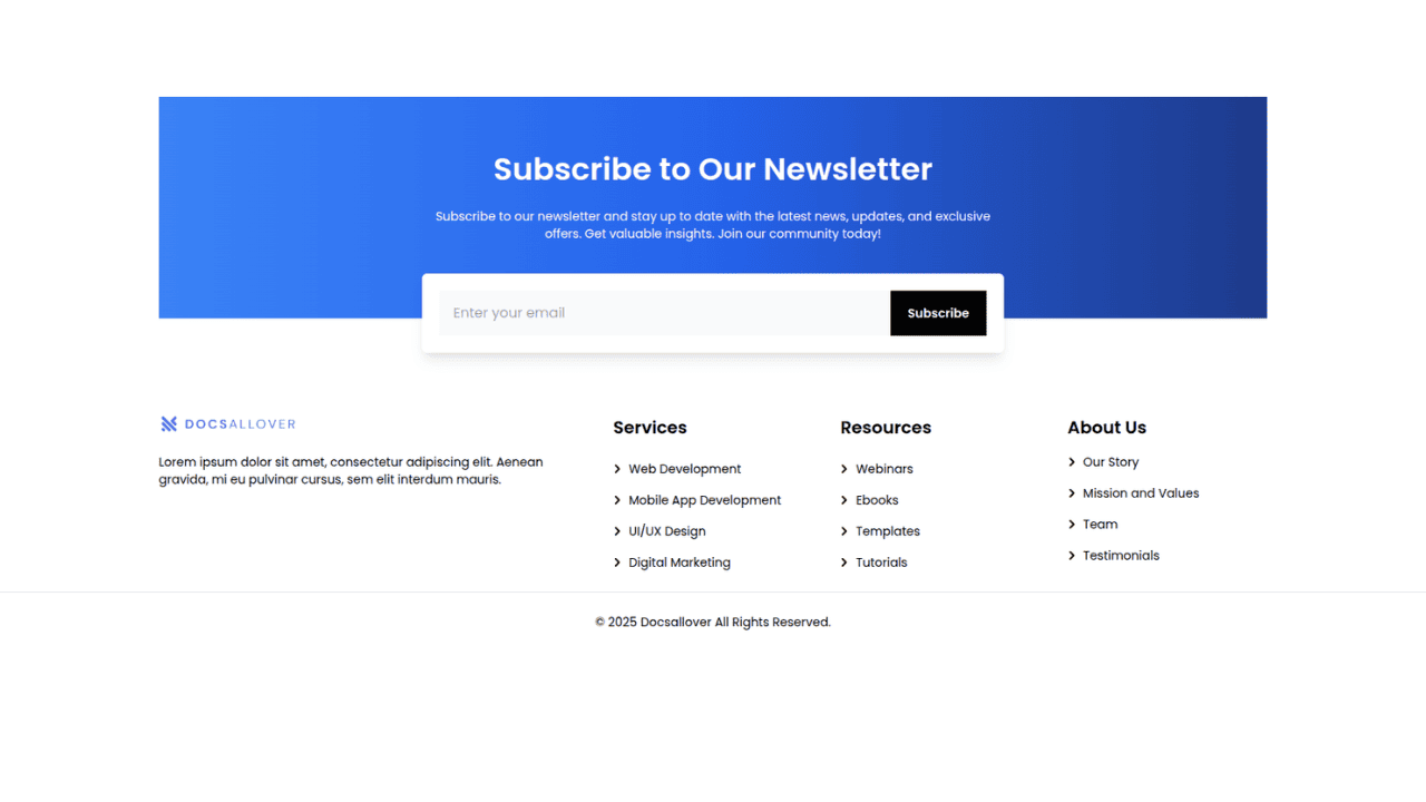
Tailwind CSS Subscribe Container with Integrated Footer
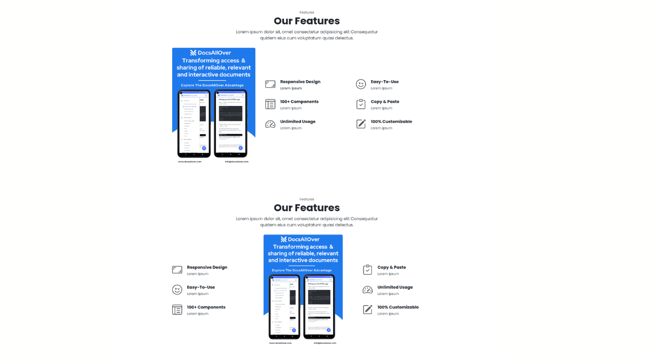
Responsive Bootstrap 5 Detailed Features Section
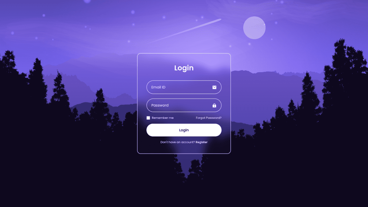
Responsive CSS-Only Glassmorphism Login Form with background image
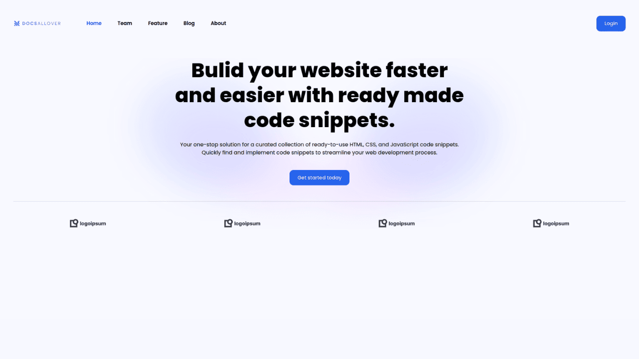
Responsive Tailwind CSS Hero Section and Adaptive Navbar
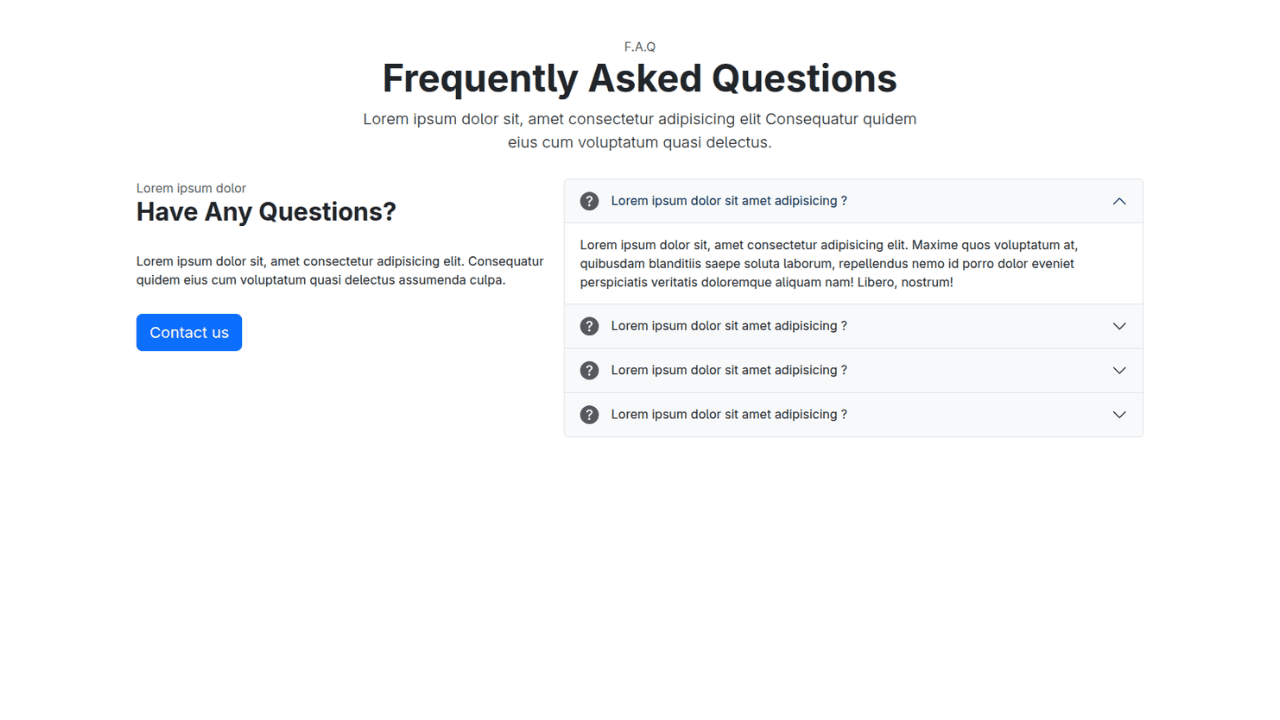
Responsive Bootstrap 5 Compact FAQ Accordion Display
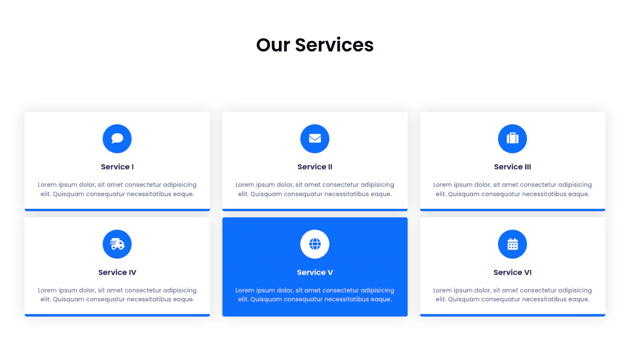
Responsive CSS Only Services Section with Hover Effects
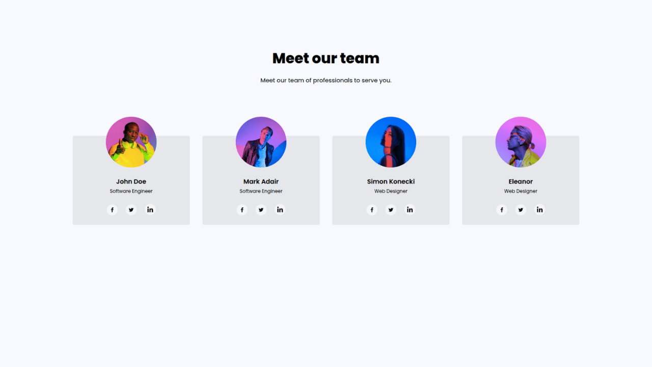
Responsive Tailwind CSS Team Members Display Showcase
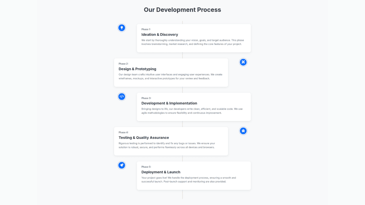
Responsive Bootstrap 5 Clear Process Flow Component
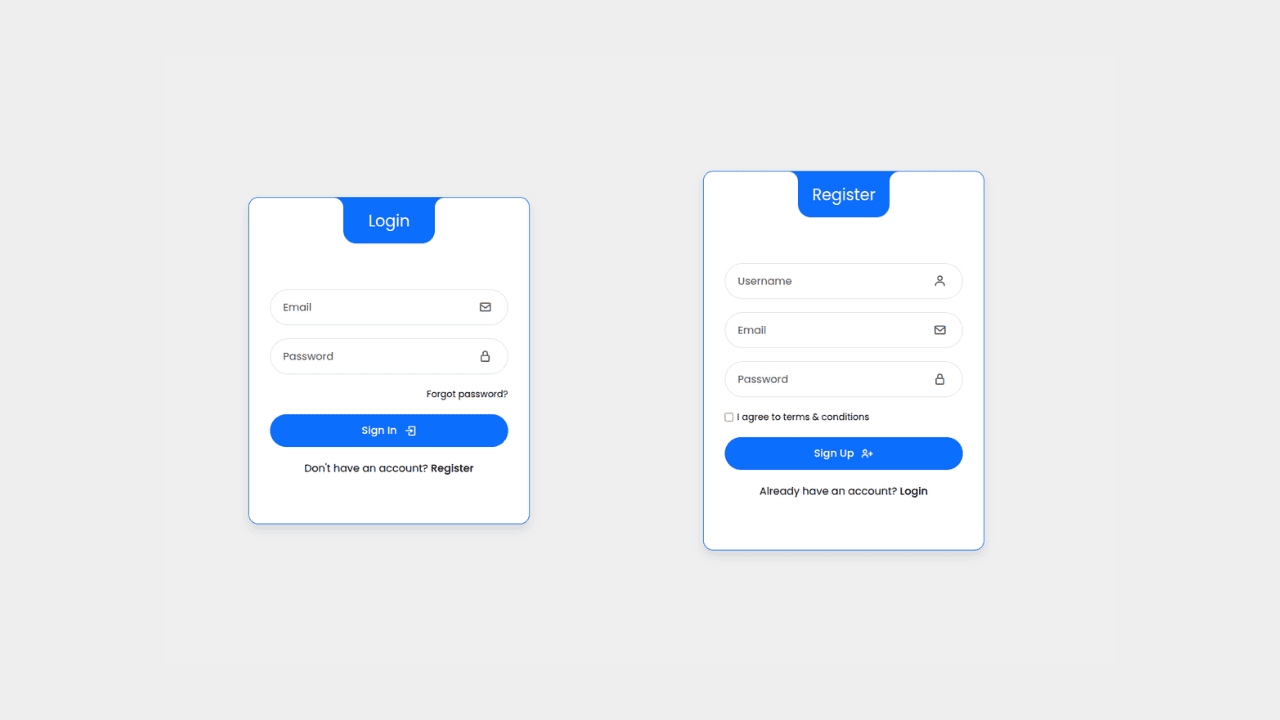
Responsive Interactive Login & Register Form with CSS & JS Transitions
Building Blocks for Your Web Pages
Explore a collection of pre-written HTML,CSS and Javascript
snippets to jumpstart your web development projects.
