Feature Section with Icons and Descriptions in Tailwind
<!doctype html>
<html>
<head>
  <meta charset="UTF-8">
  <meta name="viewport" content="width=device-width, initial-scale=1.0">
  <script src="https://cdn.tailwindcss.com"></script>
</head>
<body>
    <div class="bg-gray-200 px-2 py-10">

        <div id="features" class="mx-auto max-w-6xl">
          <p class="text-center text-base font-semibold leading-7 text-primary-500">Features</p>
          <h2 class="text-center font-display text-3xl font-bold tracking-tight text-slate-900 md:text-4xl">
            Writing has never been so easy
          </h2>
          <ul class="mt-16 grid grid-cols-1 gap-6 text-center text-slate-700 md:grid-cols-3">
            <li class="rounded-xl bg-white px-6 py-8 shadow-sm">

              <img src="https://www.svgrepo.com/show/530438/ddos-protection.svg" alt="" class="mx-auto h-10 w-10">
              <h3 class="my-3 font-display font-medium">Powered by ChatGPT</h3>
              <p class="mt-1.5 text-sm leading-6 text-secondary-500">
                the cutting-edge language model that makes interactions a breeze. With its user-friendly interface,
                effortlessly tap into the world of AI-generated text.
              </p>

            </li>
            <li class="rounded-xl bg-white px-6 py-8 shadow-sm">

              <img src="https://www.svgrepo.com/show/530442/port-detection.svg"
                      alt="" class="mx-auto h-10 w-10">
              <h3 class="my-3 font-display font-medium">Easy to use</h3>
              <p class="mt-1.5 text-sm leading-6 text-secondary-500">
                Simply input your subject, click the generate button, and the result will appear in seconds just like
                magick.
              </p>

            </li>
            <li class="rounded-xl bg-white px-6 py-8 shadow-sm">
              <img src="https://www.svgrepo.com/show/530444/availability.svg" alt="" class="mx-auto h-10 w-10">
              <h3 class="my-3 font-display font-medium">Custom settings</h3>
              <p class="mt-1.5 text-sm leading-6 text-secondary-500">
                We offer advanced customization. You can freely combine options like roles, languages, publish, tones,
                lengths,
                and formats.
              </p>

            </li>
            <li class="rounded-xl bg-white px-6 py-8 shadow-sm">
              <a href="/pricing" class="group">
                <img src="https://www.svgrepo.com/show/530440/machine-vision.svg" alt="" class="mx-auto h-10 w-10">
                <h3 class="my-3 font-display font-medium group-hover:text-primary-500">Free trial</h3>
                <p class="mt-1.5 text-sm leading-6 text-secondary-500">We offer a free trial service without login. We
                  provide
                  many payment options including pay-as-you-go and subscription.</p>
              </a>
            </li>
            <li class="rounded-xl bg-white px-6 py-8 shadow-sm">
              <a href="/templates" class="group">
                <img src="https://www.svgrepo.com/show/530450/page-analysis.svg" alt="" class="mx-auto h-10 w-10">
                <h3 class="my-3 font-display font-medium group-hover:text-primary-500">
                  90+ templates
                </h3>
                <p class="mt-1.5 text-sm leading-6 text-secondary-500">We offer many templates covering areas such as
                  writing,
                  education, lifestyle and creativity to inspire your potential. </p>
              </a>
            </li>
            <li class="rounded-xl bg-white px-6 py-8 shadow-sm">
              <a href="/download" class="group">
                <img src="https://www.svgrepo.com/show/530453/mail-reception.svg" alt="" class="mx-auto h-10 w-10">
                <h3 class="my-3 font-display font-medium group-hover:text-primary-500">Use Anywhere</h3>
                <p class="mt-1.5 text-sm leading-6 text-secondary-500">Our product is compatible with multiple platforms
                  including Web, Chrome, Windows and Mac, you can use MagickPen anywhere.</p>
              </a>
            </li>
          </ul>
        </div>

        <div>
</body>
</html>
/* Doesn't require any CSS. */
//Doesn't require any JS.
This Tailwind CSS snippet creates a visually appealing and informative features section with icons and descriptive text. It's a versatile component for showcasing the key benefits or advantages of your product or service.
Key Features:
- Responsive Design: The features section adapts seamlessly to different screen sizes, ensuring a consistent user experience across devices.
- Customizable Styling: Easily modify the appearance of the section using Tailwind CSS utility classes to match your website's design and branding.
- Icons: Incorporate relevant icons to visually represent each feature, enhancing clarity and engagement.
- Clear and Concise Descriptions: Provide clear and concise descriptions for each feature, highlighting its benefits and value proposition.
- Grid Layout: The features are organized in a grid layout for a visually appealing and structured presentation.
Implementation:
- Include Tailwind CSS: Ensure you have Tailwind CSS installed and configured in your project.
- Create the HTML Structure: Set up the basic HTML structure for the features section, including the container, feature cards, and icon elements.
- Apply Tailwind CSS Classes: Use Tailwind CSS utility classes to style the features section and its elements, such as features-section, feature-card, feature-icon, feature-title, feature-description, and any other relevant classes.
- Customize as Needed: Modify the Tailwind CSS classes and HTML structure to customize the appearance and content of the features section according to your specific requirements.
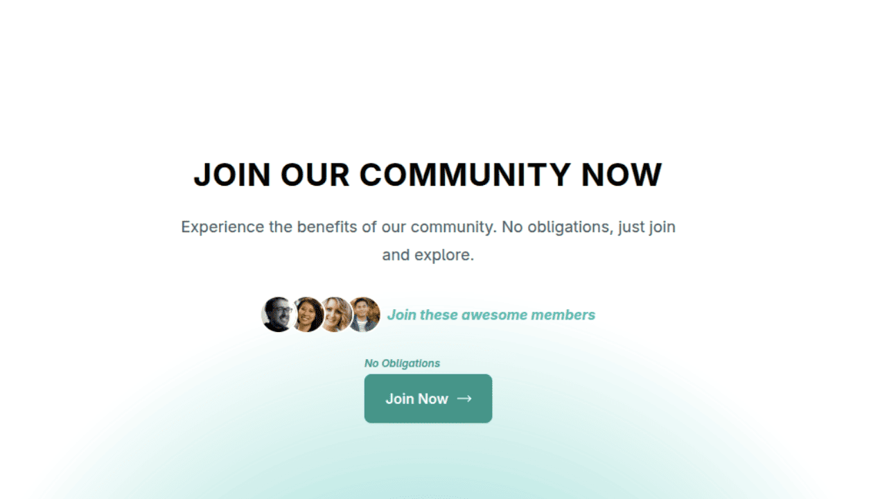
Join Our Community Call-to-Action Banner Section With Tailwind CSS
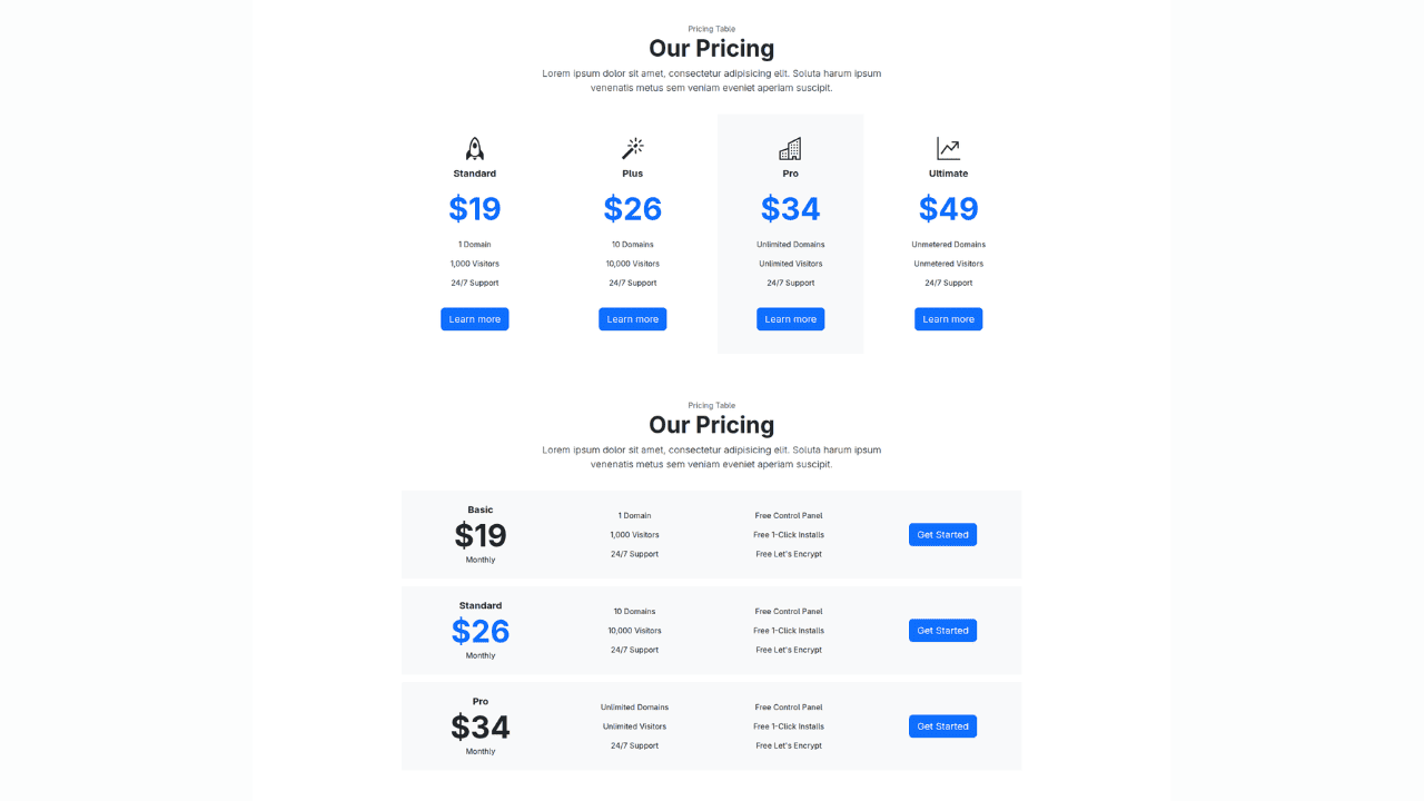
Bootstrap 5 Responsive Service Pricing Table Block
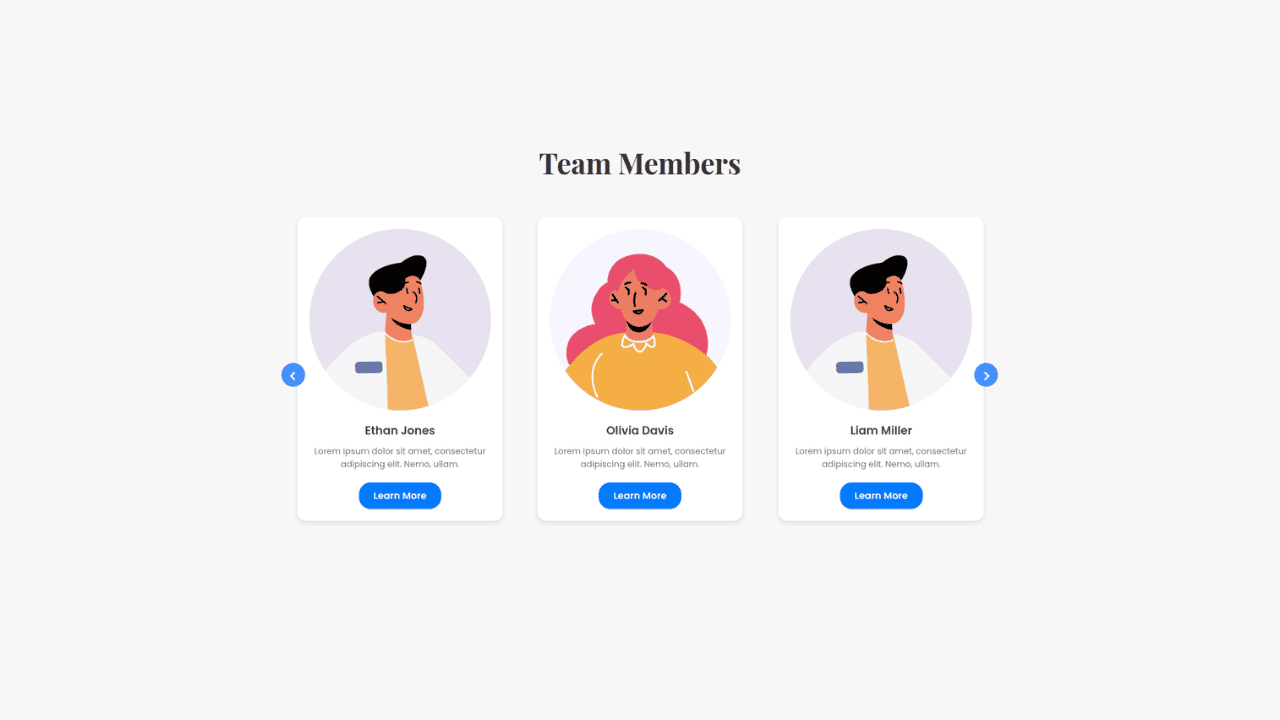
Owl Carousel Responsive CSS-Only Team Section Showcase
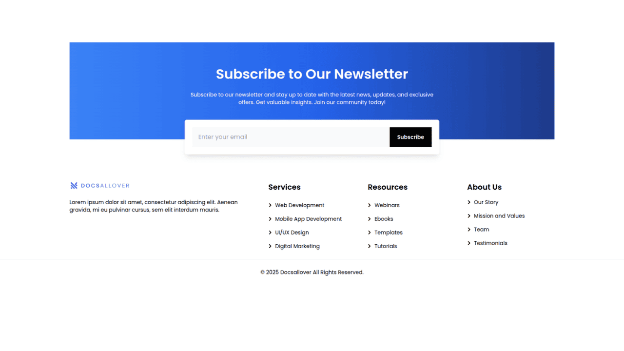
Tailwind CSS Subscribe Container with Integrated Footer
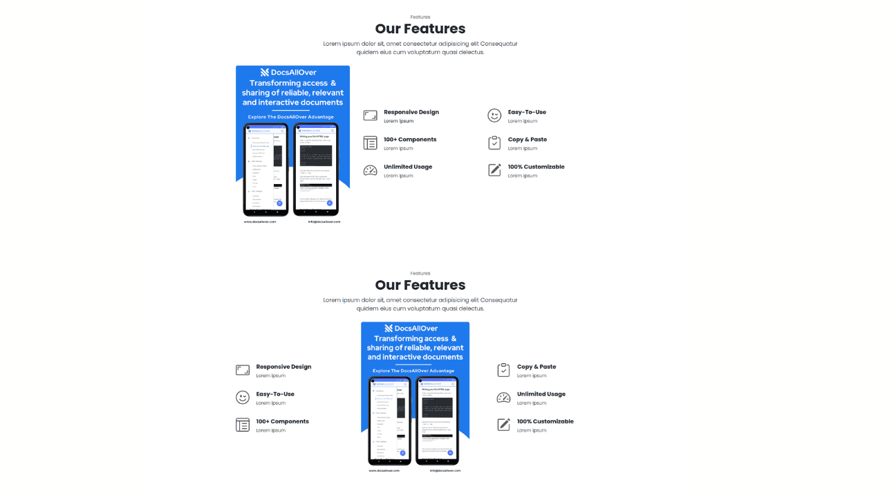
Responsive Bootstrap 5 Detailed Features Section
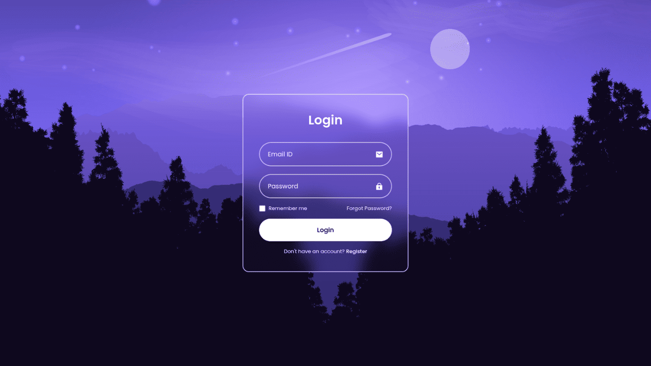
Responsive CSS-Only Glassmorphism Login Form with background image
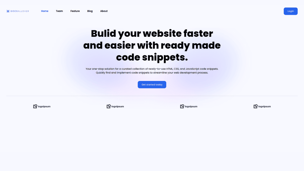
Responsive Tailwind CSS Hero Section and Adaptive Navbar
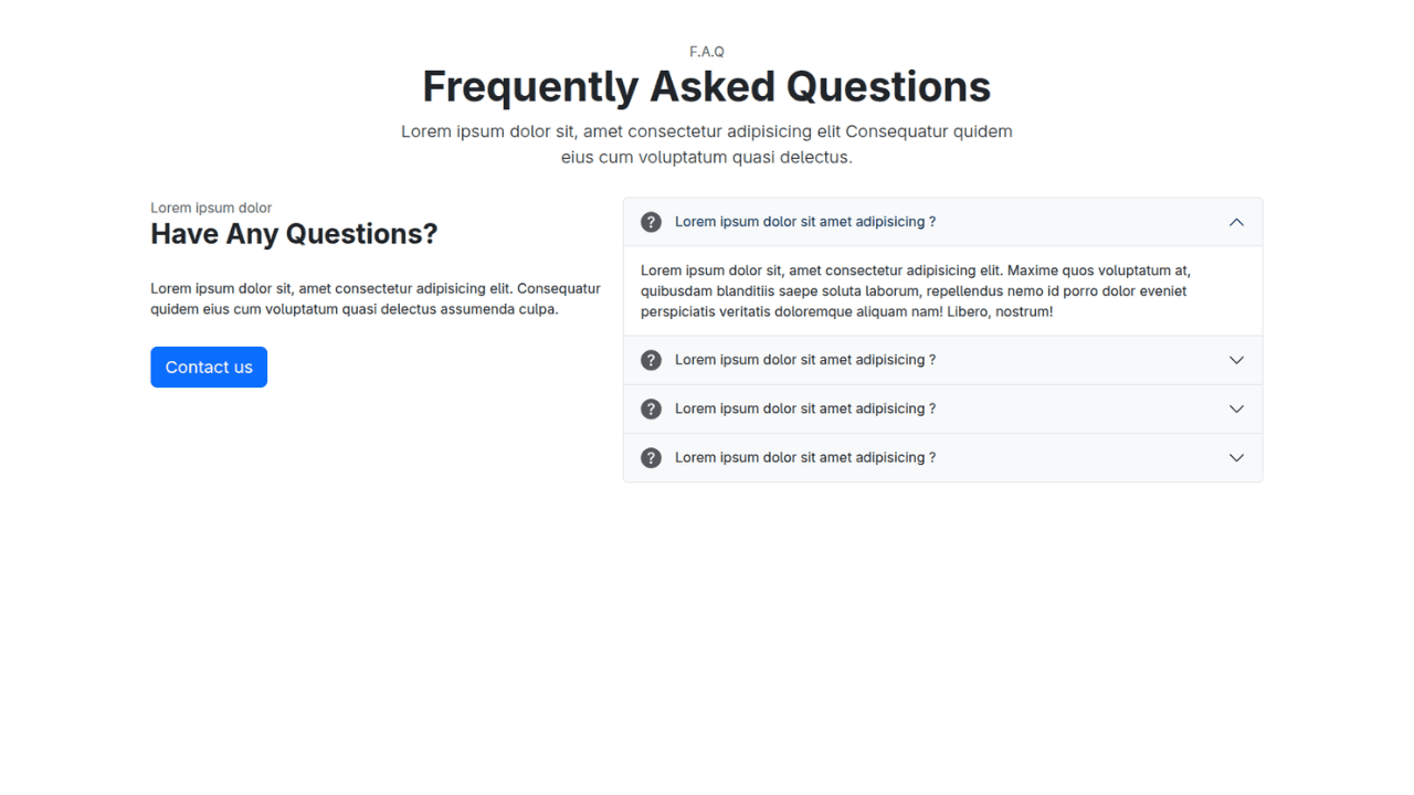
Responsive Bootstrap 5 Compact FAQ Accordion Display
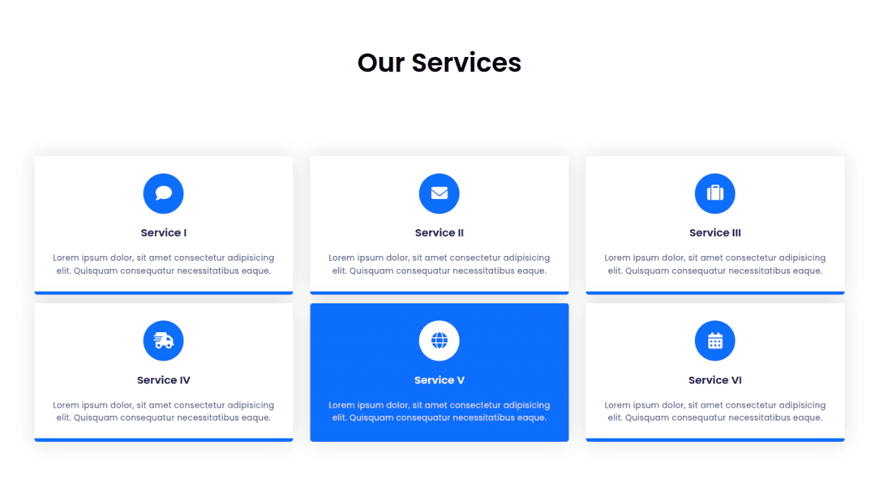
Responsive CSS Only Services Section with Hover Effects
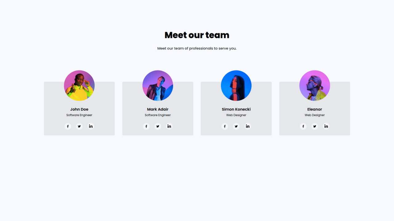
Responsive Tailwind CSS Team Members Display Showcase
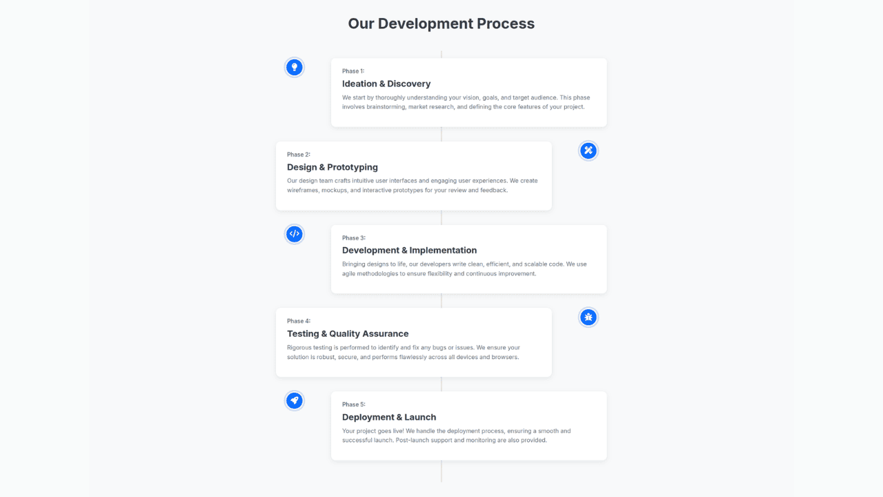
Responsive Bootstrap 5 Clear Process Flow Component
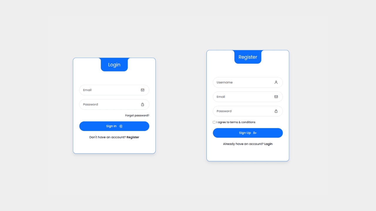
Responsive Interactive Login & Register Form with CSS & JS Transitions
Building Blocks for Your Web Pages
Explore a collection of pre-written HTML,CSS and Javascript
snippets to jumpstart your web development projects.
