Responsive Video Card Component for Tailwind CSS
<!doctype html>
<html>
<head>
  <meta charset="UTF-8">
  <meta name="viewport" content="width=device-width, initial-scale=1.0">
  <script src="https://cdn.tailwindcss.com"></script>
</head>
<body>
    <div class="flex justify-center mt-6">
        <div class="rounded-lg shadow-lg bg-white max-w-sm">
            <a href="#!">
                <video width="320" height="240" controls class="w-full rounded-t-lg">
                    <source src="https://commondatastorage.googleapis.com/gtv-videos-bucket/sample/ElephantsDream.mp4" type="video/mp4">
                    <source src="movie.ogg" type="video/ogg">
                    Your browser does not support the video tag.
                </video>
            </a>
            <div class="p-6">
                <h5 class="text-gray-900 text-xl font-medium mb-2">Video Card</h5>
                <p class="text-gray-700 text-base mb-4">
                    Some quick example text to build on the card title and make up the bulk of the card's
                    content.
                </p>
                <button type="button" class=" inline-block px-6 py-2.5 bg-blue-600 text-white font-medium text-xs leading-tight uppercase rounded shadow-md hover:bg-blue-700 hover:shadow-lg focus:bg-blue-700 focus:shadow-lg focus:outline-none focus:ring-0 active:bg-blue-800 active:shadow-lg transition duration-150 ease-in-out">Button</button>
            </div>
        </div>
    </div>
</body>
</html>
/* Doesn't require any CSS. */
//Doesn't require any JS.
This Tailwind CSS snippet provides a visually appealing and interactive video card component, designed to showcase video content in a modern and engaging way. The card features a responsive layout, clear video controls, and a customizable design.
Key Features:
- Responsive Design: The video card adapts seamlessly to different screen sizes, ensuring a consistent user experience across devices.
- Customizable Styling: Easily modify the appearance of the card using Tailwind CSS utility classes to match your website's design and branding.
- Video Player: The card includes a built-in video player with play/pause, volume control, and full-screen options.
- Visual Appeal: The card uses a clean and modern design, with clear typography and a visually appealing layout.
Implementation:
- Include Tailwind CSS: Ensure you have Tailwind CSS installed and configured in your project.
- Create the HTML Structure: Set up the basic HTML structure for the video card, including the container, video player, title, description, and button elements.
- Apply Tailwind CSS Classes: Use Tailwind CSS utility classes to style the card and its elements, such as card, card-image, card-title, card-body, card-text, card-button, and any other relevant classes.
- Customize as Needed: Modify the Tailwind CSS classes and HTML structure to customize the appearance and content of the video card according to your specific requirements.
By following these steps, you can easily integrate a visually appealing and functional video card component into your Tailwind CSS project.

Join Our Community Call-to-Action Banner Section With Tailwind CSS

Bootstrap 5 Responsive Service Pricing Table Block

Owl Carousel Responsive CSS-Only Team Section Showcase

Tailwind CSS Subscribe Container with Integrated Footer
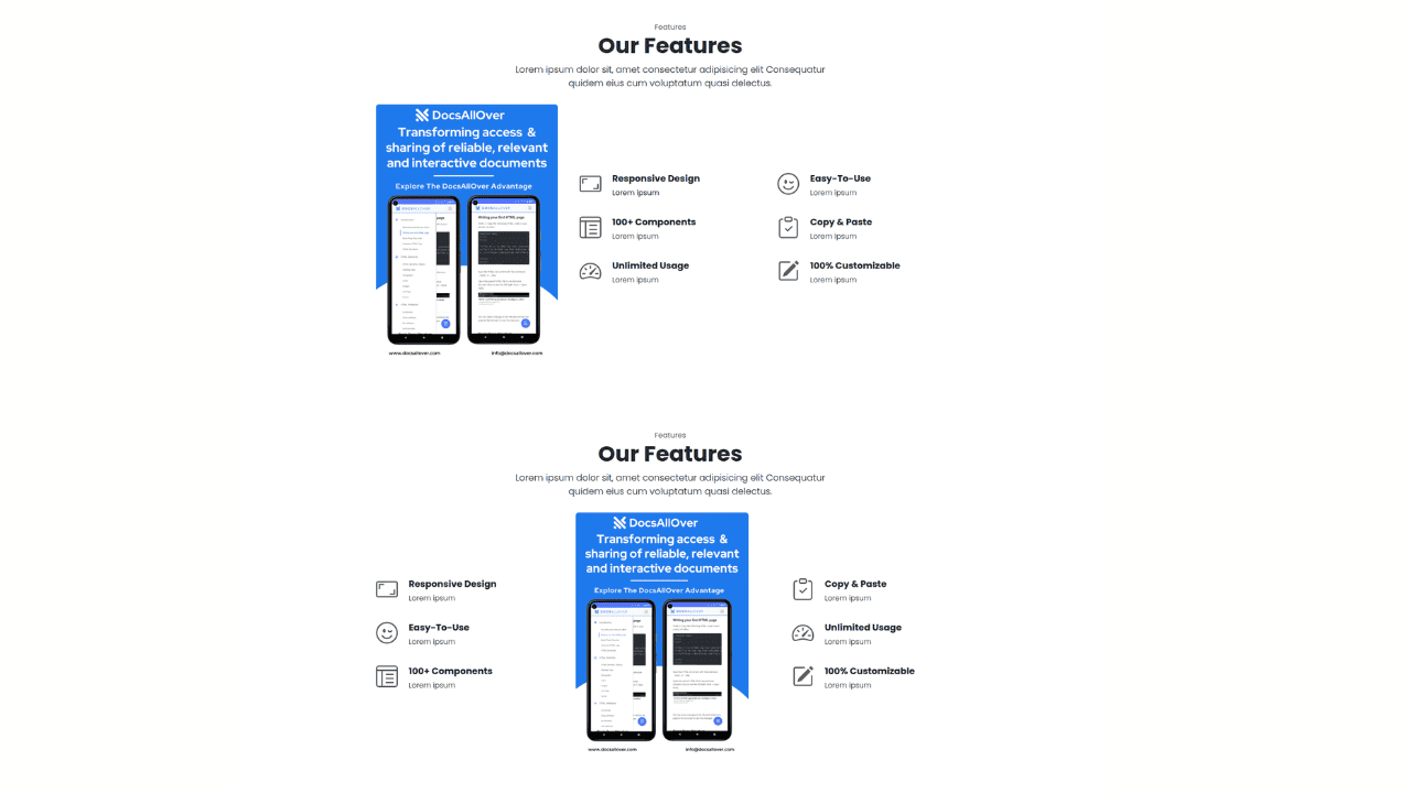
Responsive Bootstrap 5 Detailed Features Section
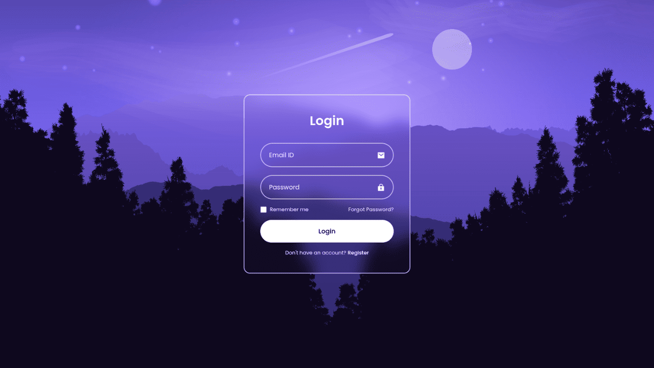
Responsive CSS-Only Glassmorphism Login Form with background image
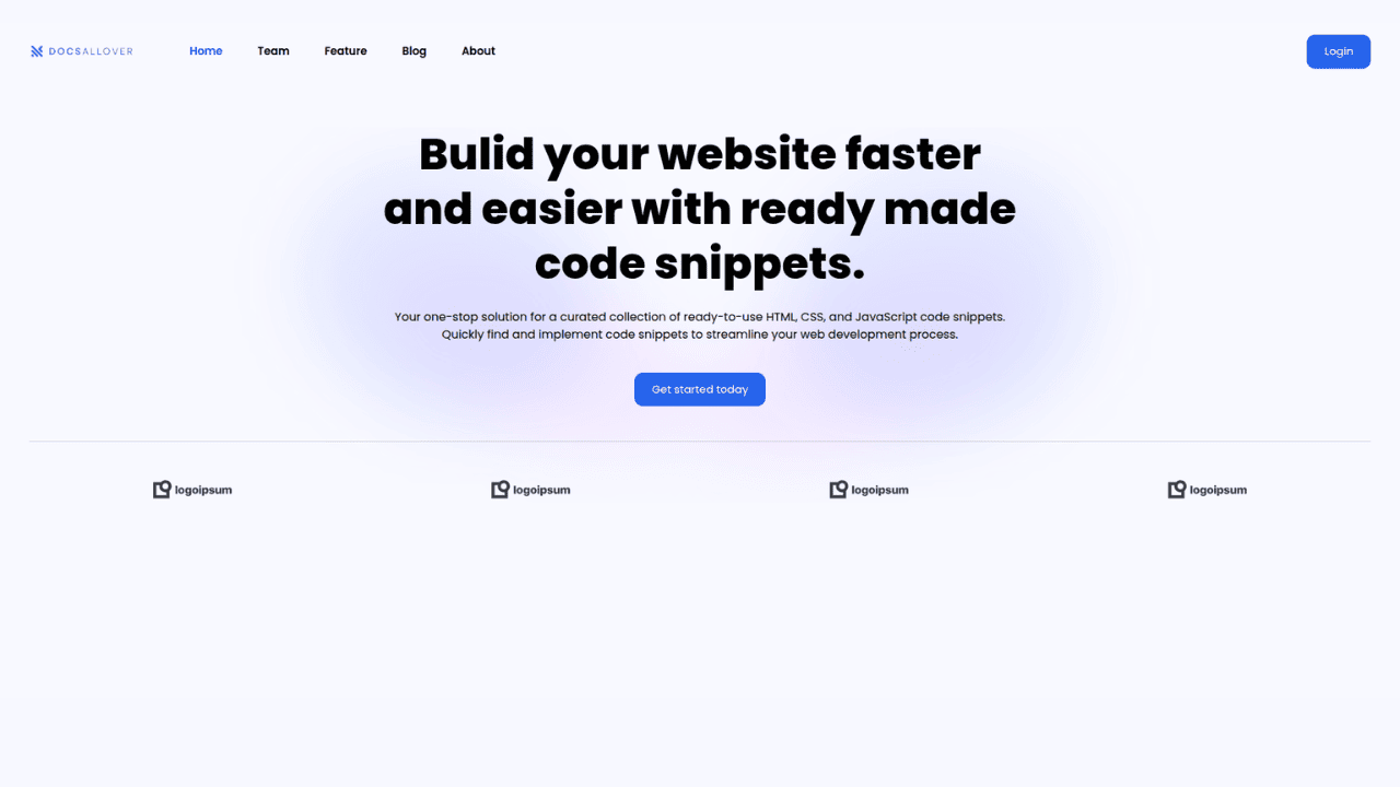
Responsive Tailwind CSS Hero Section and Adaptive Navbar
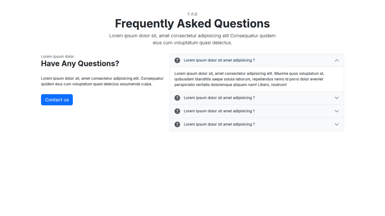
Responsive Bootstrap 5 Compact FAQ Accordion Display
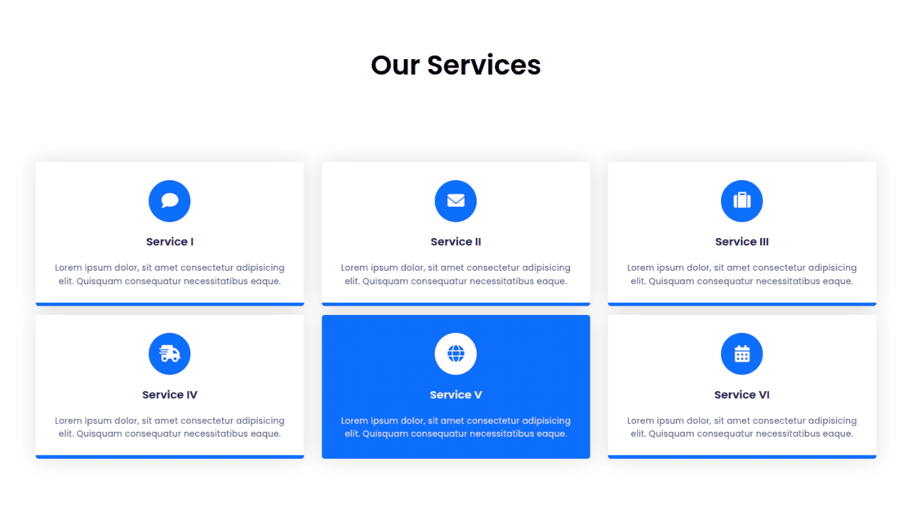
Responsive CSS Only Services Section with Hover Effects
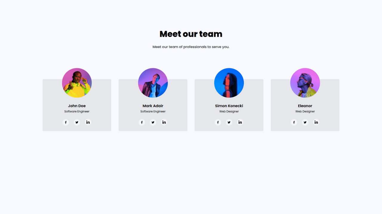
Responsive Tailwind CSS Team Members Display Showcase
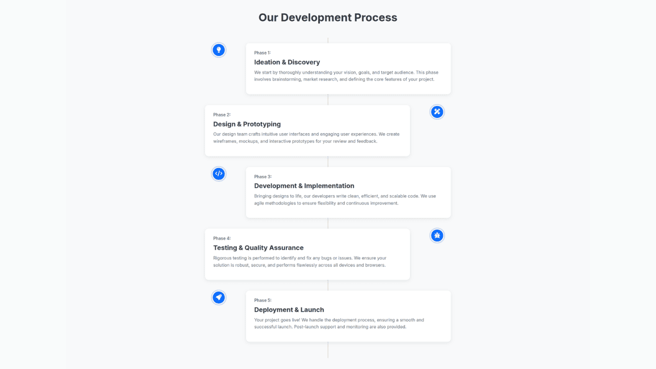
Responsive Bootstrap 5 Clear Process Flow Component
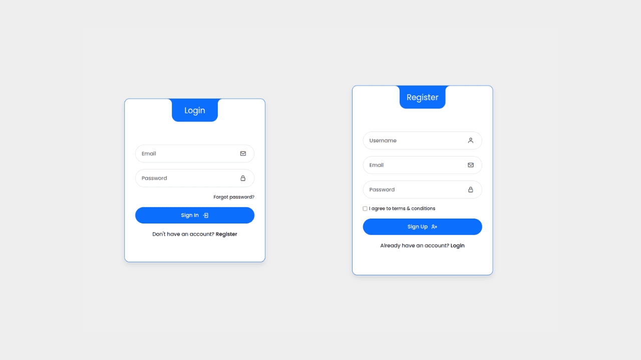
Responsive Interactive Login & Register Form with CSS & JS Transitions
Building Blocks for Your Web Pages
Explore a collection of pre-written HTML,CSS and Javascript
snippets to jumpstart your web development projects.
