Mastering Cross-Browser Compatibility: Techniques & Strategies
What is Cross-Browser Compatibility?
- Cross-browser compatibility refers to the ability of a website or web application to render and function consistently across different web browsers (e.g., Chrome, Firefox, Safari, Edge) and their versions.
- It ensures that users have a consistent experience regardless of the browser they use to access your website.
Why is Cross-Browser Compatibility Important?
- Reaching a Wider Audience: People use different browsers. By ensuring cross-browser compatibility, you reach the maximum number of potential visitors.
- Ensuring Consistent User Experience: A consistent experience across browsers builds trust and improves user satisfaction. Inconsistent layouts or broken functionality can frustrate users and drive them away.
- Maintaining Brand Consistency: A consistent appearance and behavior across browsers strengthens your brand identity and professionalism.
- SEO and Search Engine Visibility: Search engines prioritize user experience. Cross-browser compatibility is a crucial factor in search engine rankings.
Common Cross-Browser Issues
CSS Rendering Differences:
CSS is interpreted differently by different browsers. This can lead to variations in how elements are displayed, including:
- Box model inconsistencies: How browsers interpret the space occupied by elements (padding, border, margin) can differ.
- Font rendering issues: Different browsers may render the same font differently, leading to variations in text appearance.
- CSS property support: Not all browsers support the same CSS properties or support them in the same way.
JavaScript Compatibility:
- JavaScript engines vary across browsers: Differences in JavaScript engines can lead to variations in how JavaScript code is executed and interpreted.
- DOM (Document Object Model) differences: The way browsers represent and interact with the HTML document (the DOM) can vary.
- Browser APIs: Not all browsers support the same JavaScript APIs or support them in the same way.
HTML5 Support:
- Different browsers support HTML5 features to varying degrees. This can lead to issues with features like video, audio, canvas, and geolocation.
- Older browsers may not fully support HTML5, requiring the use of polyfills or workarounds.
Font Rendering Variations:
- Browsers may render fonts differently, even if the same font family is specified.
- This can affect the overall appearance and readability of text.
Device and Screen Size Differences:
- Websites need to adapt to different screen sizes and resolutions.
- Browsers on mobile devices have their own rendering quirks and limitations.
- Touchscreen devices have different input methods compared to desktop computers.
These are some of the most common cross-browser issues that web developers encounter. Addressing these issues is crucial for ensuring a consistent and positive user experience across all platforms.
Core Techniques for Cross-Browser Compatibility
I. CSS Normalization and Resets:
What are CSS Normalization and Resets?
- CSS Normalization and Resets are techniques used to address the inconsistencies in how different browsers render HTML elements by default.
- They help establish a consistent baseline for styling across browsers.
Popular libraries:
- Normalize.css: This library aims to make browsers render all elements consistently while preserving useful default styles. It corrects bugs and inconsistencies in default browser styling.
- Reset CSS: This library removes all default browser styling, effectively resetting all elements to their base state. This gives developers more control over the styling, but it requires more effort to recreate the desired visual appearance.
Benefits of using normalization and resets:
- Consistent styling: Ensures that elements are rendered consistently across different browsers, improving the visual appearance of your website.
- Reduced development time: Saves time and effort by avoiding the need to write custom styles to correct browser-specific quirks.
- Improved maintainability: Makes it easier to maintain and update your CSS code.
- Enhanced user experience: Provides a more consistent and predictable user experience across different browsers.
Example:
Instead of dealing with variations in default browser styles for headings (e.g., font sizes, line heights, margins), you can use a CSS reset or normalization library to establish a consistent baseline for all headings. Then, you can apply your custom styles on top of this consistent foundation.
By using normalization or resets, you can create a more robust and consistent foundation for your CSS, making it easier to achieve cross-browser compatibility.
II. Responsive Design and Media Queries:
Adapting layouts to different screen sizes and devices:
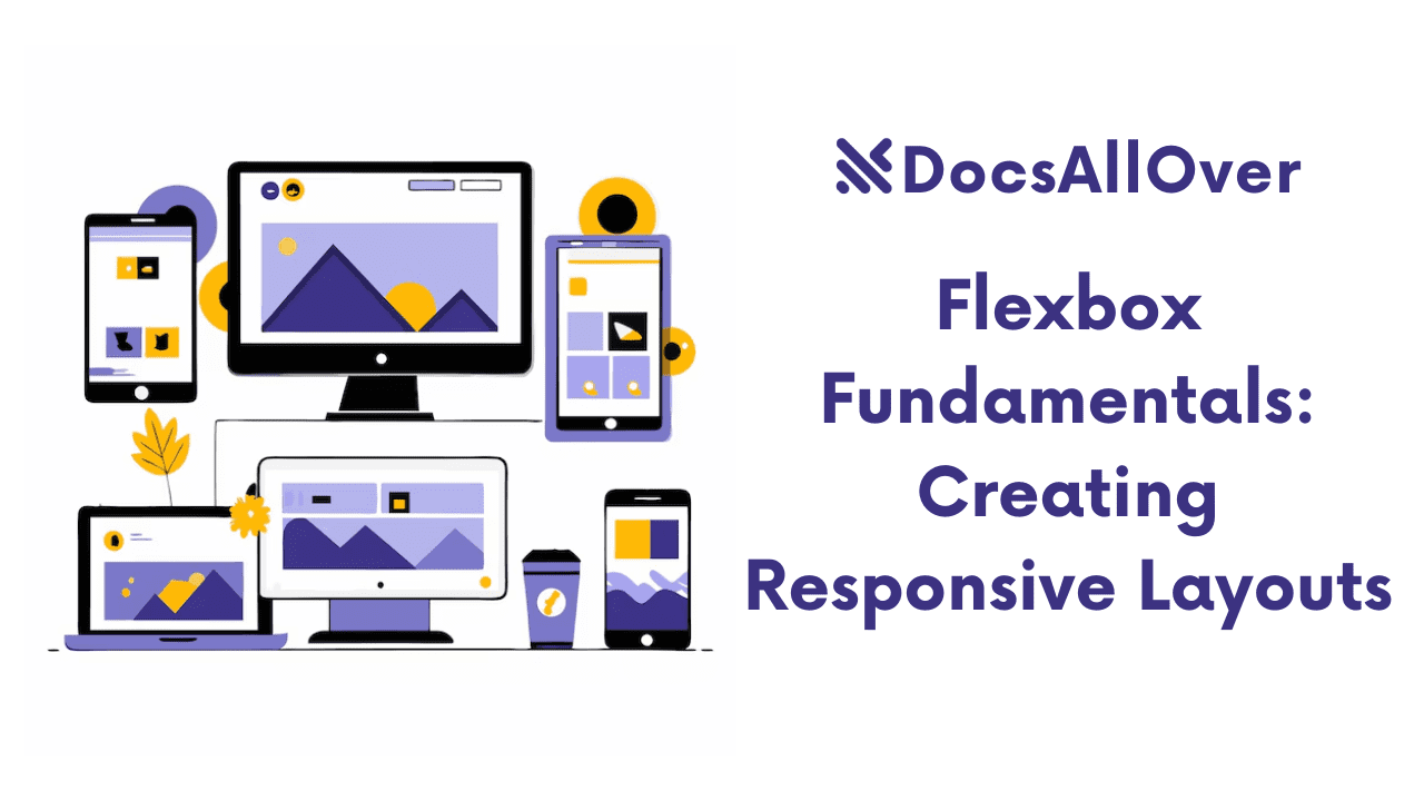
- Responsive design is crucial for ensuring your website looks good and functions correctly on all devices, from desktops and laptops to tablets and smartphones.
- The core idea is to create a flexible layout that adjusts to the available screen size and orientation.
Using media queries to target specific screen sizes and orientations:
Media queries allow you to apply CSS styles based on specific conditions, such as screen width, screen height, device orientation (portrait or landscape), and more.
Media queries enable you to create different stylesheets for different screen sizes, ensuring your website looks good and functions correctly on all devices.
III. Flexible Grid Systems:
CSS Grid and Flexbox are powerful layout systems that provide flexible and responsive ways to arrange elements on a page.
CSS Grid:
- Allows you to create two-dimensional grids with rows and columns.
- Provides fine-grained control over the positioning and sizing of elements within the grid.
- Offers features like grid gaps, alignment, and ordering of grid items.
Flexbox:
- Designed for one-dimensional layout (either a row or a column).
- Provides flexible ways to align and distribute space among items within the container.
- Offers features like
flex-grow,flex-shrink,flex-basis, andjustify-contentfor controlling item sizes and alignment.
Benefits of using Grid and Flexbox:
- Flexibility: Easily adapt layouts to different screen sizes and orientations.
- Responsiveness: Create fluid and responsive layouts that adjust to the available space.
- Maintainability: Improve the maintainability of your CSS by using a more structured and organized layout system.
By utilizing CSS Grid and Flexbox, you can create flexible and responsive layouts that work well across a wide range of devices and screen sizes.
IV. Browser Testing and Debugging:
Using browser developer tools for debugging:
- Browser developer tools (e.g., Chrome DevTools, Firefox Developer Tools) provide a wealth of tools for inspecting and debugging web pages.
- Inspect Element: Allows you to inspect the HTML, CSS, and JavaScript of any element on the page.
- Console: View and interact with JavaScript code, including logging messages and debugging errors.
- Network: Analyze network requests and responses, identify slow-loading resources, and troubleshoot performance issues.
- Rendering: Inspect the rendering of the page, including how CSS styles are applied and how elements are laid out.
- Mobile emulation: Simulate different mobile devices and screen sizes.
Testing on different browsers and devices:
- Test your website on a variety of browsers (Chrome, Firefox, Safari, Edge, Internet Explorer) and their different versions.
- Test on different operating systems (Windows, macOS, Linux).
- Test on a range of devices, including desktops, laptops, tablets, and smartphones.
- Consider using browser emulators and simulators to test on different devices and operating systems.
Utilizing cross-browser testing tools:
- There are various cross-browser testing tools available, both online and offline.
- These tools allow you to test your website on a wide range of browsers and devices remotely.
- Some popular examples include BrowserStack, LambdaTest, and Sauce Labs.
By effectively using browser developer tools, testing on different browsers and devices, and utilizing cross-browser testing tools, you can identify and resolve cross-browser compatibility issues efficiently.
JavaScript Considerations
Polyfills and Shim Libraries:
Addressing JavaScript feature gaps across browsers:
- Not all browsers support all JavaScript features in the same way or to the same extent.
- Polyfills and shims provide compatibility by providing alternative implementations of features that are not natively supported by a particular browser.
Popular libraries:
- Babel: A JavaScript compiler that allows you to use the latest JavaScript features (like ES6, ES7, etc.) in older browsers by transpiling them into older JavaScript versions.
- Polyfill.io: A service that provides polyfills for a wide range of JavaScript features, allowing you to easily add missing functionality to older browsers.
Feature Detection:
- Checking for browser support before using advanced features: Before using a specific JavaScript feature, it's essential to check whether the current browser supports it.
- This helps avoid errors and ensures that your website works correctly on older browsers.
Event Handling and Cross-Browser Compatibility:
- Event handling can vary across browsers.
- For example, event object properties and methods may differ between browsers.
- Use cross-browser compatible event handling techniques:
- Use event delegation to attach event listeners to parent elements.
- Normalize event objects using libraries or by manually checking for browser-specific properties.
Example:
By carefully considering these JavaScript-specific issues and implementing appropriate solutions, you can ensure that your website functions correctly and reliably across different browsers.
Accessibility Considerations
Ensuring your website is accessible to users with disabilities:
- Accessibility is crucial for ensuring that your website is usable by everyone, including people with disabilities.
- It's important to design and develop websites that are accessible to users with visual, auditory, motor, cognitive, and neurological disabilities.
Using ARIA attributes and semantic HTML:
- ARIA (Accessible Rich Internet Applications): ARIA attributes provide additional information about the role, state, and properties of HTML elements to assistive technologies (like screen readers). Examples:
aria-label,aria-describedby,aria-hidden - Semantic HTML: Use semantic HTML elements (e.g.,
<h1>for headings,<nav>for navigation,<article>for articles) to provide meaningful structure to your content. This helps assistive technologies understand the purpose and context of different elements on the page.
Testing with assistive technologies:
- Test your website with screen readers: Use screen readers (like JAWS, NVDA) to see how your website is perceived by users who rely on them.
- Test keyboard navigation: Ensure that users can navigate and interact with your website using only the keyboard.
- Test with other assistive technologies: Consider testing with other assistive technologies, such as screen magnifiers and speech recognition software.
By following these accessibility considerations, you can create a more inclusive and user-friendly website that is accessible to everyone.
Best Practices and Tips
Follow Web Standards:
- Adhere to the World Wide Web Consortium (W3C) standards for HTML, CSS, and JavaScript.
- Using standards-compliant code improves cross-browser compatibility and makes your website more maintainable.
Test Early and Often:
- Continuous Testing: Test your website on a variety of browsers and devices throughout the development process, not just at the end.
- Early Detection: Catch and fix cross-browser issues early on, which is much easier and less costly than fixing them later.
- Use a variety of devices and browsers: Test on different operating systems, screen sizes, and browser versions to ensure your website works consistently across all platforms.
Use a Consistent Development Environment:
- Maintain a consistent development environment: Ensure that your development environment (browser, operating system, and development tools) is consistent across your team. This helps to minimize inconsistencies in how your website renders across different environments.
Stay Updated:
- Keep up-to-date with the latest browser technologies and best practices: The web is constantly evolving. Stay informed about new browser features, CSS techniques, and JavaScript libraries.
- Regularly update your development environment: Keep your browser, operating system, and development tools updated with the latest versions and security patches.
By following these best practices, you can significantly improve the cross-browser compatibility of your website and ensure a positive user experience for all visitors.
