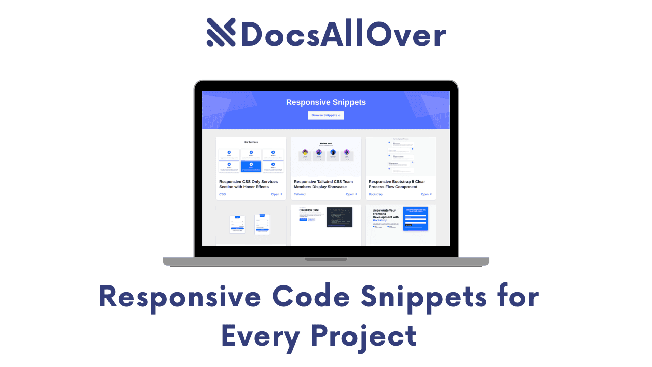
Responsive Code Snippets for Every Project
In a world where screens range from the size of a wristwatch to a 50-inch television, the "one-size-fits-all" approach to web development died years ago. If your code doesn't bend, it breaks.
The Responsive Necessity
Responsive design is no longer a "nice-to-have" feature or a checkbox for high-end clients—it is a baseline requirement. With mobile devices now accounting for over 55% of all global web traffic, a desktop-only layout is essentially a "Closed" sign for more than half of your potential users. Beyond user experience, search engines now prioritize mobile-first indexing; if your site isn't responsive, it’s virtually invisible.
The Developer's Bottleneck
Every developer knows the "CSS Loop": you start a new project, and immediately find yourself reinventing the wheel. You spend hours meticulously styling the same navigation bars, contact forms, and pricing tables to ensure they don't collapse into a mess on an iPhone 13. This repetitive work is a massive productivity killer—time spent debugging media queries for a header is time not spent building the core logic of your application.
The DocsAllOver Solution
At DocsAllOver, we believe in working smarter, not harder. To help you bypass the styling slog, we’ve curated a comprehensive "Responsive Snippets" library. Whether you are a Tailwind CSS enthusiast, a Bootstrap veteran, or a Vanilla CSS purist, these plug-and-play components are designed to be dropped into any project and look flawless on every device.
The Hero section and Navigation bar are the "make or break" moments for any website. If they don't look perfect within the first three seconds, you’ve likely lost your visitor.
1. Hero Section Snippets
A truly responsive Hero section does more than just shrink; it reorganizes. On a desktop, you have the luxury of horizontal space for side-by-side text and imagery. On mobile, that same layout must stack vertically, adjust font sizes for readability, and transform a sprawling menu into a clean "hamburger" icon.
Featured Snippets
Responsive Tailwind CSS Hero & Adaptive Navbar
This snippet is designed for the modern SaaS aesthetic. It features a sticky navigation bar that collapses into a slide-out mobile menu and a hero section with a centered "value proposition" that scales elegantly.
Best for: SaaS Landing Pages, Clean Portfolios.

Bootstrap 5 Hero with Integrated Sign-up Form
Marketing-heavy sites need conversions. This layout places a lead-generation form directly in the Hero area. On larger screens, the form sits to the right of the headline; on mobile, it drops below to stay "above the fold."
Best for: Newsletters, B2B Lead Gen, Webinar Sign-ups.

SaaS Hero with Theme Switcher (Tailwind)
Dark mode is no longer a luxury; it’s an expectation. This snippet includes a lightweight JavaScript toggle and Tailwind’s dark: variant classes to switch your entire Hero section from a crisp light theme to a sleek dark mode.
Modern Touch: Perfect for developer tools and productivity apps.

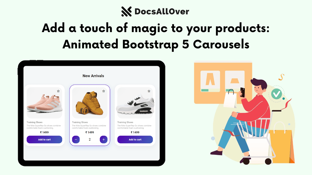
Bootstrap 5 Hero with Lottie Animations
Why use a heavy, grainy GIF when you can use a vector-based Lottie? This snippet includes the script needed to load a Lottie JSON file, giving your Hero section interactive visual flair that stays sharp at any resolution without killing your page load speed.

When a user reaches your pricing page, they are at the most critical stage of the conversion funnel. If your pricing table is broken or hard to read on a mobile device, you aren't just losing a view—you’re losing revenue.
2. Pricing Snippets
The biggest challenge with pricing tables is the "Horizontal Squeeze." On a desktop, we typically display three or four plans side-by-side to allow for easy comparison. On a mobile screen, that same table becomes unreadable.
The goal of a responsive pricing snippet is to transform these horizontal rows into vertical cards, ensuring that the Call to Action (CTA) button remains prominent and the feature list stays legible without horizontal scrolling.
Featured Snippets
Bootstrap 5 Service Pricing Table Block
This block utilizes the updated Bootstrap 5 gutter system and flex utilities to create a professional, "feature-heavy" table.
Best for: Complex services where users need to compare specific features line-by-line.

Bootstrap 4 Pricing Cards (Monthly/Yearly Toggle)
For subscription models, showing the value of an annual plan is key. This snippet includes a lightweight CSS/JS toggle that switches the price values between monthly and yearly rates instantly.
Essential for: SaaS products and membership sites.

Tailwind CSS Subscription Section
Tailwind is perfect for creating that "Apple-esque" minimalist aesthetic. This snippet focuses on high-contrast typography and plenty of whitespace.
Best for: Modern creative agencies and individual service providers.

Engagement isn’t just about looking good; it’s about reducing friction. On mobile, friction often comes from tiny buttons and cramped layouts. Responsive engagement blocks prioritize touch-targets and visual hierarchy to ensure users actually complete the actions you want them to take.
3. Interactive Element Snippets
The mobile experience is driven by thumbs, not cursors. This means your forms and Call-to-Action (CTA) buttons must be "touch-friendly." A responsive form isn't just one that fits the screen; it's one where input fields are large enough to tap easily, labels are clear, and the "Submit" button spans the width of the screen to prevent accidental clicks.
Featured Snippets
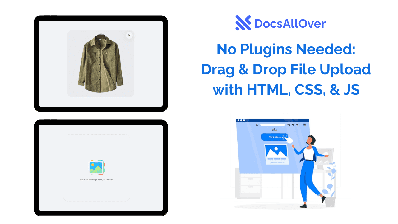
Glassmorphism Login Form (CSS Only)
This snippet leverages the modern "frosted glass" aesthetic using the backdrop-filter: blur() property. It creates a high-end, semi-transparent look that adapts to your background image without losing readability.

Interactive Login & Register Form (with JS Transitions)
Space is a premium on mobile. This snippet uses a simple JavaScript toggle to slide between a "Login" and "Register" view within the same container.
The Benefit: Instead of sending the user to a new page (and waiting for a reload), the transition is instant and smooth, keeping the user focused on the task.

Bootstrap 5 Compact FAQ Accordion
FAQs can quickly become a "wall of text" that requires endless scrolling. This snippet uses the Bootstrap 5 .accordion component to hide answers until they are needed.

Tailwind CSS CTA Block with User Avatars
Social proof is a powerful motivator. This CTA snippet includes a "Discover your potential with us" tagline alongside a stack of overlapping user avatars.
When you have a lot to say about your product or your people, the biggest risk on mobile is the "infinite scroll" of death. To keep users engaged, you need to master the art of the responsive grid—knowing exactly when to stack, when to shrink, and when to slide.
4. Grid Snippets
The secret to a clean Features or Team section is Breakpoints. On a wide desktop monitor, a 4-column grid feels spacious and organized. On a tablet, that should shift to 2 columns. On a phone, we typically move to a 1-column stack or an interactive slider. The goal is to maintain the visual weight of your icons or headshots without forcing the user to squint.
Featured Snippets
Responsive Bootstrap 5 Detailed Features Section
This snippet is designed for products that need to explain why they are better. It uses the Bootstrap .row-cols utility to manage the transition from a multi-column feature set to a focused, single-column mobile view.
Best for: Technical products, software capabilities, or service breakdowns.

Owl Carousel CSS-Only Team Showcase
If you have a large team, a vertical stack can make your "About Us" page feel miles long. This snippet uses a clever CSS-only "carousel" approach (utilizing scroll-snap-type) to let users swipe horizontally through team members on mobile while keeping them in a static grid on desktop.

Tailwind CSS Team Members Display
For those who prefer a classic, high-end look, this Tailwind snippet uses a clean grid with subtle hover effects.

The difference between a "good" website and a "professional" one often lies in the micro-interactions—the small visual cues that guide a user through a journey or reassure them that the site is working during a transition.
5. Process Flow & Loader Snippets
In User Experience (UX) design, these elements are known as feedback loops. A responsive process flow helps a user visualize their path (like a 3-step sign-up), while a loader prevents the "dead air" feeling of a slow internet connection. On mobile, where attention spans are shorter, these polished details are critical for keeping users from bouncing.
Featured Snippets
Bootstrap 5 Clear Process Flow Component
Visualizing a 1-2-3 step process is a challenge on small screens. This snippet stays in a horizontal line on desktop but intelligently pivots into a vertical timeline on mobile.
Best for: Onboarding steps, "How it Works" sections, or checkout progress bars.
Modern CSS-Only Loading Spinners Collection
Nothing kills a premium feel faster than a generic browser loading icon. This snippet provides a collection of five high-end animations—ranging from minimalist "dots" to sleek "orbit" rings—built entirely with CSS.
The Benefit: Zero dependencies. No heavy GIFs or JavaScript libraries are required, which keeps your page weight low and your performance scores high.

Ready to start building?
You can find the full, copy-pasteable library for all these components on our main resource page: docsallover.com/snippets
