Responsive Dark Mode Toggle Sidebar HTML, CSS, and JS
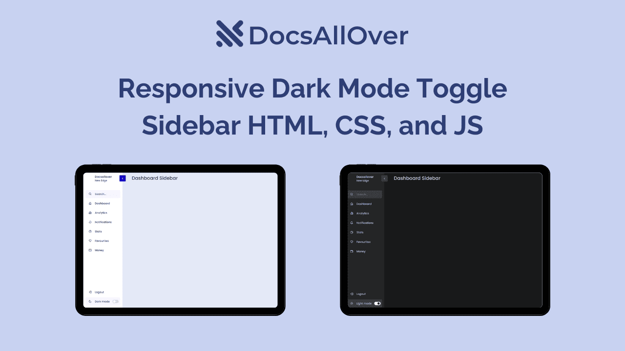
Tired of the same old static sidebar? Want to give your website a modern makeover with a responsive dark mode toggle and sidebar? Look no further! This blog will equip you with the essential HTML, CSS, and JavaScript code to create a stunning and functional sidebar that adapts to any screen size and offers a sleek dark mode option.
Why Responsive Dark Mode Sidebars Rock:
- Enhanced user experience: Dark mode is easier on the eyes in low-light environments, and responsive design ensures comfort on all devices.
- Modern and sleek aesthetics: Elevate your website's visual appeal with a clean and sophisticated sidebar that adapts to any screen size.
- Improved user engagement: Give users control over their browsing experience with a convenient toggle switch for dark mode.
- Boost accessibility: Dark mode can improve readability for users with visual impairments.
Ready to dive in? Here's the code:
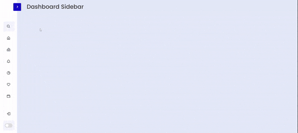
Building the HTML Framework:
Start by creating the basic HTML structure for your sidebar, including elements like a container div, navigation links, and a toggle button. Remember to use semantic HTML tags for proper accessibility.
HTML:
Styling with CSS:
This is where the magic happens! Use CSS to define the sidebar's layout, positioning, and styles. Define classes for the sidebar itself, its elements, and the dark mode toggle. Play with colors, fonts, and shadows to create a visually appealing design.
CSS:
Adding Responsiveness:
Make sure your sidebar adapts to different screen sizes using media queries in your CSS. This ensures a seamless experience for users on desktop, mobile, and tablet devices.
Implementing the Dark Mode Toggle:
Here's where JavaScript comes into play! Write a simple JavaScript function that listens for clicks on the toggle button and swaps between light and dark mode styles by manipulating CSS classes.
Add Animation:
- Add animations for a smooth transition between light and dark modes.
- Include accessibility features like keyboard navigation for the toggle button.
- Consider adding custom dark mode styles for specific elements like icons or images.
JS:
Remember: This is just a starting point. Feel free to customize and expand upon this code to create a unique and personalized sidebar that perfectly reflects your website's brand and functionality.
Let's embrace responsive dark mode sidebars and build websites that are not only functional but also stylish and user-friendly!


