Discover the Power of Bootstrap 5: Elevate Your Website with Sidebar Menu

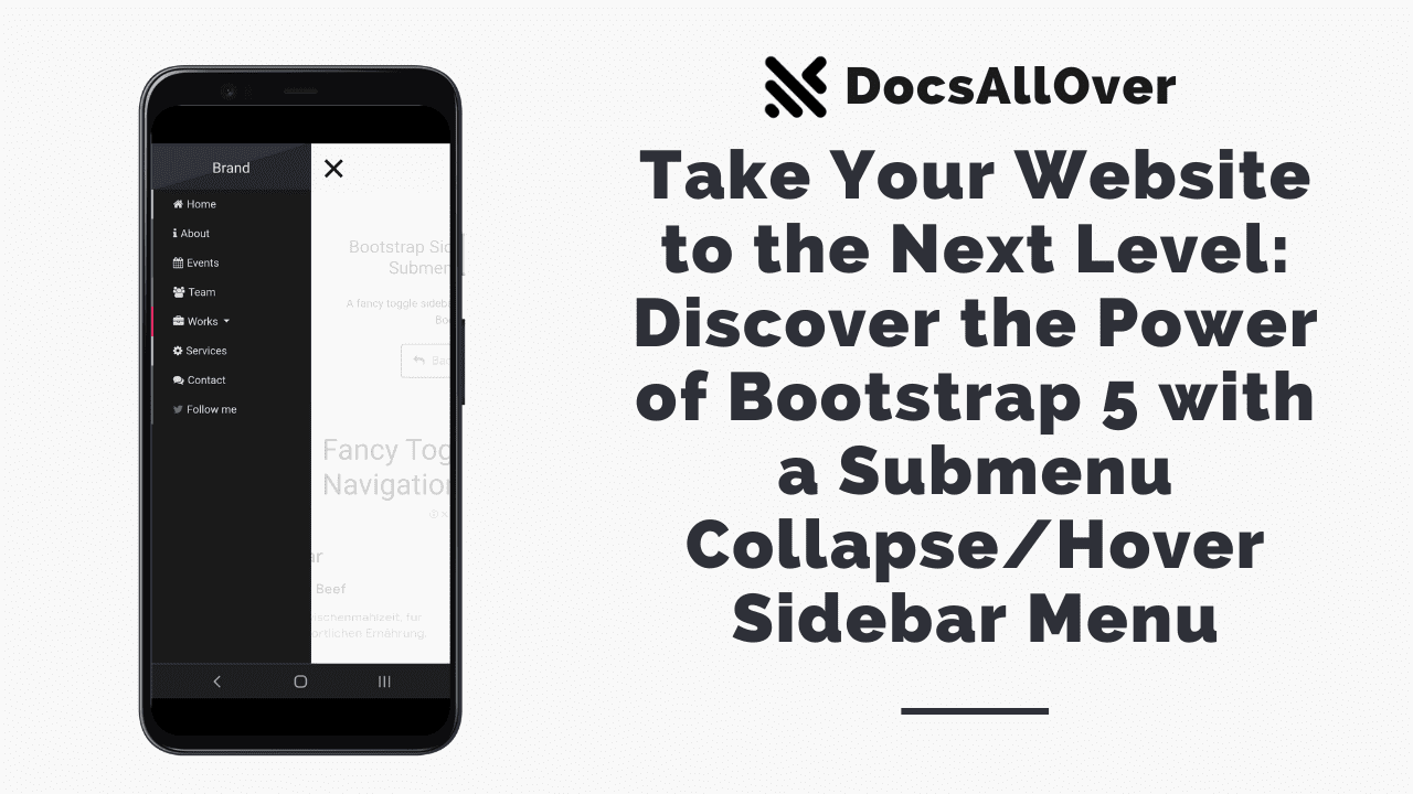
In today's digital landscape, having an intuitive and user-friendly website is essential to captivate and engage visitors. One powerful tool that can elevate your website's navigation and user experience is Bootstrap 5. With its extensive set of pre-built components and responsive grid system, Bootstrap 5 empowers web developers to create dynamic and interactive interfaces effortlessly. In this blog, we will explore how you can take your website to the next level by harnessing the power of Bootstrap 5 to design a Submenu Collapse/Hover Sidebar Menu.
Benefits of a Submenu Collapse/Hover Sidebar Menu:
A Submenu Collapse/Hover Sidebar Menu offers several advantages for your website. Firstly, it optimizes screen real estate by displaying a compact sidebar menu that expands when necessary. This helps keep the interface clean and organized, particularly on smaller devices. Secondly, it enhances navigation by allowing users to collapse and expand submenus, making it easier to access specific sections or pages. Lastly, adding hover effects to the submenu items creates an interactive and intuitive browsing experience, improving user engagement.
Exploring Bootstrap 5 Features:
Bootstrap 5 provides a rich set of features that make it the ideal framework for building a Submenu Collapse/Hover Sidebar Menu. The framework offers a responsive grid system, making it effortless to create a layout that adapts to different screen sizes. Additionally, Bootstrap 5 includes pre-built CSS classes and components for styling the menu, making it visually appealing and consistent with the overall website design. Furthermore, you can leverage Bootstrap's JavaScript plugins to add dynamic behavior, such as collapsing submenus and applying hover effects.
Designing a Submenu Collapse/Hover Sidebar Menu:
To create a Submenu Collapse/Hover Sidebar Menu using Bootstrap 5, you will need to structure your HTML markup appropriately and apply the necessary CSS classes. By utilizing Bootstrap's predefined classes, you can easily customize the appearance and behavior of the menu items, submenus, and hover effects. Additionally, you can incorporate Bootstrap's JavaScript functionality to handle the collapsing and expanding of submenus based on user interactions.
While we have provided you with the necessary code snippets to create a sidebar menu with submenus using Bootstrap, it's important to understand the underlying steps involved. By following these steps, you'll not only be able to implement the provided snippets but also gain a better understanding of how the entire process works. Each step plays a crucial role in setting up the necessary CSS and JavaScript files, creating the HTML structure, and initializing the menu functionality. So, even if you choose to use the snippets, we highly recommend reading through the following steps to grasp the concepts and ensure a smooth implementation.
To create a sidebar menu with submenus using Bootstrap, you can follow these steps:
1. Include the necessary CSS files:
To begin, you'll need to include the Bootstrap CSS file, along with any additional CSS files required for the sidebar menu and submenu styles. You can also include the Font Awesome CSS file if you want to use icons in your menu.
2. Create the HTML structure:
Next, create the HTML structure for the sidebar menu and the main content area. The sidebar menu will typically be placed inside a '<nav>' element, while the main content area can be wrapped in a '<div>' or other suitable container.
3. Load the JavaScript files:
In order to enable the functionality of the sidebar menu, you'll need to load the jQuery library and the Bootstrap JavaScript files. Additionally, if you're using any specific JavaScript plugins or custom scripts for the submenu behavior, include those files as well.
4. Initialize the sidebar menu:
Once all the necessary files are loaded, you can initialize the sidebar menu in the jQuery `document.ready()` function. This is where you'll write the JavaScript code to handle the opening and closing of the submenus, as well as any other desired behavior.
In the initialization code, you'll typically select the menu elements and apply event handlers to handle the click or hover events. When a user interacts with the menu, you can toggle classes or modify the CSS properties of the submenu elements to show or hide them.
It's important to ensure that your JavaScript code is properly structured and follows best practices to maintain code readability and modularity. You may also want to consider adding error handling and fallback options for older browsers that may not support certain JavaScript features.
By following these steps, you'll be able to create a sidebar menu with submenus using Bootstrap. Remember to customize the menu styles, animations, and interactions to fit your specific design requirements.
Conclusion:
By leveraging the power of Bootstrap 5, you can transform your website's navigation and take it to the next level. The Submenu Collapse/Hover Sidebar Menu provides a sleek and efficient way to present your site's content, improving user experience and engagement. Stay tuned for the next part of this blog series, where we will dive into the code implementation and provide a step-by-step tutorial on how to create this dynamic menu using HTML, CSS, and Bootstrap 5. Get ready to enhance your website and captivate your visitors with an impressive Submenu Collapse/Hover Sidebar Menu powered by Bootstrap 5.


