Discover The Difference Between Adaptive Versus Responsive Sites
Introduction: The Ever-Changing Digital Landscape
The digital landscape has undergone a dramatic shift in recent years. The dominance of desktop browsing has been eclipsed by the surge in mobile internet usage. People today access websites from a wide range of devices, from smartphones and tablets to laptops and large-screen TVs. This diversity in screen sizes and resolutions presents a challenge for web designers – how do you ensure websites remain user-friendly and visually appealing across all these platforms?
Here's where responsive and adaptive design come into play. These are two approaches to website design that address the need for adaptability in today's mobile-first world. Both aim to deliver an optimal user experience (UX) regardless of the device used to access the website. However, they achieve this goal in slightly different ways.
Responsive Design: Fluid and Flexible
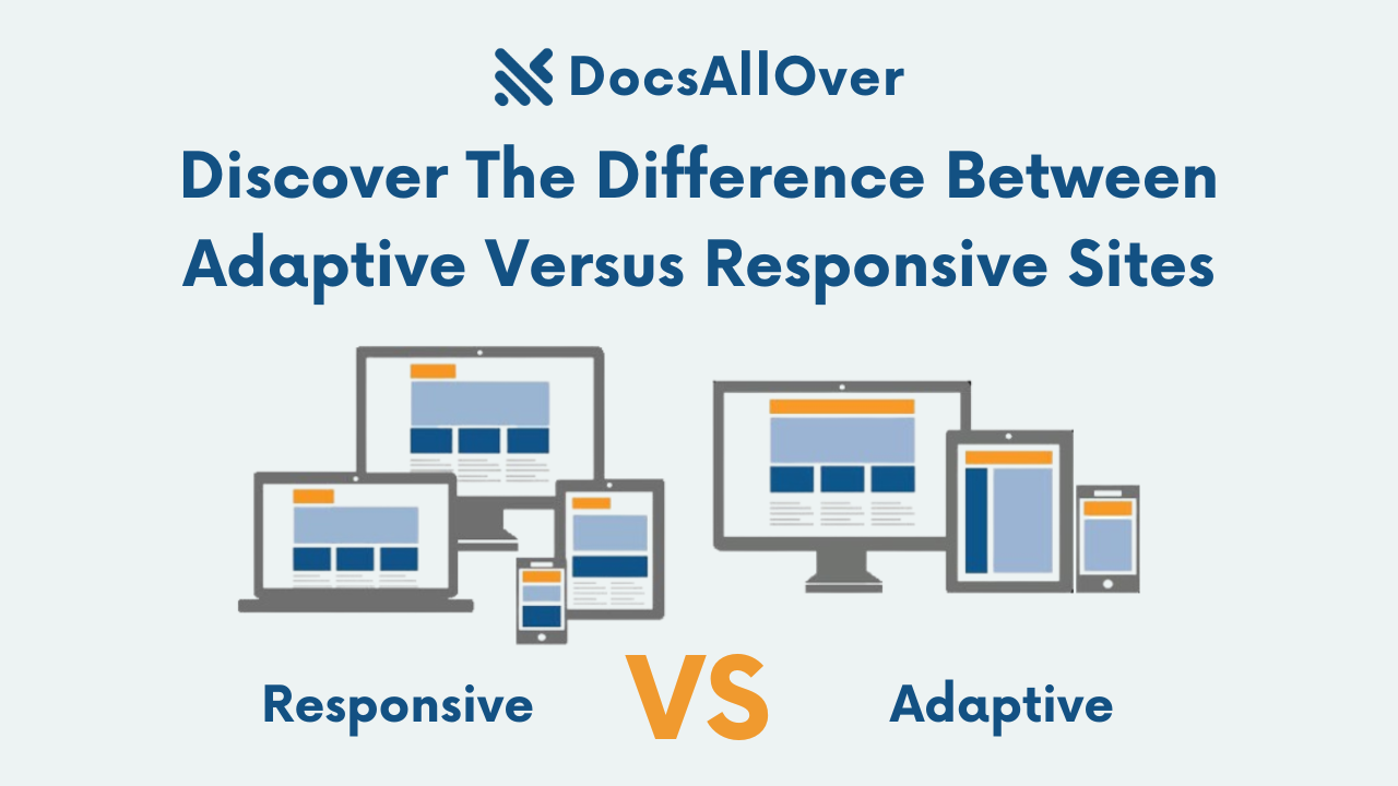
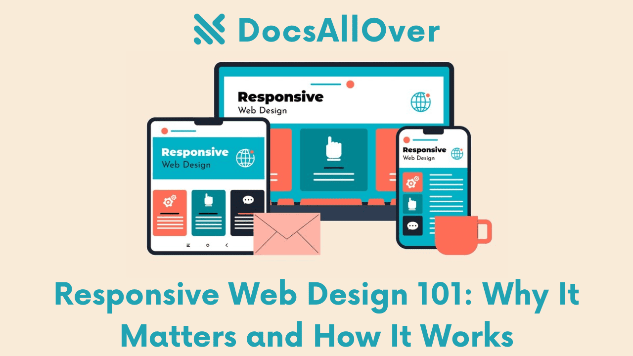
Gone are the days of needing a separate website for desktops and mobile devices. Responsive design has revolutionized web development, ensuring your website delivers an optimal viewing experience across all screen sizes, from desktops to tablets and smartphones.
At its core, responsive design utilizes a single website layout that adapts and resizes based on the device accessing it. This is achieved through the magic of **media queries**, a powerful feature in Cascading Style Sheets (CSS). Media queries allow you to define specific styles for different screen size ranges.
Here's a simplified example of a media query targeting devices with a screen width less than 768 pixels (typical for smartphones):
In this example, the styles within the @media block will only be applied when the screen width is less than 768 pixels. This allows you to adjust elements like font sizes, image widths, and menu layouts to ensure optimal presentation on smaller screens.
The Benefits of Responsive Design:
Responsive design offers a win-win situation for both website owners and users. Here are some key advantages:
- Easier Maintenance: Maintaining a single codebase for all devices is significantly more efficient compared to managing separate websites.
- Improved User Experience (UX): Users can access your website seamlessly from any device, with a layout that adjusts for optimal viewing and interaction. This translates to increased user satisfaction and engagement.
- Better Search Engine Optimization (SEO): Google prioritizes mobile-friendly websites in search results. Responsive design ensures your website is optimized for mobile searches, potentially boosting your ranking and visibility.
By embracing responsive design, you create a website that caters to the ever-increasing mobile browsing trend. This not only enhances user experience but also positions your website for success in today's mobile-first digital landscape.
Adaptive Design: Tailored Experiences
Imagine a website that seamlessly adjusts its layout based on the device you're using – that's the power of adaptive design! It's a web development approach that utilizes multiple pre-built layouts, each specifically optimized for different device categories like desktops, tablets, and mobiles. This ensures a tailored experience for users regardless of their screen size and device.
Here's how it works: When a user visits a website with adaptive design, server-side code or JavaScript detects the user's device characteristics (e.g., screen size, operating system). Based on this information, the website delivers the most appropriate pre-designed layout for that specific device.
Adaptive design offers several advantages:
- Highly Optimized Layouts: Each layout is meticulously crafted to fit the viewing area and functionalities of a particular device type. This ensures optimal use of screen real estate, improves readability, and enhances user interaction.
- Greater Control over User Experience: With dedicated layouts for different devices, developers have more control over how users experience the website on each platform. They can tailor navigation elements, content size, and overall presentation to provide the best possible experience on each device.
For example, a desktop layout might feature a multi-column structure with sidebars for navigation and additional content. On a tablet, the layout might adapt to a single column with a more condensed menu for easier touch navigation. This ensures users can efficiently access and interact with the website's content, regardless of their device.
Choosing the Right Approach: Responsive vs. Adaptive
When crafting a website, a crucial decision is choosing between responsive and adaptive design. Both approaches aim to deliver an optimal user experience across various devices, but they differ in their strategies. Here's a breakdown of key factors to consider when making this choice:
Website Complexity:
Responsive design excels with simpler websites. With a single codebase, the layout adjusts fluidly based on screen size. This makes it ideal for websites with a consistent layout structure that can adapt to different viewports.
Target Audience:
If your target audience uses a wide range of devices, responsive design offers wider compatibility. A single, responsive website ensures a smooth experience on desktops, tablets, and smartphones, regardless of screen size or resolution.
Development and Maintenance:
Responsive design generally requires less maintenance in the long run. Changes made to the core design are reflected across all devices automatically. Adaptive design, on the other hand, might require more effort for complex layouts with multiple breakpoints. Maintaining separate codebases for different layouts can become cumbersome over time.
Here's a table summarizing the key differences:
| Factor | Responsive Design | Adaptive Design |
|---|---|---|
| Website Complexity | Better suited for simpler layouts | Flexible for complex layouts |
| Target Audience | Wider device compatibility | May require separate layouts for specific devices |
| Development | Less initial development time | May require more upfront development effort |
| Maintenance | Easier to maintain a single codebase | Can require maintaining multiple layouts |
Choosing the Right Approach:
The best approach depends on your specific website's needs. For simpler websites with a broad target audience, responsive design offers a cost-effective and efficient solution. For complex websites with a focus on specific device experiences, adaptive design might be preferable. Consider these factors and weigh the pros and cons to make an informed decision.
Real-World Examples: Showcasing Responsive and Adaptive Design
Responsive Design in Action:
Responsive design has become the industry standard for ensuring a seamless user experience across diverse devices. Let's explore how some tech giants leverage responsive design:
- Google: A prime example of responsive design done right. Google's website adapts flawlessly to desktops, tablets, and mobile phones. The layout elements like search bar, navigation menus, and content blocks automatically adjust their size and position based on the screen size. On desktops, the layout offers a wider view with a prominent search bar and categorized information sections. As the screen size shrinks for tablets and mobiles, the search bar becomes more prominent, navigation menus collapse into compact icons, and content sections stack vertically for optimal readability on smaller screens.
- Apple: Apple's website is another excellent example of responsive design. Their clean and minimalist aesthetic translates beautifully across various devices. On desktops, the website showcases stunning product imagery alongside detailed information. For tablets and mobiles, the layout prioritizes product images and key information, with additional details accessible through taps or swipes. The overall user experience remains consistent, regardless of the device used to access the website.
Adaptive Design Considerations:
While responsive design remains the dominant approach, adaptive design can be used in specific scenarios. For example, a travel website might offer a desktop version with a complex search interface featuring multiple filters and sorting options. The mobile version might adopt a more simplified search interface with fewer filters, focusing on core functionalities like location selection and travel dates. This caters to the specific needs of users on different devices.
However, it's important to note that maintaining separate adaptive layouts for various screen sizes can be more resource-intensive compared to responsive design.
The Future of Web Design: Considering New Trends
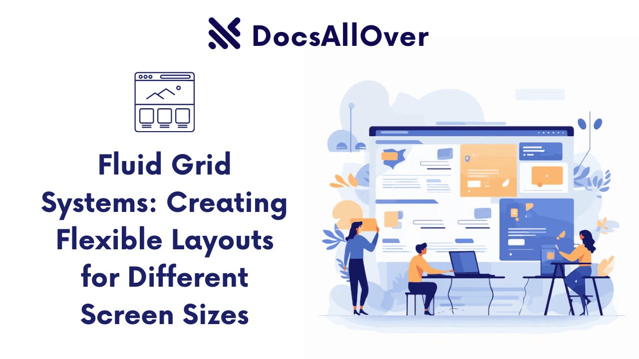
The web design landscape is constantly evolving, and responsive and adaptive approaches need to consider these emerging trends to stay future-proof. A significant factor is the rise of foldable devices. These innovative devices boast unique screen formats that traditional responsive layouts might not fully optimize. Imagine a website designed for a standard phone screen suddenly stretched across a tablet-sized fold – the layout might become clunky or elements might appear out of place.
To address this challenge, web designers are exploring techniques like fluid grids and flexible layouts that can adapt seamlessly to various screen sizes and aspect ratios. Additionally, foldable devices often offer multi-window functionality, where users can view multiple applications side-by-side. This necessitates web designs that can adjust their layout to fit a smaller viewing area while maintaining usability.
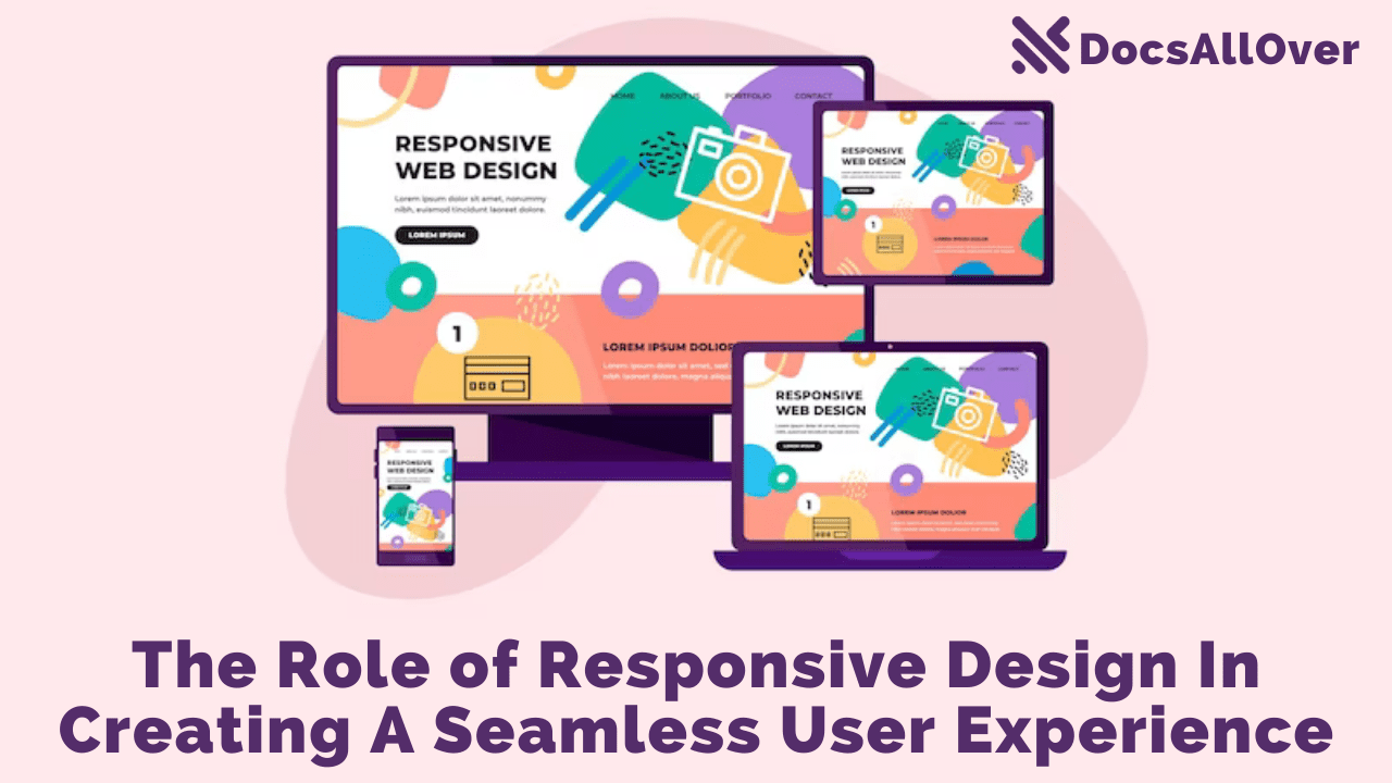
Ultimately, the core principle of responsive and adaptive design remains: deliver an optimal user experience (UX) across all devices. Regardless of the chosen design approach, the focus should be on creating websites that are intuitive, visually appealing, and function flawlessly on desktops, tablets, phones, and the ever-evolving world of new screen formats.
The future of web design is brimming with exciting possibilities. As technology continues to push boundaries, responsive and adaptive design approaches will need to adapt as well. By embracing new trends like foldable devices and remaining user-centric in design philosophy, web designers can create websites that not only look stunning but also provide a seamless and engaging experience for users on any device they choose. The future of the web is user-defined, and responsive and adaptive design will continue to play a pivotal role in shaping this ever-evolving digital landscape.


