The Importance of Responsive Design in Web Development

In today's digital age, the importance of having a responsive website cannot be overstated. With more and more users accessing the internet through their mobile devices, it has become imperative for web developers to create websites that are optimized for all screen sizes. In this blog, we'll explore the importance of responsive design in web development and provide some examples of how it can benefit businesses.
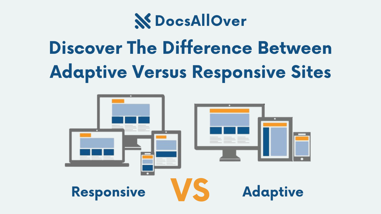
With the increase in the use of mobile devices for browsing the internet, it has become essential to ensure that your website is optimized for all screen sizes. This is where responsive design comes in. Responsive design refers to the ability of a website to adapt and respond to various screen sizes and resolutions.
What is Responsive Design?
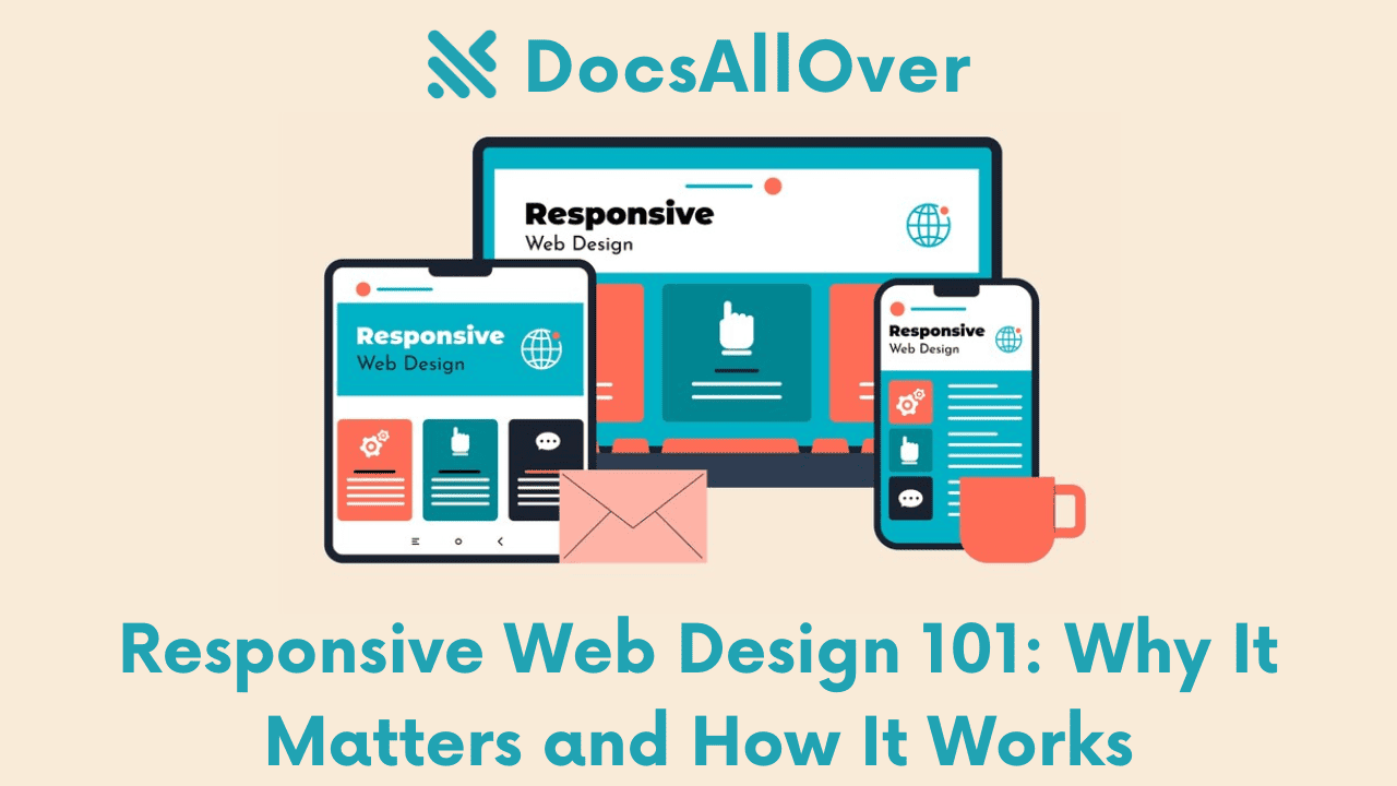
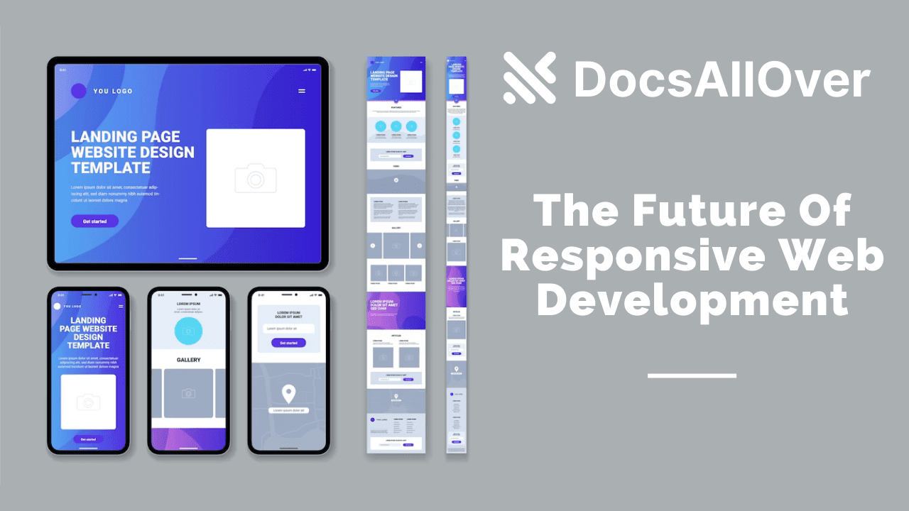
Responsive design is an approach to web development that aims to provide an optimal viewing experience across a wide range of devices, from desktop computers to mobile phones. It involves designing and developing websites to adapt and respond to the screen size and resolution of the device being used to view it. This means that regardless of the device being used, the website will look and function as intended, with content and images adjusting to fit the screen size.
In web development, responsive design is crucial for several reasons. Firstly, it enhances the user experience. A website that is not optimized for mobile devices will appear cluttered and difficult to navigate, making it frustrating for users to browse. This can lead to a high bounce rate, where users quickly leave the website without engaging with its content. On the other hand, a website that is optimized for all devices will load quickly, be easy to navigate, and provide a pleasant user experience.
Secondly, responsive design improves search engine optimization (SEO). Google has made it clear that mobile optimization is an essential factor in ranking websites on search engine results pages. Websites that are not mobile-friendly will rank lower in search engine results, resulting in less traffic and fewer conversions.
Thirdly, responsive design reduces the need for multiple websites. In the past, developers would create multiple versions of a website, each optimized for a specific device. This was not only expensive but also time-consuming. Responsive design eliminates the need for multiple websites, as it optimizes a single website for all devices.
Responsive design has become an essential part of web development over the past decade. With the rise of mobile devices and the increasing number of people accessing the internet on their smartphones and tablets, it's more important than ever to ensure that your website is easily accessible and usable across all devices. In this article, we'll discuss the importance of responsive design in web development and provide some examples of how to implement it using HTML and CSS.
Why is Responsive Design Important?
There are several reasons why responsive design is important for businesses:
It improves user experience. A responsive website is easier to use and navigate on mobile devices, which means that users are more likely to have a positive experience. This can lead to increased engagement and conversions.
It improves SEO. Google and other search engines now favor mobile-friendly websites in their search results. This means that a responsive website can help your business to rank higher in search results, which can lead to more traffic.
It saves time and money. Responsive design eliminates the need to create separate mobile and desktop versions of your website. This can save you time and money in the long run.
Quote from a Google executive about the importance of mobile-friendly websites
"Mobile-friendly websites are essential for businesses that want to reach a wider audience."
In fact, Google has said that mobile-friendliness is a ranking factor for search results, so businesses that don't have a mobile-friendly website are at a disadvantage.
Additional tips for implementing responsive design:
- Use clear and concise navigation. The navigation menu should be easy to find and use, regardless of the screen size.
- Make sure your images are optimized for mobile devices. This means using smaller file sizes and high-quality images that will look good on small screens.
- Use large, readable fonts. The text on your website should be easy to read on all devices, so use large fonts and a clear font face.
- Avoid using too much text on a single page. A lot of text can be difficult to read on mobile devices, so break up your content into smaller chunks and use images to break up the text.
- Test your website on a variety of devices to make sure it looks and functions properly. This will help you to identify any problems and make sure your website is optimized for all devices.
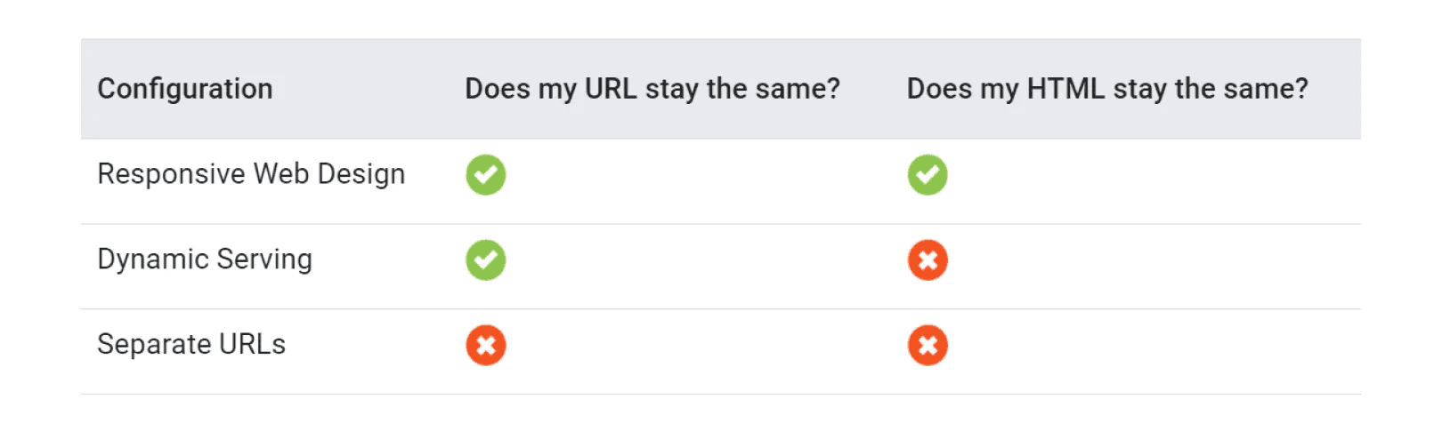
Mobile-First Indexing Advantages
Responsive design instantly makes your website mobile-friendly. As we know, Google’s Mobile-First Indexing has been gradually taking over the web in the past few years and is now becoming the standard. This means that only the content of the mobile version of the website will be crawled by Google and visible in organic search results.
Since responsive websites answer the requirements for the update, no changes are necessary and no shifts in performance should occur. That’s one of the reasons Google recommends using a responsive website, over a stand-alone mobile version.
Another reason is that responsive sites have one URL and a similar HTML, which makes it easier for Google to index, crawl, and organize content.
How Responsive Design Works?
To make your website responsive, you have to add some additional code to your existing site. It provides instructions and performance parameters to trigger the changes, and make your layouts fluid. This way the same version of the website is served to users on different devices, only the content is transformed and rearranged for better viewability.
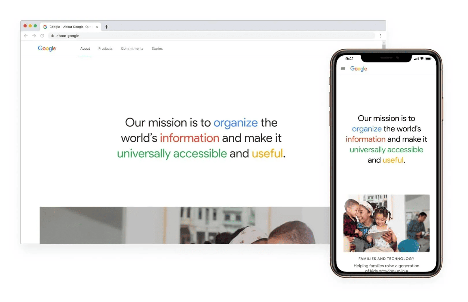
For example, this is how Google’s About page was set up to look when viewed on a desktop and on a smartphone.
If you are building a new website and want to make it responsive, it’s advisable to take the mobile-first approach. This means that you should set up the original layouts to look good on a small screen and once you are finished with the design, you should add the meta viewport tag, CSS media queries, and breakpoints, to scale it up when viewed on a big screen device.
WordPress users should be on the safe side, since there is a good chance that your theme is a responsive one. You can check this by testing your website on different devices or simply by trying Google’s mobile-friendliness test. If you find out your theme is not responsive, you should consider changing it to a more up-to-date one. This will improve the overall user experience on your website and can also help you to improve your ranking in organic search engine results.
Efficiently Increase Your Website’s Traffic with Responsive Design
In today's mobile-first world, it is more important than ever for businesses to have a responsive website. A responsive website is one that can be viewed and navigated easily on any device, regardless of its screen size or orientation. This means that businesses can reach a wider audience and improve the user experience for their customers.
Here are some of the benefits of responsive design for businesses:
- Better SEO: Google and other search engines now favor mobile-friendly websites in their search results. This means that a responsive website can help businesses to rank higher in search results, which can lead to more traffic.
- Improved User Experience: A responsive website provides a better user experience for visitors on all devices. This is because the website can be easily navigated and read, regardless of the screen size or orientation. For example, on a mobile device, the navigation menu can be collapsed to make it easier to use. And on a tablet, the content can be resized to fill the screen.
- Increase in Traffic: A responsive website can help businesses to increase traffic by making it easier for users to find the information they need. For example, a study by Google found that mobile-friendly websites receive 15% more traffic than non-mobile-friendly websites.
- Faster Website Loading Times: A responsive website can load faster than a non-responsive website, which can improve the user experience and reduce bounce rates. This is because a responsive website only needs to load one version of the code, regardless of the device being used.
- Higher Conversion Rates: A responsive website can help businesses to increase conversion rates by making it easier for users to take action. For example, a study by Baymard Institute found that businesses with a responsive website have conversion rates that are 10% higher than businesses with a non-responsive website.
- Easier and Simpler Website Analytics: Responsive websites make it easier for businesses to track their website analytics. This is because all of the data is collected in one place, regardless of the device being used. This can help businesses to understand how users are interacting with their website and make necessary improvements.
- Faster Web Development: Responsive design can help businesses to save time and money during the web development process. This is because businesses only need to develop one website, rather than two separate websites for mobile and desktop devices.
- Easier Maintenance: Responsive websites are easier to maintain than non-responsive websites. This is because businesses only need to update one website, rather than two separate websites.
- Lower Bounce Rates: A responsive website can help businesses to reduce bounce rates. This is because users are less likely to leave a website if they can easily read and navigate it.
Implementing responsive design using HTML and CSS is relatively straightforward. Here are some examples of how to achieve a responsive design:
1.Use Media Queries
Media queries are CSS rules that allow you to apply different styles to a website based on the size of the screen. For example, you could apply different styles for screens smaller than 768 pixels, such as adjusting font size or hiding certain elements.
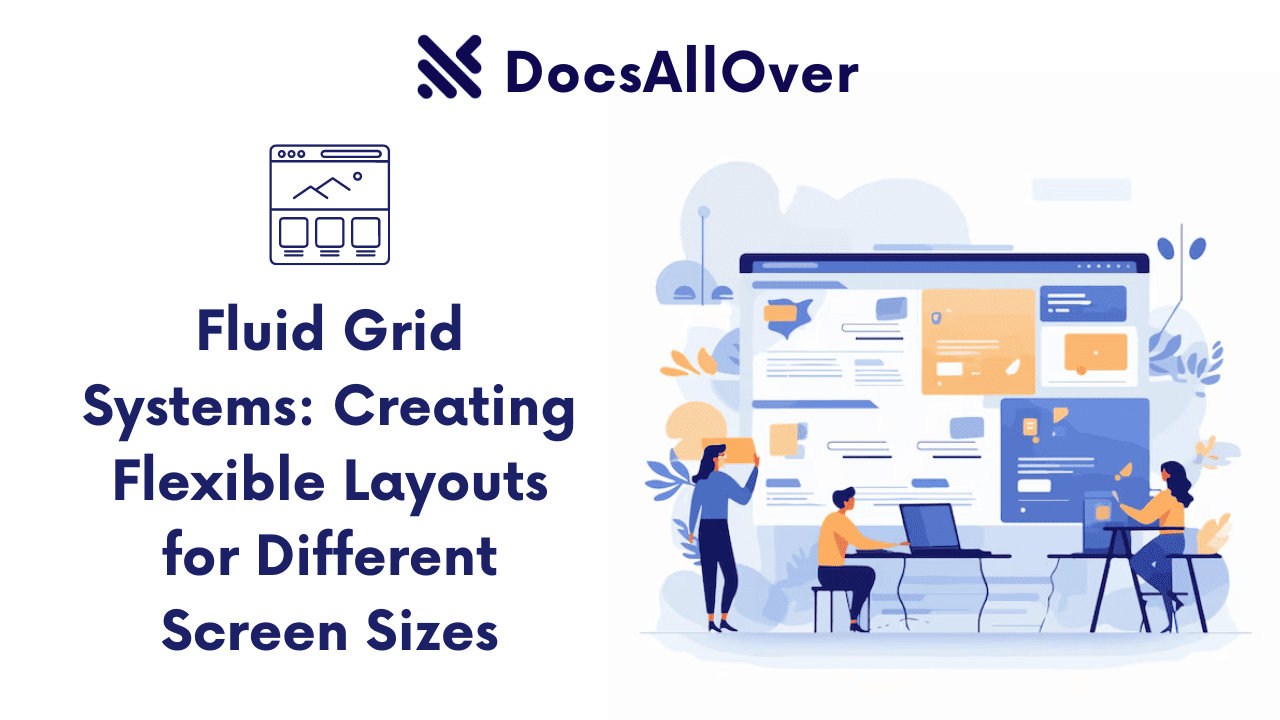
2.Use Fluid Layouts
Fluid layouts are designed to adjust and respond to the screen size, using percentages instead of fixed pixel values. This ensures that content and images adjust to fit the screen size, regardless of the device being used.
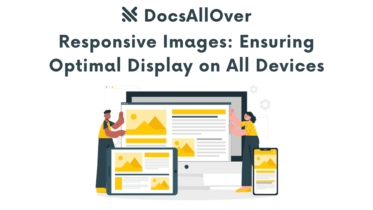
3.Use Flexible Images
Flexible images are designed to adjust and respond to the screen size, using the max-width property to set a maximum width for the image. This ensures that images adjust to fit the screen size, without distorting or stretching.


