The Role of Responsive Design In Creating A Seamless User Experience
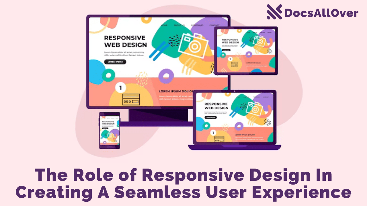
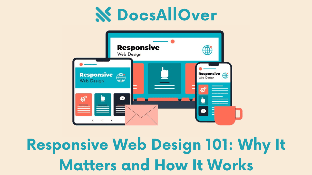
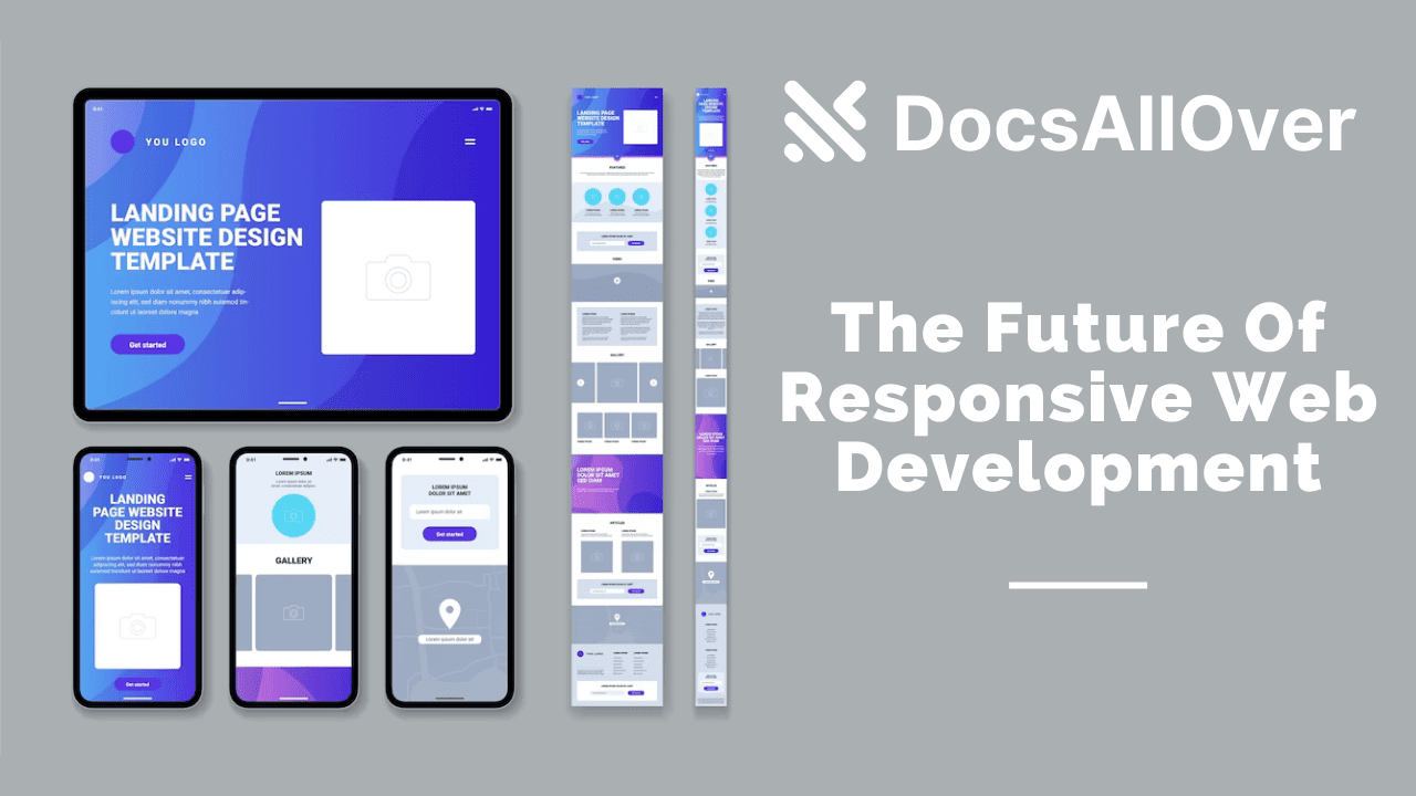
Responsive web design (RWD) is a web design approach that ensures websites look good and function well on all devices, from desktop computers to smartphones. This is important because more and more people are using mobile devices to access the internet. In fact, mobile devices now account for over half of all web traffic.
RWD is achieved by using CSS media queries to adapt the layout and style of a website to the screen size of the device it is being viewed on. For example, a website with a responsive design might have a different layout for desktop computers, tablets, and smartphones.
What is a responsive website?
A responsive website is a website that is designed to look and work well on any device, regardless of the screen size or resolution. This means that users will have a positive experience when visiting your website on their desktop computer, laptop, tablet, or smartphone.
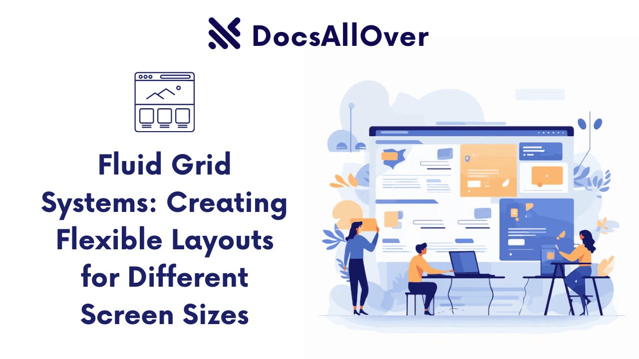
Responsive design works by using a set of techniques to adjust the layout and appearance of a website based on the screen size and resolution of the device it is being viewed on. This includes using flexible grids, fluid images, and media queries.
Advantages of having a responsive website to reach more customers, engage them better, and boost your sales with a responsive website that looks great and works perfectly on all devices.
How does responsive design work?
Responsive design works by using a set of techniques to adjust the layout and appearance of a website based on the screen size and resolution of the device it is being viewed on. This includes using flexible grids, fluid images, and media queries.
- Flexible grids allow the website's layout to expand or contract to fit the screen size of the device it is being viewed on. This means that users will not have to scroll horizontally to view the content of your website on a mobile device.
- Fluid images are images that are scaled to fit the screen size of the device they are being viewed on. This means that users will not have to zoom in or out to view images on your website.
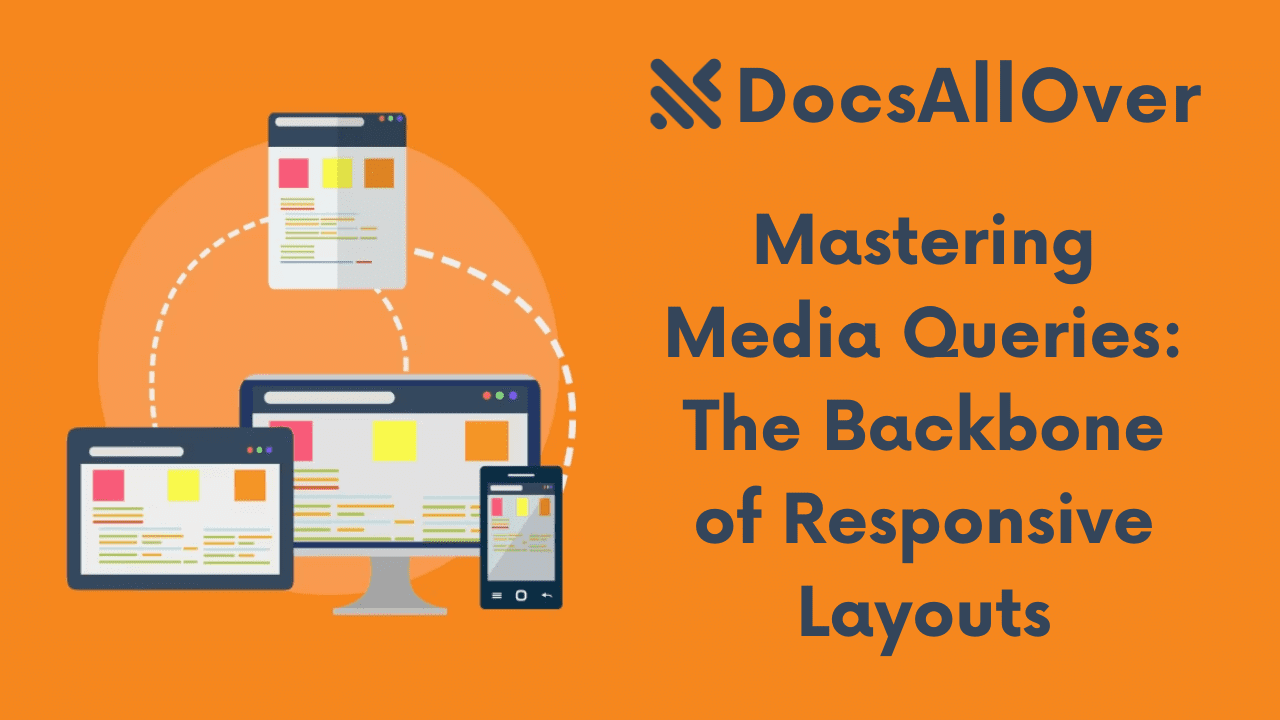
- Media queries allow you to specify different CSS styles for different screen sizes and resolutions. This allows you to create a custom responsive design that meets the specific needs of your website.
For example, you could use a media query to specify that the font size of your website's headings should be 20px on desktop devices and 16px on mobile devices. This would ensure that the headings are easy to read on all devices, regardless of the screen size.
Responsive design is a complex topic, but there are a number of resources available to help you get started. There are also a number of responsive design frameworks that you can use to create a responsive website more easily.
- Use a responsive grid system. A responsive grid system will help you to create a layout that can adapt to different screen sizes.
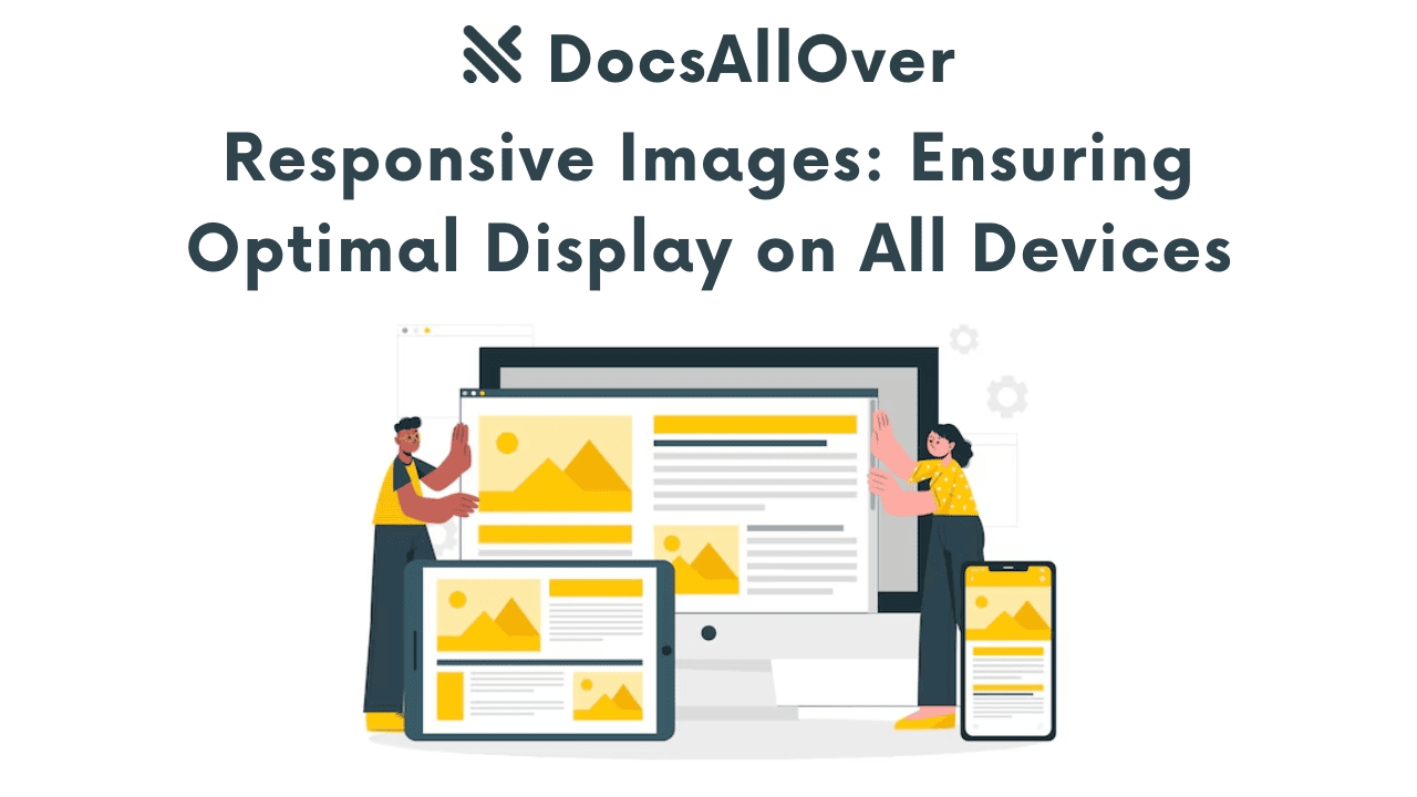
- Use flexible images and videos. Flexible images and videos will scale to fit the screen size on which they are being viewed.
- Use large fonts and buttons. Large fonts and buttons will be easier to tap and read on mobile devices.
- Avoid using Flash. Flash is not supported by all mobile devices, so it is best to avoid using it on responsive websites.
- Test your website on different devices and screen sizes to make sure that it is working properly.
Responsive design is an essential part of modern web development. By creating a responsive website, you can ensure that all users have a positive experience, regardless of the device they are using. This can lead to improved user engagement, increased mobile traffic, and reduced development costs.
Why is responsive design important?
Responsive design is important because more and more people are using mobile devices to access the internet. In fact, mobile devices now account for over half of all web traffic. If your website is not responsive, you are likely to lose out on a significant number of potential visitors.
In addition, responsive design is important for SEO. Google and other search engines give preference to mobile-friendly websites in their search results. This means that if your website is responsive, it is more likely to rank higher in search results, which can lead to more traffic and visitors.
Benefits of responsive design.
- Improved user experience: Responsive websites are easier to use and navigate, regardless of the device being used. This can lead to increased user engagement and satisfaction.
- Increased mobile traffic: Responsive websites are more likely to rank well in search engine results pages (SERPs) for mobile searches. This can lead to increased mobile traffic and conversions.
- Reduced development costs: Responsive websites can be developed and maintained more cost-effectively than separate mobile websites.
- Improved SEO: Responsive websites are more likely to rank well in search results, which can lead to more traffic and visitors.
- Increased brand awareness: A responsive website that looks and works well on all devices will help to create a positive brand experience for your users. This can lead to increased brand awareness and loyalty.
- Improved customer satisfaction: A responsive website that is easy to use and navigate can help to improve customer satisfaction. This can lead to repeat business and positive word-of-mouth referrals.
- Boosted sales: A responsive website that is optimized for mobile devices can help to boost sales. This is because mobile users are more likely to purchase products and services from websites that are easy to use on their smartphones and tablets.
- Improve accessibility: Responsive websites can be made more accessible to users with disabilities by using features such as larger fonts, higher contrast colors, and keyboard navigation.
- Future-proof your website: As new devices and technologies emerge, responsive websites will be able to adapt to them more easily than non-responsive websites.
By creating a responsive website, you can ensure that all users have a positive experience, regardless of the device they are using. This can lead to a number of benefits, including improved user engagement, increased mobile traffic, reduced development costs, improved SEO, increased brand awareness, improved customer satisfaction, and boosted sales.
To create a responsive website with programming tech, you can use the following steps:
- 1.Choose a responsive framework: A responsive framework is a collection of CSS and JavaScript code that can help you to create a responsive website more easily. Some popular responsive frameworks include Bootstrap, Foundation, and Tailwind CSS.
- 2.Create a layout: Once you have chosen a responsive framework, you can start to create the layout of your website. The layout should be based on a grid system, which will allow it to adapt to different screen sizes.
- 3.Use flexible images and videos: Flexible images and videos are images and videos that are scaled to fit the screen size on which they are being viewed. You can use CSS to make your images and videos flexible.
- 4.Use media queries: Media queries allow you to specify different CSS styles for different screen sizes. This allows you to create a custom responsive design that meets the specific needs of your website.
- 5.Test your website on different devices and screen sizes: Once you have created your responsive website, it is important to test it on different devices and screen sizes to make sure that it looks and works as expected.
How to test your website for responsiveness
Testing your website on different devices and screen sizes for responsiveness is an essential part of web development. It ensures that your website looks and functions well on all devices, regardless of size or resolution. This is important because more and more people are using mobile devices to access the internet. In fact, mobile devices now account for over half of all web traffic.
There are a number of ways to test your website for responsiveness. One way is to use a responsive design checker. This is a tool that allows you to enter the URL of your website and see how it looks on different devices and screen sizes. Another way to test your website for responsiveness is to use real devices. This is the most accurate way to test your website, but it can be time-consuming and expensive.
Recommendations for testing your website for responsiveness:- Use a variety of devices and screen sizes. This includes desktop computers, laptops, tablets, and smartphones.
- Test your website in different orientations. This includes portrait and landscape orientations.
- Test all of the features of your website. This includes menus, forms, and buttons.
- Ask other people to test your website. This can help you to identify any issues that you may have missed.
Free websites to check your website responsiveness
1. Am I Responsive
Am I Responsive is a free website that allows you to check the responsiveness of your website. Simply enter the URL of your website and the tool will show you how it looks on a variety of devices and screen sizes. You can also hover your mouse over any device type to scroll up and down, and click on links to test them further.The display is not as clear as some other responsiveness checker tools, but it does a fairly good job for being free.
Steps to test your website's responsiveness using Am I Responsive:
- Go to the Am I Responsive website.
- Enter the URL of your website in the search bar and click "Go".
- The tool will show you how your website looks on a variety of devices and screen sizes.
- You can hover your mouse over any device type to scroll up and down, and click on links to test them further.
- If you are happy with the way your website looks and functions on all devices, then you can stop there. If you see any issues, you can make changes to your website and then test it again.
2. Responsive Design Checker
It has a neat interface and allows you to check your site responsiveness on various screen sizes, including landscape and portrait mode. This is especially useful if I need to check responsiveness in detail.
To use Responsive Design Checker, you simply select any device, such as a Nexus 7, and browse any site until you are done checking the responsiveness. This is useful for a new site that you just got designed by a web developer, as it allows you to check the responsiveness of your site in both landscape and portrait mode to find any bugs in the design.
Additional suggestions for using Responsive Design Checker:
- You can also test your website on specific screen sizes by entering a custom width and height.
- You can use the "Device Toolbar" to switch between different devices and screen sizes quickly and easily.
- You can use the "Screenshot" button to take a screenshot of your website at any time.
- You can use the "Share" button to share your website with others for feedback.
Here is an example of a simple HTML code snippet for a responsive website:
The viewport meta tag in the <head> section of the code snippet tells the browser to render the website at a width that is equal to the width of the device it is being viewed on. The `initial-scale` value of 1 tells the browser to render the website at its original scale.
style.css file in the code snippet contains the CSS styles for the website. For example, the following CSS code would make the main content of the website have a width of 80% on all devices:
You can use media queries to specify different CSS styles for different screen sizes. For example, the following media query would make the main content of the website have a width of 100% on devices with a screen width of less than 576px:
This is just a simple example of how to create a responsive website with programming tech. There are many other resources available online that can help you to learn more about responsive web design.
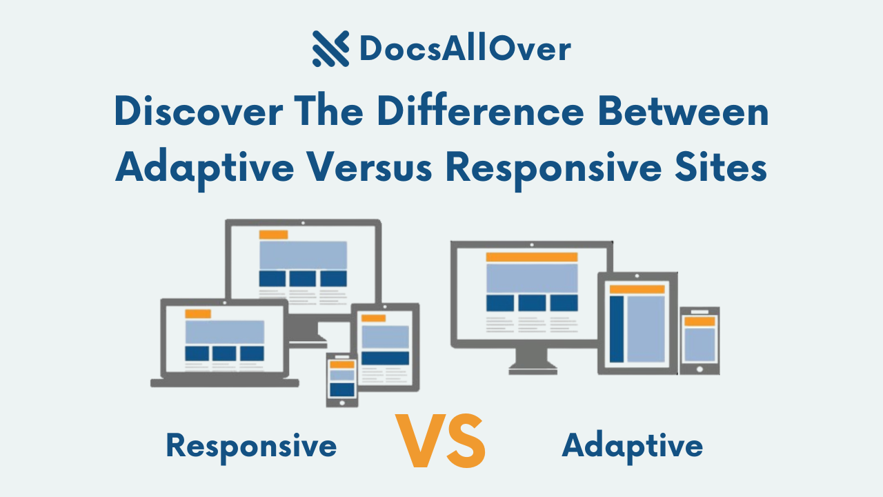
Responsive Web Design vs Adaptive Web Design
Responsive and adaptive web design are both approaches to creating websites that look good and function well on all devices, regardless of screen size or resolution. However, there are some key differences between the two approaches.
Responsive web design uses a single layout that adapts to different screen sizes. This is done using CSS media queries, which allow you to specify different styles for different screen sizes. For example, you could use a media query to specify that the font size of your website's headings should be 20px on desktop devices and 16px on mobile devices. This would ensure that the headings are easy to read on all devices.
Adaptive web design uses a set of different layouts for different screen sizes. This means that you need to create a separate layout for each device type that you want to support. For example, you might create a layout for desktop computers, a layout for tablets, and a layout for smartphones.
| Feature | Responsive Web Design | Adaptive Web Design | Additional Context |
|---|---|---|---|
| Definition | Dynamically changes a site's page layout based on a device's display type, width, height, etc. | Detects the screen size and loads the appropriate layout for it. | Responsive web design is a more modern and widely used approach, while adaptive web design is an older approach that is still used in some cases. |
| How it works | Uses CSS media queries to change styles. | Uses static layouts based on breakpoints that don’t respond once they’re loaded. | Responsive web design is more flexible and can be used to create a better experience on a wider range of devices. |
| Advantages | Easier to design and maintain, better performance. | Works better for smaller sites that need to be redesigned or refreshed. | Responsive web design is generally a better choice for most websites, but adaptive web design may be a better option for smaller sites with limited budgets. |
| Disadvantages | More complex to implement for complex websites. | More difficult to maintain for larger websites. | Both responsive and adaptive web design can have challenges, but responsive web design is generally easier to implement and maintain. |
| Best suited for | Larger sites that are being designed for the first time, sites with a lot of content. | Smaller sites that need to be redesigned or refreshed, sites with a limited budget. | The best approach for you will depend on the specific needs of your website and your users. |
Overall, responsive web design is more widely used and easier to implement, making it a good choice for most websites. However, adaptive web design may be a better option for smaller sites that need to be redesigned or refreshed, or for sites with a limited budget.
how responsive and adaptive web design can be used:
Responsive web design:
- A website that uses a responsive layout will look good and function well on all devices, from desktop computers to smartphones.
- An e-commerce website that uses a responsive layout will make it easy for customers to shop on their mobile devices.
- A news website that uses a responsive layout will make it easy for readers to stay informed on the go.
Adaptive web design:
- A website that uses an adaptive layout might have a different layout for desktop computers, tablets, and smartphones.
- A corporate website that uses an adaptive layout might have a different layout for desktop computers and mobile devices.
- A website that is designed primarily for desktop computers might use an adaptive layout to provide a better experience for mobile users.
Ultimately, the best way to decide whether to use responsive or adaptive web design is to consider the specific needs of your website and your users.
Responsive design is essential for creating a seamless user experience across all devices. It leads to faster loading times, consistent branding, and better accessibility for users with disabilities. By implementing responsive design best practices and testing your website on different devices, you can optimize your website for all users and improve your overall user experience.

