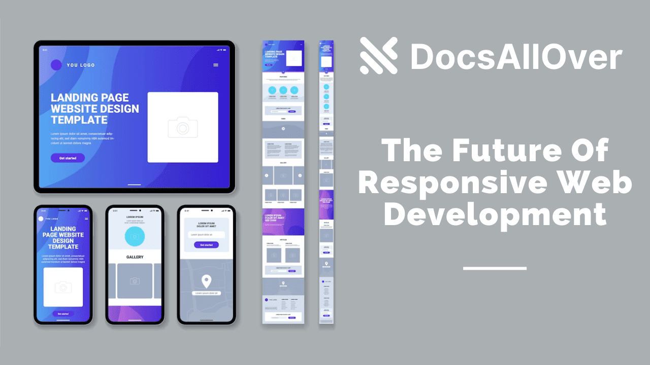
Mobile First Design: The Future Of Responsive Web Development
One of the most important aspects of mobile-first design is the concept of "content prioritization." This means that designers must determine the most important content on the website or app and prioritize it for mobile devices. This is because mobile devices have limited screen space and attention spans, and users want to find the information they need quickly.
Designers should also focus on the performance of the website or app, especially on mobile devices. Slow loading times and lagging functionality can lead to frustration and user abandonment. Techniques such as lazy loading and minifying code can help improve performance.
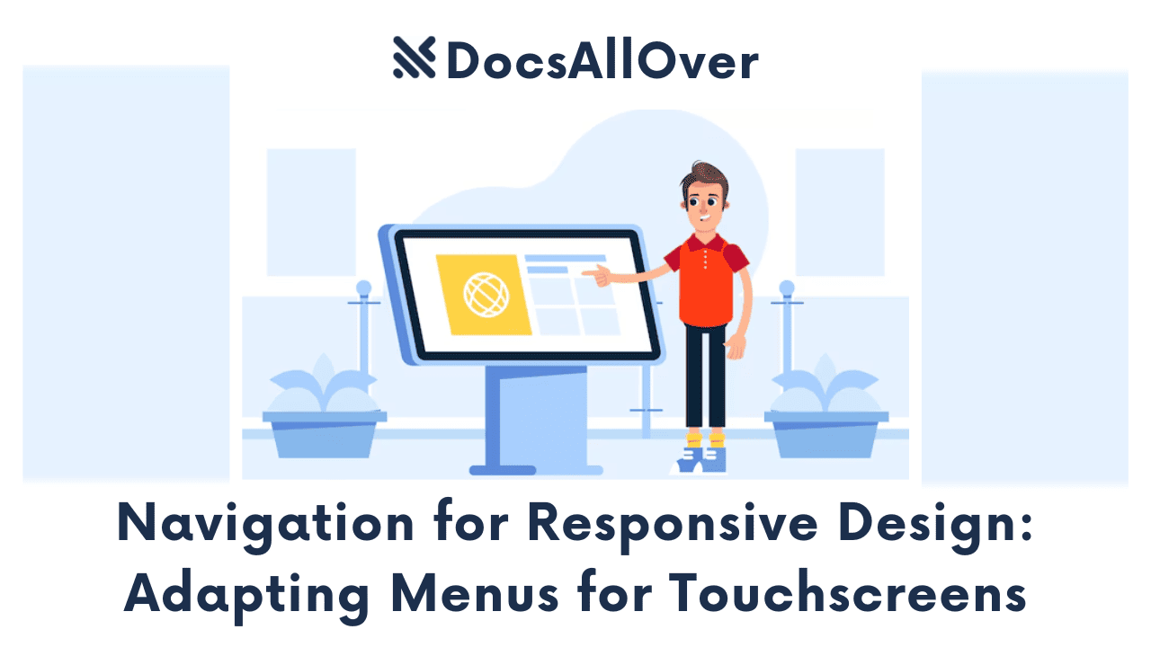
Another key consideration in mobile-first design is the use of intuitive navigation. Mobile users are often browsing on-the-go and need to be able to quickly and easily find what they are looking for. Clear and concise navigation menus and easy-to-use search functionality can greatly improve the user experience.
In terms of programming examples, a mobile-first design approach often involves the use of media queries in CSS to adjust the layout and styling of a website or app based on screen size. This allows designers to create a fluid and responsive design that looks great on any device.
What is Mobile First Design?
Mobile devices are everywhere, and they are being used more and more to access the internet. In fact, mobile devices now account for over half of all internet traffic. This shift in consumer behavior has led to a new approach to web design: mobile first design. In this blog post, we will discuss the importance of mobile first design and provide examples of how to implement it using HTML, CSS, and JavaScript.
Mobile first design is an approach to web design that prioritizes the mobile user experience over the desktop experience. This means designing your website with mobile devices in mind first and then scaling up to larger screens. This approach is in contrast to the traditional method of designing for desktop first and then scaling down to smaller screens.
Why Mobile First Design is Important?
Mobile first design is important because of the shift in consumer behavior towards mobile devices. If your website is not optimized for mobile devices, you could be missing out on a significant portion of your audience. In addition, mobile first design can lead to faster load times, improved user experience, and better search engine rankings.
- Mobile-first design is not just about designing for smaller screens; it's about a shift in mindset that puts mobile users' needs first. This means designing with a focus on speed, simplicity, and ease of use.
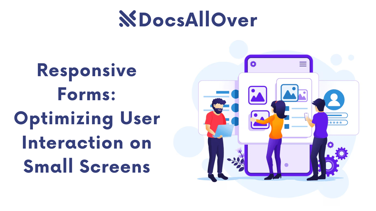
- One important aspect of mobile-first design is the use of touch-friendly interfaces, such as larger buttons and interactive elements that are easy to tap with a finger. This can be achieved with CSS properties like
'touch-action'and'pointer-events'. - Mobile-first design also involves careful consideration of the layout and organization of content, with a focus on prioritizing the most important information for mobile users. This can be accomplished through techniques like progressive disclosure, which gradually reveals additional content as the user interacts with the page.
- Another key consideration in mobile-first design is performance optimization, which is critical for delivering a fast and responsive experience on mobile devices. This can involve techniques like lazy loading of images, minification of code, and use of caching.
- In addition to the technical aspects of mobile-first design, it's also important to consider the overall user experience and how it can be optimized for mobile users. This includes factors like user testing, accessibility, and localization.
- Mobile-first design is not just a trend; it's becoming increasingly important as mobile usage continues to grow. By adopting a mobile-first approach, businesses can ensure that their websites are optimized for the majority of their users and stay ahead of the curve in terms of responsive design best practices.
- Mobile-first design can be implemented using frameworks like Bootstrap or Foundation, which provide pre-built responsive design components that can be customized to meet specific design needs. This can save time and effort in the development process, while also ensuring that the design is responsive and optimized for mobile devices.
- Mobile-first design is not just for mobile devices; it also has implications for desktop design. By starting with a mobile-first approach, designers can create a more streamlined and efficient design that works well on all devices, rather than trying to shoehorn a desktop design into a mobile context.
- mobile-first design is not just about creating a responsive website; it's also about creating a responsive organization that can adapt to changing user needs and technology trends. By adopting a mobile-first mindset, businesses can stay agile and responsive in the face of ongoing change and innovation.
Overall, mobile-first design is becoming increasingly important as more and more users rely on mobile devices to browse the web. By prioritizing content, focusing on performance, and using intuitive navigation, designers can create a seamless and enjoyable user experience on any device.
10 best practices for mobile first design in 2023:
- 1. Prioritize content over other design elements. Mobile users have smaller screens, so it is important to prioritize the content that is most important to them. Use large fonts and headers, and make sure that your content is easy to read and scan.
- 2. Use a simple layout. Avoid using complex layouts or too much text on a single page. Instead, use a simple and straightforward layout that is easy to navigate on a mobile device.
- 3. Use white space. White space can help to make your website look more spacious and readable on mobile devices. Use white space to separate different elements on your website and make it easier for mobile users to scan your content.
- 4. Use large fonts and touch-friendly buttons. Mobile users should be able to easily tap on buttons and read text on your website. Use large fonts and touch-friendly buttons to make it easy for mobile users to interact with your website.
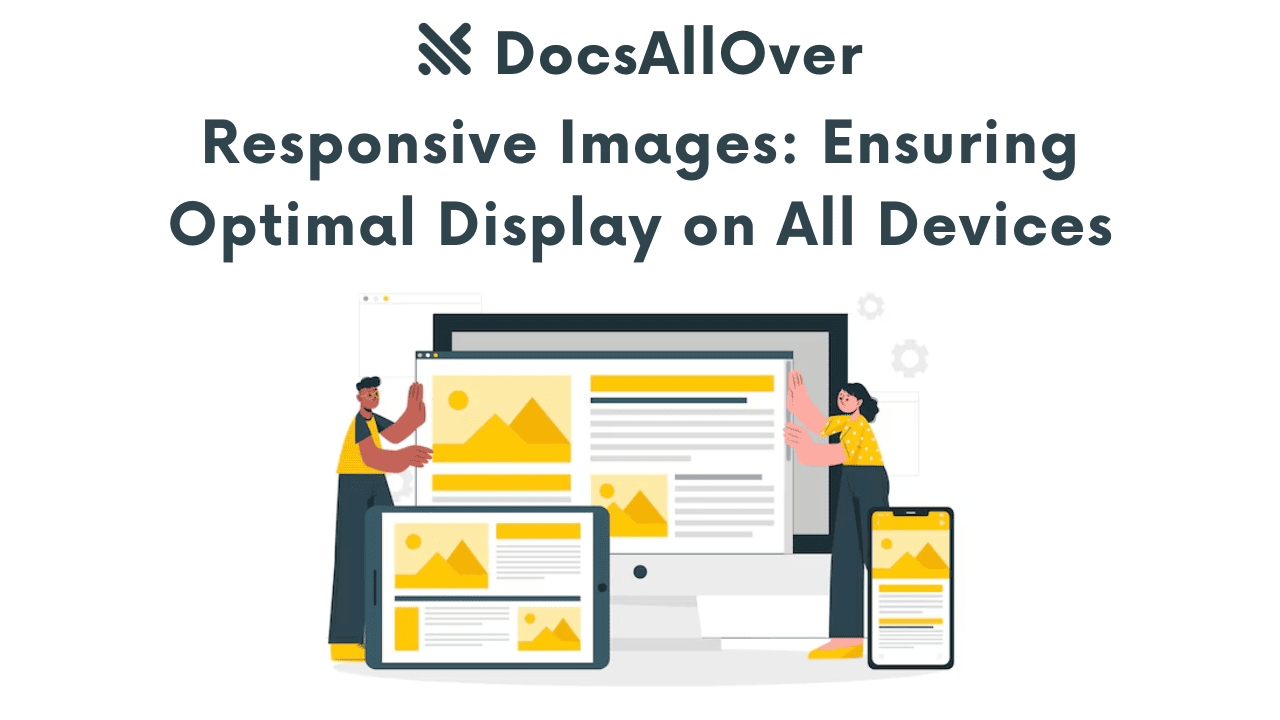
- 5. Optimize your images. Mobile devices have smaller screens than desktops, so it is important to optimize your images for mobile. Use compressed images and avoid using large image files.
- 6. Use a responsive design framework. A responsive design framework will help you to create a website that looks and functions well on all devices. There are many popular responsive design frameworks available, such as Bootstrap and Foundation.
- 7. Test your website on different devices. Once you have developed your website, be sure to test it on a variety of different devices to make sure that it looks and functions as expected.
- 8. Use intuitive navigation. Mobile users should be able to easily find the information they are looking for on your website. Use intuitive navigation menus and buttons to make it easy for mobile users to navigate your website.
- 9. Use a clear and concise call-to-action. Tell mobile users what you want them to do on your website. Use a clear and concise call-to-action button to make it easy for mobile users to take the desired action.
- 10. Use progressive enhancement. Progressive enhancement is a web development technique that involves building a website for basic browsers and then adding features for more advanced browsers. This ensures that your website is accessible to all users, regardless of their device or browser.
By following these best practices, you can create a mobile first website that is both user-friendly and SEO-friendly.
Essential elements of high-quality mobile first design include:
- Responsive design: A responsive website will resize and rearrange its elements to fit any screen size, ensuring that it looks and functions well on all devices.
- Large fonts and touch-friendly buttons: Mobile users should be able to easily tap on buttons and read text on your website. Use large fonts and touch-friendly buttons to make it easy for mobile users to interact with your website.
- Simple layout: Mobile devices have smaller screens than desktops, so it is important to use a simple layout for your website. Avoid using complex layouts or too much text on a single page.
- White space: White space can help to make your website look more spacious and readable on mobile devices. Use white space to separate different elements on your website and make it easier for mobile users to scan your content.
- Fast loading speed: Mobile users are more likely to leave a website if it takes too long to load. Optimize your website for speed to ensure that it loads quickly on all devices.
- Accessibility: Make sure that your website is accessible to all users, regardless of their abilities or disabilities. This includes using clear and concise language, providing alternative text for images, and using a consistent design throughout your website.
Following these essential elements will help you to create a mobile first website that is both user-friendly and SEO-friendly.
How to implement mobile first design
There are a few key things you can do to implement mobile first design:
- Start with the mobile user experience: When designing your website, start by thinking about the mobile user experience. What tasks do mobile users need to be able to complete on your website? How can you make it easy for them to do so?
- Use a responsive design framework: A responsive design framework will help you to create a website that looks and functions well on all devices. There are many popular responsive design frameworks available, such as Bootstrap and Foundation.
- Test your website on different devices: Once you have developed your website, be sure to test it on a variety of different devices to make sure that it looks and functions as expected.
Mobile first design is becoming increasingly important in today's world, and it is essential to optimize your website for mobile devices to provide a seamless user experience. By following the example above and prioritizing mobile design in your web development process, you can ensure that your website is accessible to all users, regardless of the device they are using.


