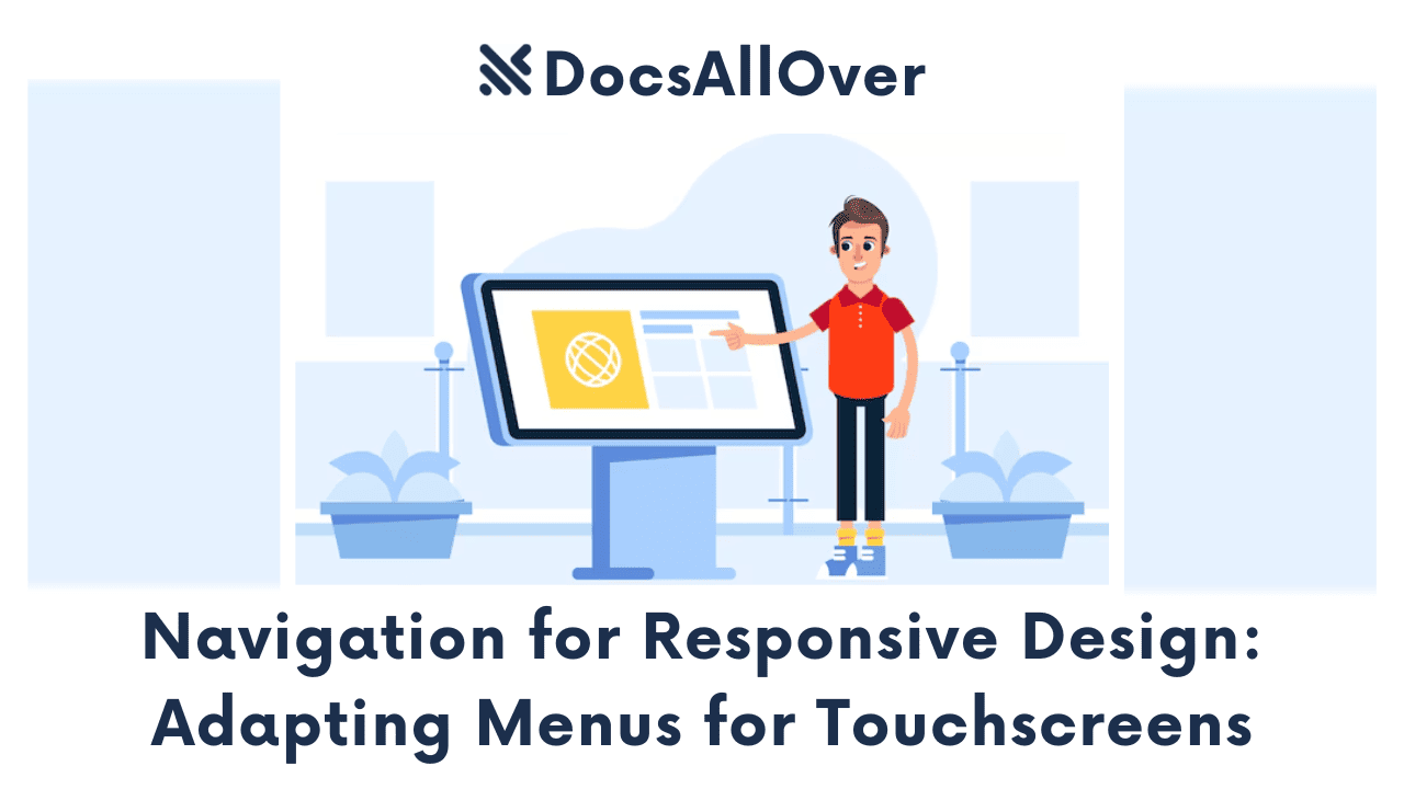
Responsive Forms: Optimizing User Interaction on Small Screens

When was the last time you tried to fill out a form on your phone and gave up in frustration? You're not alone. The common experience of encountering tiny text, cramped input fields, and the need for constant zooming is a major pain point for mobile users. This poor design creates a terrible user experience, leading to high bounce rates and abandoned shopping carts. For businesses, this translates to lost customers and missed opportunities.
The solution to this problem is responsive forms. This isn't just a design trend; it's a critical component of modern web development that ensures your forms adapt seamlessly to any device.
This guide will walk you through the essential principles and techniques for creating forms that are intuitive, easy to use, and a pleasure for everyone, no matter what device they're on.
The Core Problem: Why Mobile Forms Fail
Responsive forms are a must, but many mobile forms still fail users. Here's why:
Visual Clutter and Poor Layout
Many forms are simply desktop versions shrunk down to fit a small screen. This results in a cramped, multi-column layout that's difficult to read and navigate. The visual clutter makes the form feel overwhelming and hard to complete. Users often have to scroll horizontally or zoom in, leading to frustration and mistakes.
Tiny Tap Targets
Buttons, checkboxes, and radio buttons designed for a mouse cursor are often too small for a human finger. This leads to accidental taps on the wrong field or button, forcing the user to correct their input or navigate backward. These tiny tap targets make the form frustrating and prone to errors.
Incorrect Keyboard Types
A common issue is the wrong keyboard appearing for the input field. For example, a form might display a full QWERTY keyboard for a telephone number field, forcing the user to switch to the numeric keyboard manually. This seemingly small inconvenience adds friction and slows down the user, increasing the likelihood of them abandoning the form.
Lack of Spacing
On a small screen, fields that are too close together can make a form feel claustrophobic and difficult to use. A lack of padding around inputs and insufficient vertical margin between fields can cause users to accidentally tap the wrong field. This poor use of whitespace makes the form look unapproachable and confusing.
Long and Unforgiving
Users are less patient on mobile devices. A form with too many fields or questions can be a major turn-off. Furthermore, when a user makes a mistake, cryptic or generic error messages like "Invalid entry" are unhelpful and can leave them guessing how to fix the issue. This unforgiving design turns a small error into a major roadblock, often causing the user to give up entirely.
Foundational Principles of Responsive Form Design
Building a great mobile form starts with a user-first mindset. Here are the foundational principles of responsive form design.
Single-Column Layout
The most important rule for mobile forms is to use a single vertical column layout. This eliminates horizontal scrolling and ensures the user can easily move from one field to the next by simply scrolling down. It prevents visual clutter and makes the form feel less intimidating.
Generous Sizing
On a small touchscreen, a user's finger is the primary input device, not a precise mouse cursor. This necessitates generous sizing for all interactive elements.
- Input Fields: Make input fields full-width so they fill the screen and are easy to tap. Use ample padding and a minimum height to give them a substantial, finger-friendly feel.
- Buttons: Action buttons, like "Submit" or "Next," should be large enough to be easily and reliably tapped. A minimum size of 44x44 pixels is a widely accepted standard for a comfortable tap target.
- Typography: The text must be legible without zooming. Use a minimum font size of 16px for all form text, including labels and placeholders, to ensure readability.
Logical Grouping
To combat the "long form" problem, break down complex forms into smaller, logical sections or steps. Grouping related fields together (e.g., personal information, shipping address, payment details) makes the form feel more manageable and reduces the user's cognitive load. This can be done with simple headings or by using a multi-step form design.
Minimalism is Your Friend
Every additional field you ask a user to fill out increases the likelihood of them abandoning the form. Embrace minimalism by only asking for information that is absolutely essential. If you can get by with just a name and email, don't ask for a phone number or home address. For optional fields, make them clearly labeled as such. A streamlined form is a completed form.
HTML5 & CSS Techniques for Building Better Forms
Creating a great user experience on a mobile form isn't just about good design; it's also about using the right code. By leveraging modern HTML5 and CSS, you can build forms that are both functional and elegant on any screen.
HTML5 Input Types and Keyboard Control
HTML5 introduced new input types that are specifically designed to improve user interaction. These types tell the browser what kind of data to expect, which allows mobile devices to display the most convenient keyboard.
<input type="email">: This type brings up a keyboard that includes the @ symbol, making it easier for users to type their email address.<input type="tel">: This displays a numeric keypad, which is ideal for phone numbers.<input type="date">: This input type launches a calendar widget, so users don't have to manually type the date.
Here's a simple code example:
Essential CSS for Responsive Forms
CSS is what brings your form to life on different screen sizes. By using a few key properties, you can ensure your form elements adapt correctly.
box-sizing: border-box;: This is a crucial property for responsive design. It tells the browser to include padding and borders within the element's total width and height, preventing layout issues when you add padding.width: 100%;andmax-width: 100%;: These properties ensure that your form inputs fill the width of their container, adapting gracefully to any screen size. Usemax-widthto prevent them from becoming too wide on large screens.- Media Queries: Use media queries to apply different styles based on the device's screen size. For instance, you could change the font size or increase spacing between fields specifically for small screens.
Labels and Placeholders
Labels are more important than you might think. A <label> tag with a for attribute that matches the input's id is a crucial accessibility feature. It links the text to the input field, allowing screen readers to correctly identify what the user needs to enter. It also allows a user to click on the label to activate the input field, which is especially helpful on small screens.
Placeholders, on the other hand, should only be used as a hint or example of the required input, not as a replacement for a label. The text disappears when the user starts typing, so it shouldn't contain important information.
Enhancing the Mobile Form Experience
Once the foundation of a responsive form is in place, you can enhance the user experience with features that make the form more intelligent, helpful, and seamless.
Real-time Validation and Clear Errors
Real-time validation provides instant feedback to the user as they fill out the form, preventing them from submitting it with mistakes. Instead of waiting until the user hits "Submit" to tell them something's wrong, you can highlight valid and invalid input on the fly. This proactive approach saves time and reduces frustration.
For this to be effective, error messages must be clear and contextual. Instead of a generic "Invalid" message, a helpful message like "Please enter a valid email address" guides the user to fix the error immediately. For a password field, you might specify, "Password must be at least 8 characters long and include a number." This level of detail makes the form feel helpful, not punitive.
Leverage Autofill and Biometrics
Modern browsers and mobile operating systems offer powerful tools to streamline the form-filling process. By using the correct HTML attributes, you can enable these features for your users:
- Autofill: By adding autocomplete attributes to your input fields (e.g.,
<input type="email" autocomplete="email">), you allow browsers to automatically populate the form with a user's saved information. This can drastically reduce the time it takes to fill out a long address or contact form. - Biometrics: For login or payment forms, you can leverage biometric authentication (like fingerprint or facial recognition) to simplify the process. This provides a secure and lightning-fast alternative to typing in a long password, significantly enhancing the user experience.
Visual Feedback with CSS
Good forms provide visual feedback to the user at every step. This makes the interface feel more responsive and confirms user interaction. You can achieve this easily with CSS pseudo-classes:
:focus: This selector applies styles when an input field is actively selected by the user. A subtle but clear change, like a colored outline or a bold border, confirms that the user is typing in the correct field.:active: Use this pseudo-class to add a visual effect (e.g., a slight change in background color or a box shadow) when a user taps a button. This confirms the tap has been registered and makes the interface feel dynamic.
Responsive forms are more than just a modern design trend; they're a critical investment in your users and your business. By embracing a user-centered approach, you can transform a common source of frustration into a seamless and intuitive experience.
The payoff for this effort is significant. A well-designed responsive form isn't just about aesthetics; it directly impacts your bottom line. By reducing friction and building a more positive user experience, you'll see higher completion rates, increased conversions, and a stronger, more positive brand impression.


