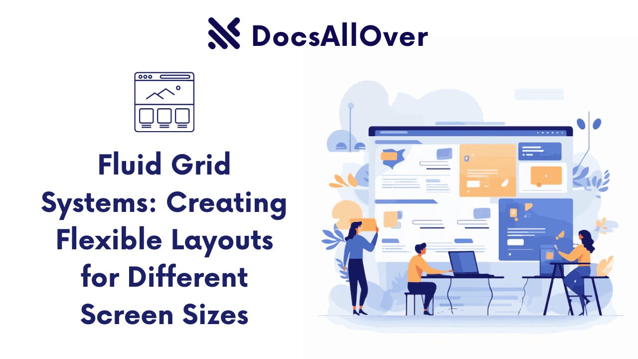
Fluid Grid Systems: Creating Flexible Layouts for Different Screen Sizes
What are Fluid Grid Systems?
Fluid grid systems are CSS frameworks or techniques that allow you to create web layouts that adapt to different screen sizes and orientations. They provide a structured approach to organizing and positioning elements on a web page, ensuring a consistent and visually appealing experience across various devices.
Importance of Responsive Design
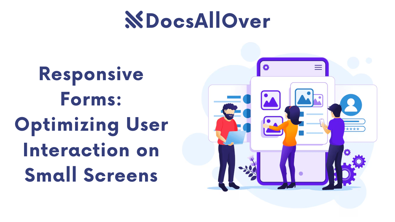
In today's digital age, it is essential for websites to be responsive and provide a seamless user experience on different devices, such as desktops, tablets, and smartphones. Responsive design ensures that your website looks and functions optimally on all screen sizes, improving user engagement and accessibility.
Benefits of Using Fluid Grid Systems
- Flexibility: Fluid grid systems offer flexibility in arranging elements on a page, allowing you to create various layouts and adapt to different content requirements.
- Responsiveness: By using fluid grid systems, you can ensure that your website adapts to different screen sizes, providing a consistent user experience across devices.
- Efficiency: Fluid grid systems can streamline the development process by providing a structured approach to layout design.
- Maintainability: Well-structured grid systems can be easier to maintain and update as your website evolves.
- Improved user experience: Responsive layouts enhance the user experience by providing a more intuitive and engaging interface on all devices.
Popular Fluid Grid Frameworks
Bootstrap
Bootstrap is one of the most popular CSS frameworks for building responsive websites. It offers a comprehensive set of pre-built components and utility classes for creating flexible layouts.
Example:
Foundation

Foundation is another popular CSS framework that provides a robust set of components and utilities for responsive design. It offers a modular approach, allowing you to choose only the components you need.
Example:
Materialize

Materialize is a CSS framework based on Google's Material Design principles. It offers a clean and modern look, with pre-built components that follow Material Design guidelines.
Example:
Semantic UI
Semantic UI is a framework that emphasizes human-friendly semantics for HTML elements. It provides a set of components and utilities that are easy to understand and use.
Example:
Bulma

Bulma is a modern CSS framework that offers a simple and flexible approach to building responsive layouts. It is based on Flexbox and provides a set of pre-built components and utilities.
Example:
These are just a few examples of popular fluid grid frameworks. The best choice for your project will depend on your specific needs and preferences.
Key Concepts of Fluid Grid Systems
Grid Containers and Grid Items
- Grid containers: These are the parent elements that define the grid layout. They are typically set to
display: grid;. - Grid items: These are the child elements that are placed within the grid container. They are automatically arranged according to the grid layout.
Grid Columns and Rows
- Grid columns: These are the vertical divisions within the grid container.
- Grid rows: These are the horizontal divisions within the grid container.
You can define the number of columns and rows using the grid-template-columns and grid-template-rows properties.
Responsive Breakpoints
Responsive grid systems use media queries to adjust the layout based on the screen size. Breakpoints are specific screen widths at which the layout changes. For example, you might define breakpoints for mobile, tablet, and desktop views.
Flexbox and CSS Grid Comparison
| Feature | Flexbox | CSS Grid |
|---|---|---|
| Layout direction | One-dimensional (row or column) | Two-dimensional |
| Complexity | Simpler for basic layouts | More powerful for complex layouts |
| Performance | Generally performs well | Can be slightly slower for complex layouts |
| Browser support | Wide support | Good support, but some older browsers may require polyfills |
While both Flexbox and CSS Grid can be used to create responsive layouts, CSS Grid is generally more powerful and flexible for complex layouts. However, Flexbox is still a valuable tool for many use cases.
Creating Responsive Layouts with Fluid Grid Systems
Basic Layout Examples
Bootstrap:
Foundation:
Centering Elements
Bootstrap:
Foundation:
Creating Flexible Columns and Rows
Bootstrap:
Foundation:
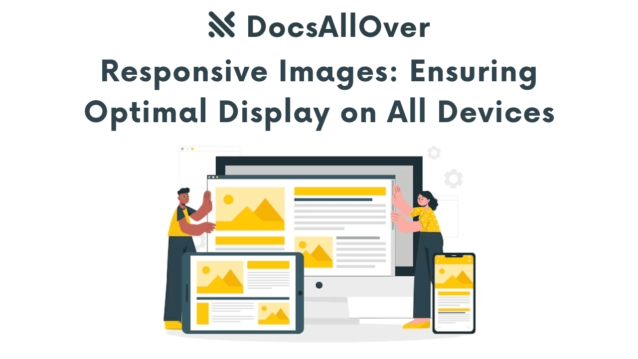
Responsive Image Galleries
Bootstrap:
Foundation:
Remember to replace image.jpg with the actual image paths and adjust the column widths as needed to achieve your desired layout.
Best Practices for Fluid Grid Systems
Choose the Right Framework for Your Project
Select a framework that aligns with your project requirements and team preferences. Consider factors such as:
- Features and components: Does the framework provide the necessary features and components for your project?
- Community and support: Is there a large and active community around the framework?
- Learning curve: How easy is it to learn and use the framework?
Use Meaningful Class Names
Use descriptive class names for your grid elements to improve code readability and maintainability. This will make it easier to understand and modify your layouts.
Test Your Layouts on Different Devices and Screen Sizes
Ensure that your layouts work as expected on various devices and screen sizes. Use browser developer tools or real devices for testing.
Consider Accessibility
Make sure your layouts are accessible to users with disabilities. Use appropriate ARIA attributes and follow accessibility guidelines.
By following these best practices, you can create responsive and accessible layouts using fluid grid systems.


