Mastering Media Queries: The Backbone of Responsive Layouts
What are Media Queries?
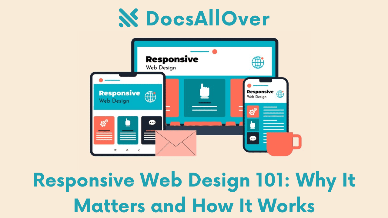
Media queries are a powerful CSS feature that allows you to create responsive web designs, adapting the layout and content of your website based on the characteristics of the device viewing it. They enable you to tailor the user experience to different screen sizes, orientations, resolutions, and more.
Importance of Responsive Design in Today's Web
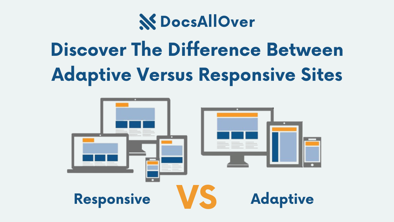
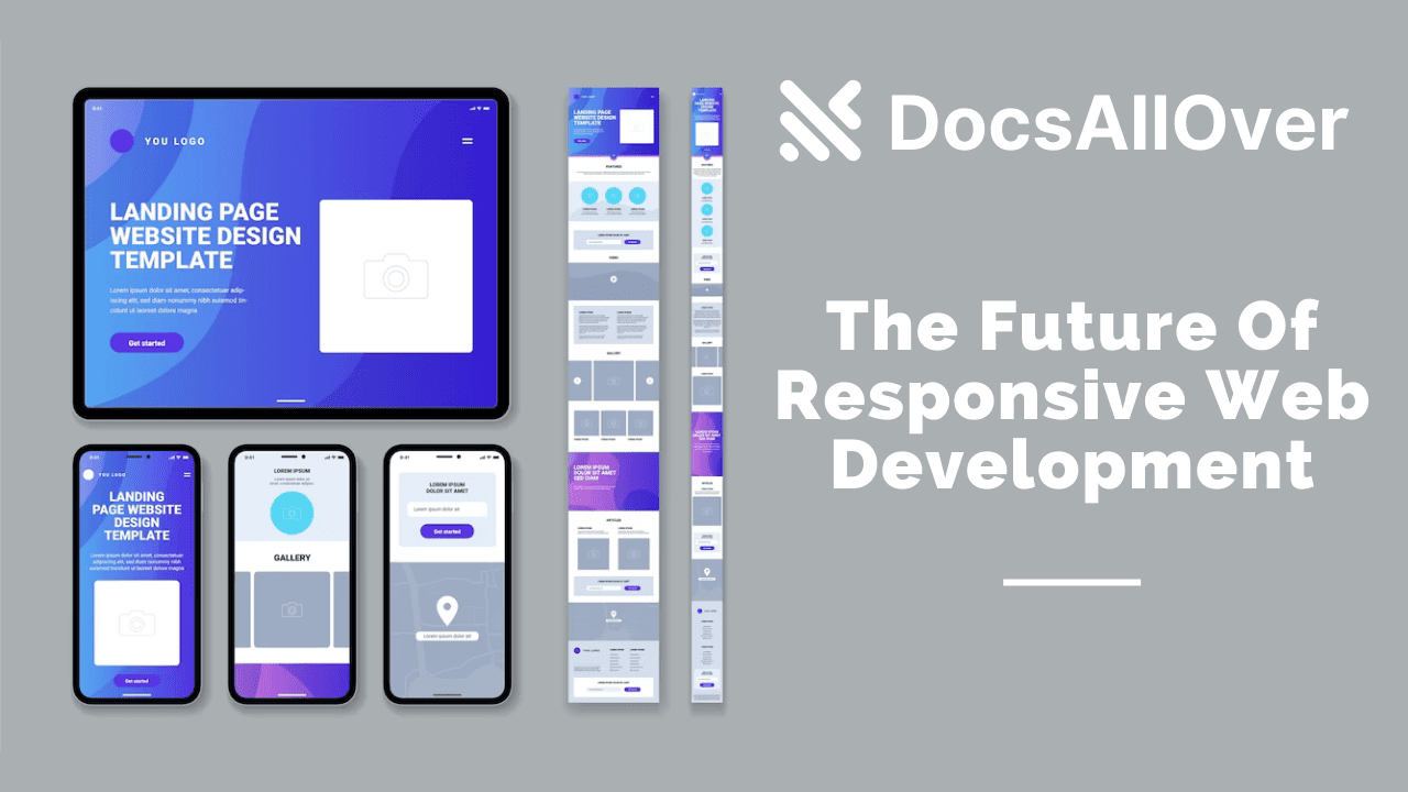
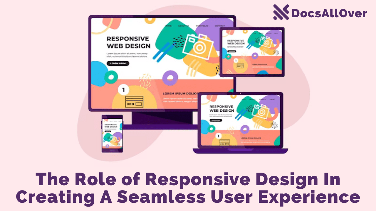
In today's digital age, where users access websites from a variety of devices (desktops, laptops, tablets, smartphones), responsive design has become essential. It ensures that your website looks and functions optimally on all screen sizes, providing a consistent and enjoyable experience for your audience.
Overview of Media Query Usage
Media queries are used to apply different styles based on specific conditions. They are typically placed within a <style> element or in a separate CSS file. By using media queries, you can:
- Create different layouts: Adapt your layout to fit different screen sizes.
- Adjust typography: Change font sizes and styles for better readability on smaller screens.
- Hide or show elements: Display or hide content based on screen dimensions.
- Optimize images: Use different image sizes for different devices.
- Create responsive navigation menus: Adjust the layout of navigation elements.
Understanding Media Query Syntax
Basic Media Query Structure
A basic media query consists of a media keyword followed by a media type and one or more media features. Here's the general syntax:
Media Types
Common media types include:
- screen: For screens (computers, tablets, smartphones)
- print: For printing
- speech: For speech synthesis
- projection: For projectors
- screen and (min-width: 768px): For screens with a minimum width of 768 pixels
Media Features
Some commonly used media features:
- width: The width of the viewport.
- height: The height of the viewport.
- orientation: The orientation of the device (portrait or landscape).
- aspect-ratio: The aspect ratio of the viewport.
- device-width: The width of the device's screen.
- device-height: The height of the device's screen.
- min-width: The minimum width of the viewport.
- max-width: The maximum width of the viewport.
Combining Multiple Media Features
You can combine multiple media features using the and keyword.
By understanding these components, you can create targeted styles for different devices and screen sizes.
Creating Responsive Layouts
Using Media Queries to Adjust Layout Based on Screen Size
Media queries are the core mechanism for creating responsive layouts. By defining different styles based on screen size, orientation, and other factors, you can ensure your website adapts to various devices.
Example:
In this example, the layout will change to a single-column layout on screens smaller than 768px.
Responsive Grid Systems
Using a responsive grid system like Bootstrap or Foundation can simplify the process of creating responsive layouts. These frameworks provide pre-built grid systems with classes and utilities for easy layout customization.
Fluid Layouts Using Percentage Units
Using percentage units for widths and heights allows elements to scale proportionally with the screen size. This creates fluid layouts that adapt to different screen sizes without breaking.
Example:
Responsive Typography and Images
- Adjusting font sizes: Use relative units like
emorremfor font sizes to ensure they scale with the screen. - Responsive images: Use techniques like
srcsetandsizesattributes to provide different image sizes for different screen resolutions.
Example:
By combining these techniques, you can create responsive layouts that provide a consistent and enjoyable user experience across all devices.
Best Practices for Media Queries
Writing Efficient Media Queries
- Use specific media features: Choose the most relevant media features for your target devices and screen sizes.
- Avoid redundant media queries: Combine media queries when possible to reduce complexity.
- Use responsive grid systems: Leverage pre-built grid systems like Bootstrap or Foundation for efficient layout management.
- Test across different devices: Validate your media queries on a variety of devices to ensure proper responsiveness.
Avoiding Common Pitfalls
- Overly complex media queries: Keep media queries simple and focused.
- Conflicting styles: Ensure that styles applied through media queries do not conflict with other styles.
- Viewport units: Use viewport units (vw, vh, ch, em, rem) for flexible sizing.
- Testing on older devices: Consider supporting older devices with limited capabilities.
Testing Across Different Devices and Browsers
- Emulator and simulator tools: Use tools like BrowserStack or Sauce Labs to test on various devices and browsers.
- Real device testing: Test on a wide range of devices to ensure compatibility.
- Responsive design testing tools: Utilize tools like Google Developer Tools or Chrome DevTools for responsive design testing.
By following these best practices, you can create effective media queries that ensure your website looks and functions great on all devices.
Advanced Media Query Techniques
Media Query Lists
Media query lists allow you to combine multiple media queries into a single expression. This can be useful for creating more complex conditions.
Example:
Range Media Queries
Range media queries allow you to specify a range of values for a media feature.
Example:
Media Query Expressions
You can create more complex expressions using logical operators (and, or, not) and comparison operators.
Example:
These advanced techniques provide greater flexibility and control when creating responsive layouts.
Case Studies and Examples
Analyzing Responsive Layouts of Popular Websites
To understand how media queries are used effectively in real-world scenarios, let's analyze a few popular websites:
- Medium: Medium uses a grid-based layout that adapts to different screen sizes. The content area adjusts its width, and the sidebar may be hidden on smaller screens.
- Amazon: Amazon employs a flexible layout with responsive images and navigation menus. The main content area adjusts based on screen size, and the sidebar may collapse or be hidden on smaller devices.
- The New York Times: The NYT uses a responsive design that adapts the layout and font sizes to different screen sizes. The navigation menu may collapse into a hamburger menu on smaller screens.
Practical Examples of Using Media Queries for Different Scenarios
- Responsive Navigation Menus: Use media queries to create collapsible navigation menus on smaller screens.
- Adaptive Typography: Adjust font sizes, line heights, and letter spacing based on screen size for better readability.
- Image Optimization: Use media queries to load different image sizes for different screen resolutions, improving performance.
- Device-Specific Styles: Target specific devices (e.g., smartphones, tablets) with media queries to create tailored experiences.
- Layout Changes: Adjust the layout of elements (e.g., columns, rows, spacing) based on screen size.
By studying these examples and experimenting with different techniques, you can create responsive layouts that enhance the user experience across various devices.
