Navigation for Responsive Design: Adapting Menus for Touchscreens
The Importance of Responsive Navigation
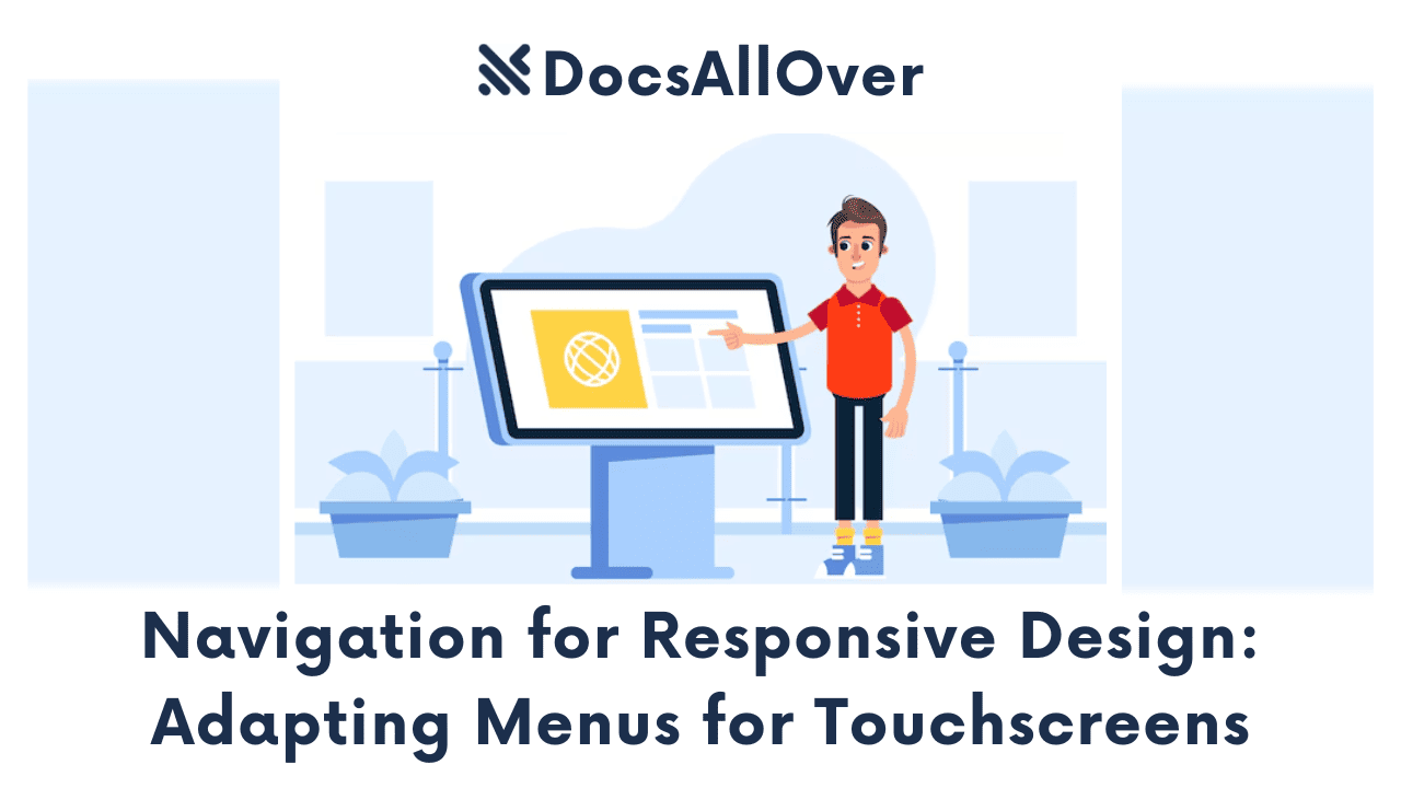
In today's mobile-first world, it's crucial to design websites that are not only visually appealing but also easy to navigate on various devices, especially touchscreens. Responsive navigation ensures a seamless user experience across different screen sizes, from desktops to smartphones.
Challenges of Navigating on Touchscreens
Touchscreen devices present unique challenges for navigation:
- Smaller Screen Size: Less space for navigation elements.
- Touch Sensitivity: Requires larger touch targets to avoid accidental taps.
- Lack of Hover States: Touchscreens don't support hover states, which can be a limitation for traditional navigation patterns.
To overcome these challenges, web designers and developers must adopt effective navigation strategies tailored for touchscreens.
Common Navigation Patterns for Touchscreens
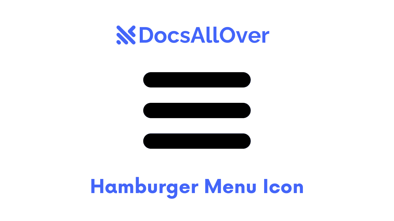
Hamburger Menu
Pros:
- Space-Efficient: Conserves screen space, especially on smaller screens.
- Familiar Pattern: Widely recognized and understood by users.
Cons:
- Hides Navigation: Can be less intuitive for users who prefer immediate access to navigation options.
- Requires Additional Taps: Users need to tap the hamburger icon to access the menu.
Best Practices:
- Clear Iconography: Use a clear and recognizable hamburger icon.
- Intuitive Menu Structure: Organize menu items logically and hierarchically.
- Fast Menu Animation: Ensure the menu appears quickly to avoid frustrating users.
- Accessibility: Make sure the menu is accessible to users with disabilities, using keyboard navigation and screen readers.
Off-Canvas Menu
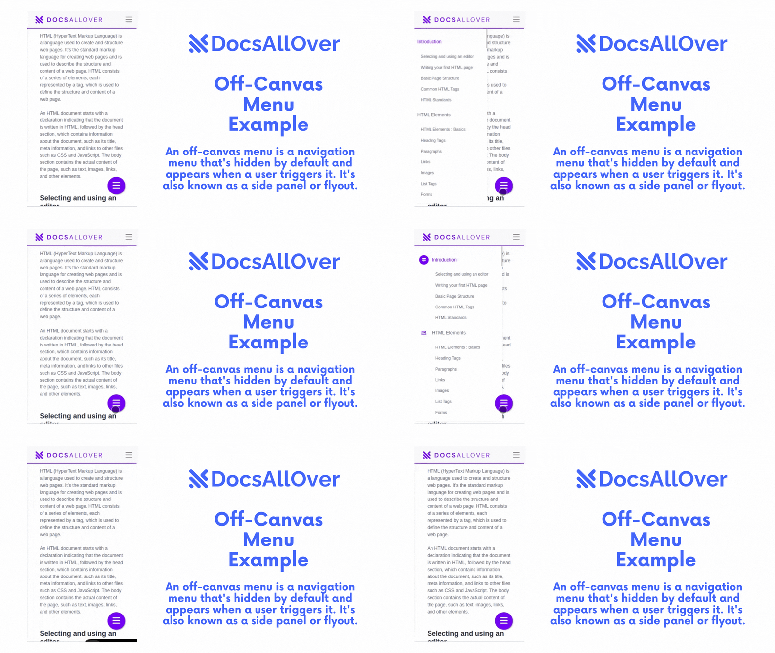
Pros:
- Preserves Screen Space: Keeps the main content area clear.
- Can Display More Information: Provides ample space for longer menus and submenus.
Cons:
- Requires User Interaction: Users need to actively trigger the menu.
- Can Be Disruptive: Opening and closing the menu can interrupt the user's flow.
Effective Use Cases:
- Complex Navigation Structures: For websites with many menu items and submenus.
- Mobile-First Design: When the primary focus is on mobile devices.
Sticky Navigation
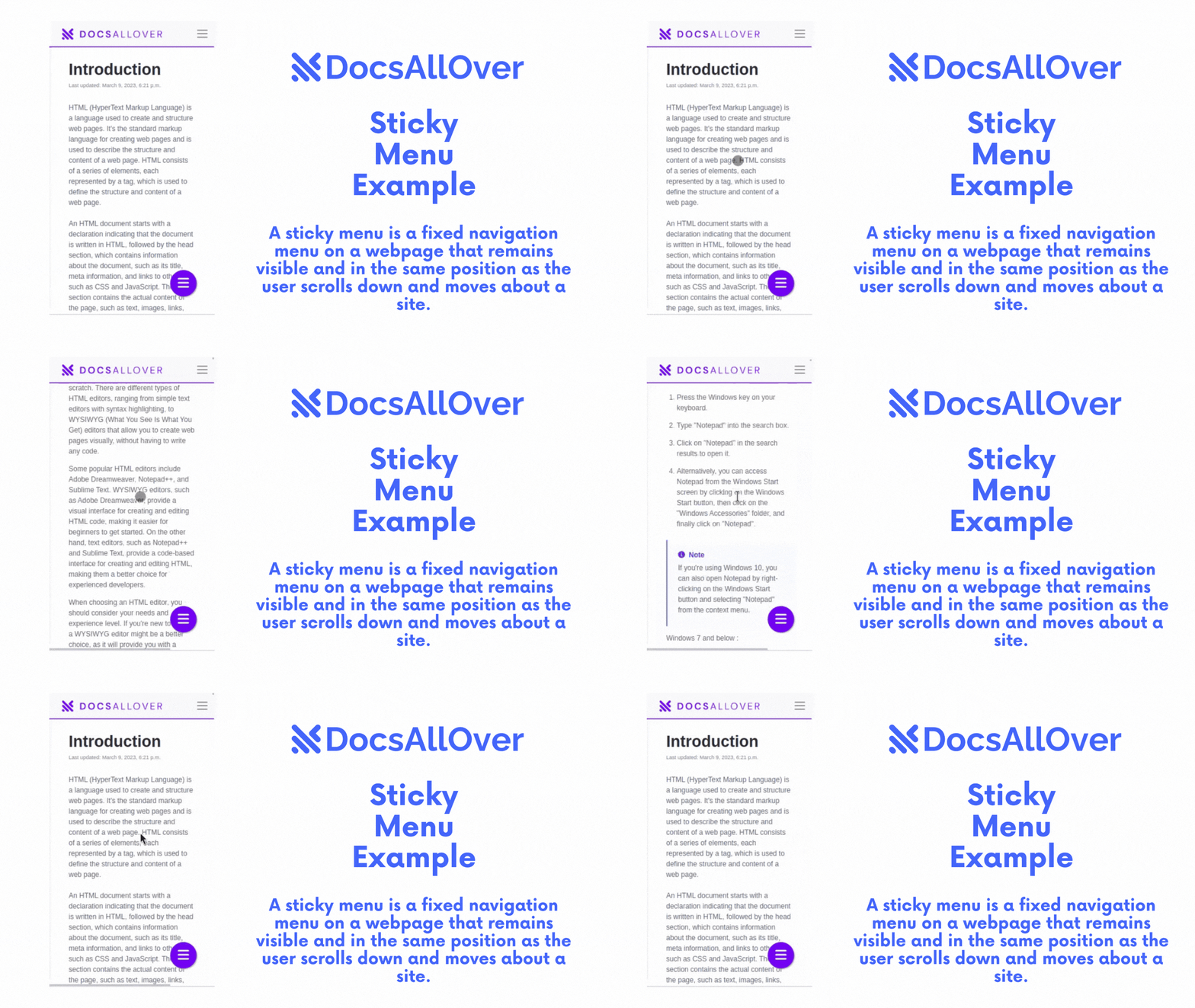
When to Use Sticky Navigation:
- Important Navigation Elements: Keep essential navigation elements always visible, even when scrolling.
- Consistent User Experience: Provide a consistent navigation experience throughout the website.
Design Considerations:
- Minimalist Design: Keep the sticky navigation bar clean and concise.
- Responsive Design: Ensure the sticky navigation adapts well to different screen sizes.
- Scroll Offset: Consider using a scroll offset to trigger the sticky navigation.
- Mobile-Friendly Design: Optimize the sticky navigation for touchscreens.
By carefully considering these navigation patterns and design principles, you can create intuitive and user-friendly experiences for your website visitors.
Responsive Navigation Design Tips
Clear and Concise Labels
- Use simple and direct language: Avoid jargon and technical terms.
- Prioritize essential information: Focus on the most important information.
- Keep labels consistent: Use consistent terminology throughout the navigation.
Touch-Friendly Interactions
- Large Touch Targets: Ensure that clickable elements are large enough to be easily tapped.
- Sufficient Spacing: Provide ample spacing between elements to prevent accidental taps.
- Tap Feedback: Use visual and haptic feedback to confirm user interactions.
Visual Cues
- Clear Indicators: Use clear visual indicators, such as hover effects or color changes, to highlight interactive elements.
- Consistent Styling: Maintain consistent styling for navigation elements across different pages.
Fast Loading Times
- Optimize Images: Compress images to reduce file size.
- Minimize HTTP Requests: Combine and minify CSS and JavaScript files.
- Leverage Browser Caching: Enable browser caching to store static assets locally.
- Optimize Font Loading: Use font optimization techniques to reduce load times.
Testing and Optimization
User Testing
- Recruit a Diverse Group of Users: Include users with different devices, screen sizes, and technical abilities.
- Observe User Behavior: Watch how users interact with your navigation, identify any points of confusion or frustration.
- Gather Feedback: Conduct surveys or interviews to collect qualitative feedback.
Performance Optimization
- Minimize HTTP Requests: Combine and minify CSS and JavaScript files.
- Optimize Images: Compress images without compromising quality.
- Leverage Browser Caching: Enable browser caching to store static assets locally.
- Reduce Page Weight: Minimize the size of your HTML, CSS, and JavaScript files.
- Optimize Font Loading: Use font optimization techniques to reduce load times.
Conclusion
In conclusion, responsive navigation is essential for creating seamless user experiences across various devices. By understanding the unique challenges of touchscreen devices and implementing effective design strategies, you can ensure that your website is accessible, user-friendly, and performs optimally.
As technology continues to evolve, so too will the landscape of responsive navigation. By embracing innovation and user-centered design, you can create exceptional digital experiences.
