Responsive Images: Ensuring Optimal Display on All Devices
What are Responsive Images?
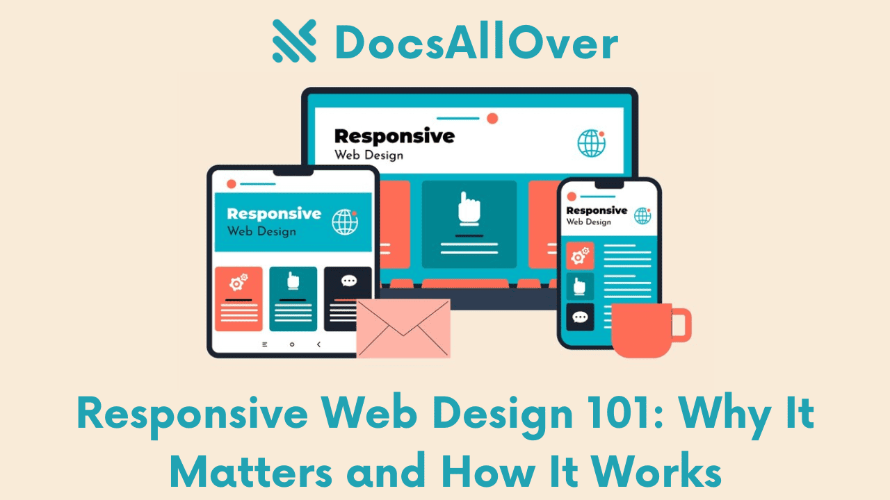
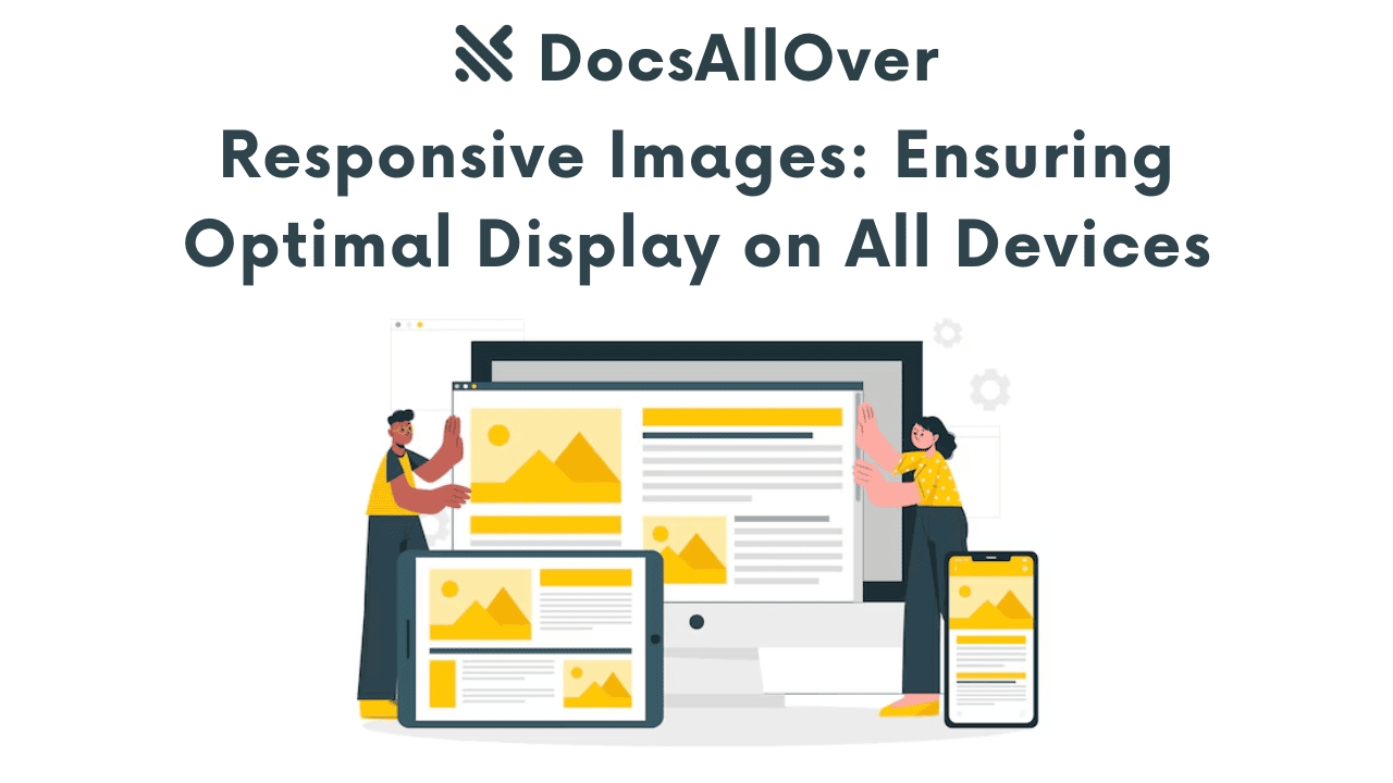
Responsive images are images that automatically adjust their size and resolution to fit the screen size of the device being used. This ensures that images load quickly and display correctly on various devices, from smartphones to large desktop monitors.
Why are Responsive Images Important?
- Improved User Experience: Responsive images enhance user experience by providing clear, sharp images that are optimized for the device's screen size.
- Faster Page Load Times: Smaller image file sizes lead to faster page load times, which is crucial for SEO and user satisfaction.
- Reduced Bandwidth Usage: By delivering images that are appropriately sized, you can reduce the amount of data transferred, leading to lower bandwidth costs.
- Better Mobile Performance: Responsive images are essential for mobile devices, where screen sizes and network speeds can vary significantly.
The Problem with Fixed-Width Images
Fixed-width images can cause several issues:
- Poor Image Quality: Images that are too large or too small can appear blurry or pixelated.
- Slow Page Load Times: Large image files can significantly slow down page load times, especially on mobile devices.
- Layout Issues: Fixed-width images can disrupt the layout of a website, especially on smaller screens.
To overcome these challenges, we need to implement responsive image techniques.
Core Techniques for Responsive Images
The srcset Attribute
The srcset attribute allows you to specify multiple image sources with different resolutions and sizes. The browser then selects the most appropriate image based on the screen resolution and device pixel ratio (DPR).
Example:
In this example, the browser will choose the appropriate image based on the screen width.
The sizes Attribute
The sizes attribute specifies the image size in CSS pixels for different viewport widths. This helps the browser select the optimal image size.
Example:
In this example, the browser will choose the image with a width of 1200px for screens wider than 1200px, 800px for screens wider than 800px, and 320px for smaller screens.
The <picture> Element
The <picture> element provides more flexibility and control over responsive images. It allows you to define multiple <source> elements with different srcset and media attributes.
In this example, the browser will choose the appropriate image source based on the viewport width.
By effectively using these techniques, you can ensure that your images are optimized for different screen sizes and devices, leading to a better user experience and improved website performance.
Image Optimization Techniques
To further enhance the performance and user experience of your website, consider these image optimization techniques:
Choosing the Right Image Format
The choice of image format significantly impacts file size and quality. Consider the following formats:
- JPEG: Suitable for photographs with continuous tones and gradients.
- PNG: Ideal for images with sharp edges, text, and logos.
- WebP: A modern format that supports lossy and lossless compression, often resulting in smaller file sizes.
- AVIF: A newer format that offers even better compression than WebP, but browser support is still limited.
Compressing Images
Image compression reduces file size without significantly compromising quality. You can use the following tools:
- TinyPNG: A free online tool for compressing PNG and JPEG images.
- Squoosh: A web-based image optimizer that supports various formats and compression techniques.
- Built-in image optimization tools: Many image editing software and web development tools have built-in image optimization features.
Resizing Images
Resize images to the appropriate dimensions for your website to reduce file size and improve load times. Use tools like Photoshop, GIMP, or online image editors to resize images.
Lazy Loading Images
Lazy loading is a technique that delays the loading of images until they are about to be displayed on the screen. This can significantly improve initial page load time, especially on mobile devices.
You can implement lazy loading using JavaScript or by leveraging browser-native support for lazy loading.
By following these image optimization techniques, you can significantly improve the performance and user experience of your website.
Best Practices for Responsive Images
To ensure your images look great on all devices, follow these best practices:
Testing Across Devices
- Browser Developer Tools: Use the developer tools in your browser to simulate different screen sizes and resolutions.
- Real Device Testing: Test your website on a variety of devices to see how images render in real-world conditions.
Using a Responsive Image Service
Responsive image services like Cloudinary and Imgix can automate the process of optimizing and delivering images for different screen sizes. They offer features like:
- Automatic resizing and cropping: The service will automatically resize and crop images to fit the specific dimensions of the device.
- Image optimization: The service will compress images to reduce file size without sacrificing quality.
- Lazy loading: The service will delay the loading of images until they are about to be displayed.
- CDN delivery: The service will deliver images from a global content delivery network (CDN) to improve performance.
Prioritizing Performance
- Balance quality and file size: Choose the appropriate image format and compression level to achieve the best balance between quality and file size.
- Avoid unnecessary image dimensions: Only use the necessary image dimensions to reduce file size.
- Use modern image formats: Consider using modern formats like WebP and AVIF, which can offer significant file size reductions.
Considering Accessibility
- Provide meaningful alt text: Use descriptive alt text for all images to make your website accessible to users who rely on screen readers.
- Use appropriate image formats: Ensure that the image formats you use are accessible to all users, including those with visual impairments.
By following these best practices, you can create responsive images that look great and perform well on all devices.
