Responsive Web Design 101: Why It Matters and How It Works
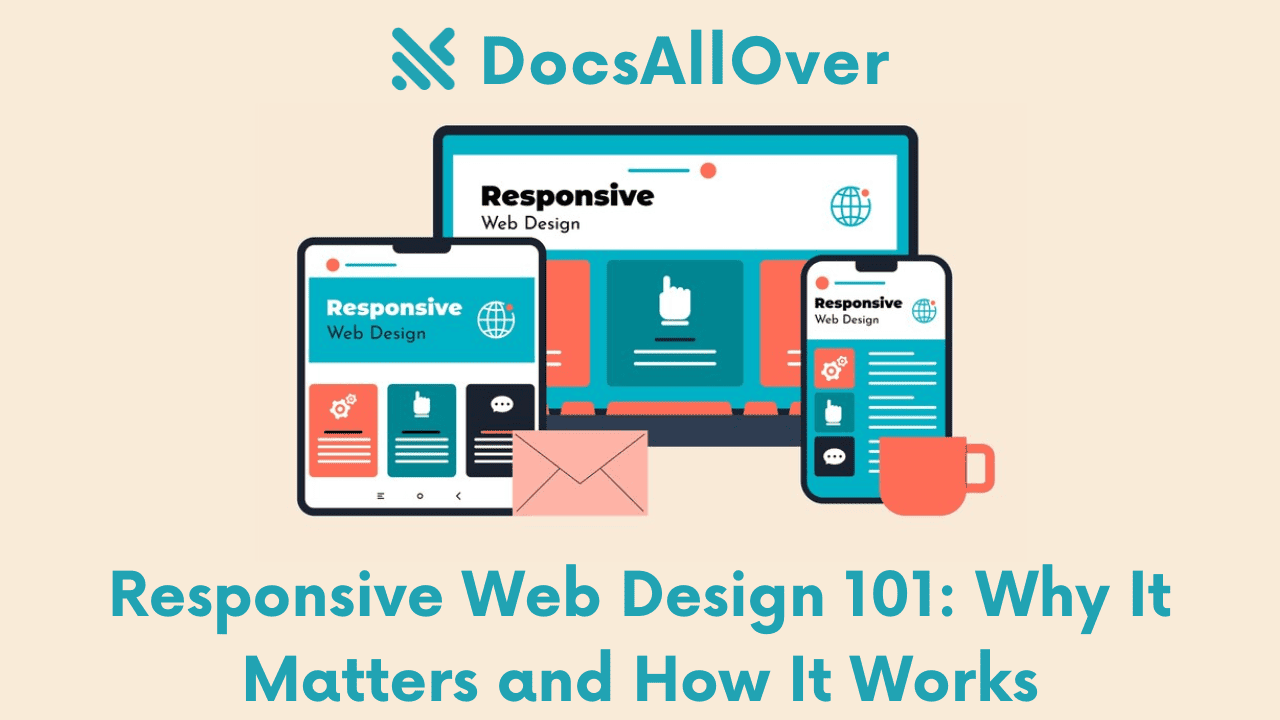
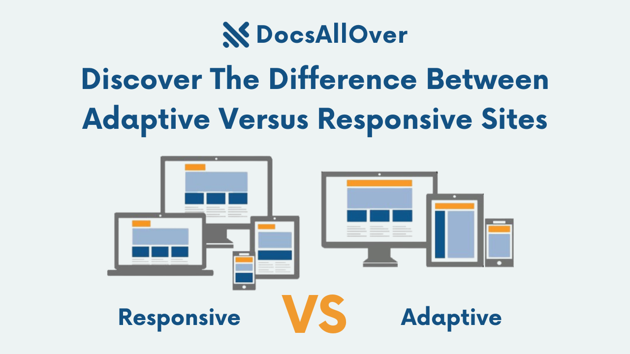
What is Responsive Web Design (RWD)? Responsive web design (RWD) is an approach to website development that ensures your website looks and functions flawlessly on any device, from desktop computers with large screens down to smartphones with much smaller displays. It's like having a website that can magically adjust its layout to perfectly fit the screen size a user is viewing it on. Here's an analogy: imagine a responsive website is like a responsive clothing store. One size doesn't fit all, and the store caters to all body types with clothes that adjust to fit the customer. Responsive web design achieves a similar goal, ensuring your website's content adjusts to fit the screen, whether it's a large widescreen monitor, a standard laptop screen, a tablet in portrait mode, or a smartphone held vertically.
Examples of Responsive Design in Action:
- Fluid Layouts: Imagine a website with a fluid layout is like a stretchy waistband on a pair of pants. The content on the page, including text, images, and videos, can expand or shrink to fit the available screen size. This ensures everything stays proportionate and easy to read, no matter the device.
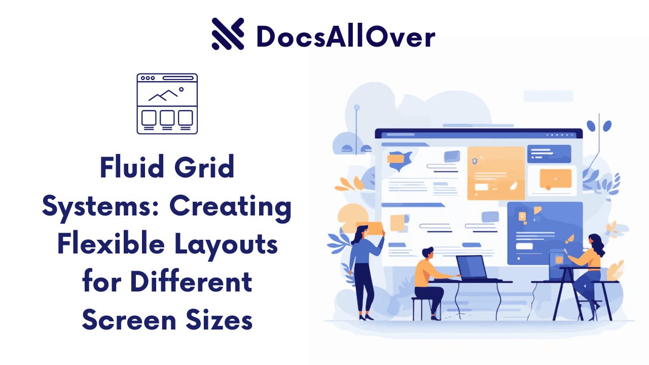
- Flexible Grids: Websites often use a grid system to organize content into rows and columns. Responsive design utilizes flexible grids that can adapt and rearrange the layout of website elements based on the screen size. Think of it as a shelving unit that can adjust the spacing and number of shelves depending on the size of the room. On a large screen, the website might display content in three columns, while on a smaller screen, it might switch to a single column to ensure everything remains clear and readable.
- Media Queries: Media queries are like special instructions written in code that tell the website how to adjust its styles for different screen sizes. For instance, a media query might specify that on screens smaller than 768 pixels wide (typical for smartphones), the font size should increase and the spacing between elements should expand to improve readability on a smaller screen.
Why it Matters: The Rise of Mobile and the User Experience Imperative
The reason responsive web design (RWD) is so crucial lies in the massive shift towards mobile browsing. Statistics from sources like Statista and Pew Research Center consistently show that mobile internet usage has surpassed desktop browsing in recent years. This means that a significant portion of your website traffic is likely coming from users on smartphones and tablets. If your website is not optimized for these devices, you're potentially alienating a large segment of your audience.
Imagine a clothing store that only caters to one specific size or body type. They would be missing out on a vast customer base! Similarly, a website that isn't responsive is essentially turning away users on mobile devices. Responsive design ensures that your website provides a positive user experience (UX) no matter how users access it. People expect websites to be mobile-friendly these days. If a website is difficult to navigate on a phone, users are likely to abandon it quickly and may form a negative impression of your brand. Studies have shown that a positive mobile experience can lead to higher conversion rates, increased customer satisfaction, and improved brand loyalty. In today's competitive online environment, responsive design is no longer optional; it's a necessity for businesses and organizations that want to thrive in the mobile-first world.
The Impact of Mobile Browsing
Mobile internet usage has become the dominant force in web browsing. According to sources like Statista[1] and Pew Research Center[2], mobile browsing has surpassed desktop browsing in recent years, ushering in a mobile-first era. This means that more people are accessing websites from their smartphones and tablets than ever before. The statistics paint a clear picture:
- In 2023, over 63% of global web traffic originated from mobile devices[1]. This means that for every 100 website visitors, well over 60 are likely browsing on their phones or tablets.
- Smartphone penetration is rapidly increasing worldwide, with billions of users relying on their phones for daily internet access[2]. This trend is expected to continue in the coming years, solidifying mobile devices as the primary way people connect to the web.
User Expectations: Frustration on the Go
With the surge in mobile browsing, user expectations have shifted dramatically. People expect websites to be mobile-friendly, offering a seamless and frustration-free experience on any device. Imagine trying to read an article on a website with text so small you need a magnifying glass, or buttons that are impossible to click on a touchscreen. This is the reality for users encountering websites that haven't embraced responsive design. These clunky, non-mobile-friendly websites lead to:
- High Bounce Rates: Users are likely to abandon a website quickly if it's difficult to navigate or use on their mobile device. This can lead to a high bounce rate, which is the percentage of visitors who leave a website after viewing only one page. High bounce rates can negatively impact your website's traffic and overall engagement.
- Negative User Experience (UX): A frustrating mobile experience can damage a user's perception of your brand. People form opinions quickly online, and a bad mobile experience can lead to negative reviews and lost trust.
- Reduced Conversions: If users can't easily navigate your website or complete desired actions (like making a purchase or signing up for a form) on their mobile devices, you're missing out on potential conversions.
SEO and Responsive Design: A Match Made in Mobile Heaven
There's an added bonus to responsive web design: it can actually benefit your website's search engine optimization (SEO). Search engines like Google prioritize websites that offer a positive user experience, and responsive design is a major factor they consider. A website that's optimized for mobile devices is more likely to rank higher in search results, leading to increased organic traffic and visibility. Here's how it works:
- Improved Mobile Usability: Responsive design ensures your website is easy to use and navigate on all devices. This includes factors like fast loading times, clear and legible text, and buttons that are easy to tap on a touchscreen. Search engines view these elements as hallmarks of a positive user experience and reward mobile-friendly websites with higher rankings.
- Google's Mobile-First Indexing: In 2016, Google announced a shift to mobile-first indexing, meaning they primarily use the mobile version of a website for ranking purposes. If your website isn't responsive, Google may index a version that's not optimized for mobile search, potentially harming your website's ranking and visibility.
- Better User Engagement Metrics: Responsive design can lead to better user engagement metrics, such as lower bounce rates and longer session times. These metrics are signals to search engines that users are finding your website valuable and engaging. In turn, search engines may reward websites with these positive metrics with higher rankings in search results.
Benefits of Responsive Web Design: A User-Centric Approach
Responsive web design (RWD) isn't just a technical nicety; it offers a multitude of benefits that can significantly enhance your website's performance and user experience. Here's how RWD delivers value:
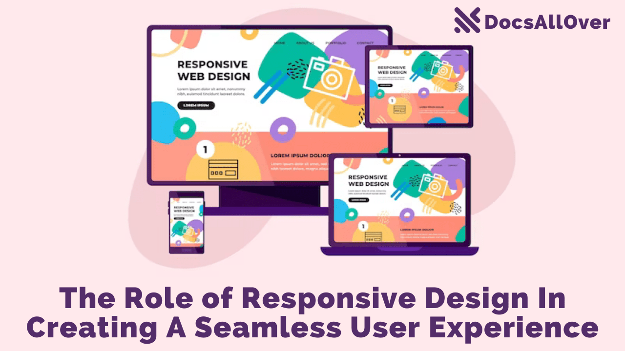
- Enhanced User Experience (UX): At the core of RWD lies the user. A responsive website adapts its layout and elements to perfectly fit the screen size, be it a desktop monitor, a tablet, or a smartphone. This ensures users can easily navigate, interact with elements like buttons and forms, and consume content regardless of their device. Imagine the difference between a comfortable, well-fitting shirt and one that's too big or too small. Responsive design ensures your website "fits" any user comfortably, leading to a frustration-free and enjoyable experience. In today's mobile-driven world, users expect websites to be responsive. If your website isn't optimized for mobile devices, users are likely to encounter a clunky and frustrating experience. This can lead to high bounce rates, where visitors leave your website immediately, and diminished brand reputation. Responsive design ensures a positive user experience across all devices, keeping users engaged and satisfied.
- Improved Conversion Rates: A positive user experience directly translates to increased conversions. When users can easily find the information they need, complete desired actions (like making a purchase or signing up for a form), and navigate your website seamlessly, they're more likely to convert. Responsive design removes the barriers that can hinder conversions on mobile devices, leading to better results for your website's goals. Consider an e-commerce website; if users can't easily browse products, add items to their cart, and complete the checkout process on their smartphones, you're missing out on valuable sales opportunities. Responsive design ensures a smooth and user-friendly experience throughout the conversion funnel, boosting your website's ability to convert visitors into customers.
- Reduced Maintenance: Gone are the days of managing separate mobile and desktop websites! Responsive design allows you to maintain a single website that adapts to all devices. This reduces the workload for your web development team and eliminates the potential for inconsistencies between different versions of your website. Imagine the extra time and resources required to update and maintain two separate websites, one for desktop and one for mobile. Responsive design simplifies website management, saving you time and money in the long run.
- Cost-Effectiveness: Maintaining multiple website versions translates to additional costs in terms of development, design, and ongoing updates. Responsive design offers a cost-effective solution by eliminating the need for separate mobile and desktop websites. You'll invest in a single website that delivers an optimal experience across all devices. Responsive design is an investment that pays off; it reduces development costs, streamlines website management, and ensures your website remains competitive in the ever-evolving digital landscape.
In essence, responsive web design is an investment in your website's future. It ensures your website stays relevant in the mobile-first era, caters to the ever-growing mobile audience, and delivers a user experience that fosters engagement and conversions.
How Responsive Web Design Works: Unveiling the Magic
So, how does responsive web design (RWD) achieve this magic of adapting websites to any screen size? Let's delve into the technical aspects:
- Fluid Layouts and Flexible Grids:
Imagine a website layout as a web of elements like text, images, and buttons. In responsive design, these elements are placed within a fluid layout, which expands and contracts like a balloon depending on the available screen space. This ensures everything stays proportionate and avoids elements getting cut off or crammed together on smaller screens.
Another key component is the use of flexible grids. Think of a website's layout as a grid system, like a table with rows and columns that organize content. Responsive design utilizes flexible grids that can rearrange and adjust the layout of these elements based on the screen size. On a large desktop screen, the website might display content in three columns. However, on a smaller smartphone screen, the grid might automatically adjust to a single column to ensure everything remains clear and readable.
- Media Queries: The Language of Responsive Design
Media queries are like the secret instructions that power responsive design. Written in a coding language called CSS (Cascading Style Sheets), media queries allow designers to define specific styles for different screen sizes. Imagine them as little notes attached to website elements, specifying how they should behave on various devices. For instance, a media query might specify that:
- On screens wider than 768 pixels (typical for desktops):
- Font size should be 16px
- Images should be displayed at 50% width
- Content might be organized in a three-column grid layout
- On screens smaller than 768 pixels (typical for smartphones):
- Font size should increase to 18px for better readability on small screens
- Images should resize to 100% width to fill the available space
- The layout might switch to a single column to ensure everything fits and remains easy to navigate with a finger.
By using media queries strategically, designers can create a website that seamlessly adjusts its presentation based on the device it's being viewed on.
- On screens wider than 768 pixels (typical for desktops):
- Example in Action: Bringing it to Life
Let's look at a simplified example to illustrate the power of media queries:
In this example, we have basic styles for all screens. Then, we use media queries to target specific screen sizes and adjust font size, image width, and even layout elements (like displaying content in a grid format on desktops) to create an optimal viewing experience on any device.
By combining fluid layouts, flexible grids, and media queries, responsive web design ensures your website can adapt and deliver a user-friendly experience no matter how users choose to access it.
Building Responsive Websites: Best Practices for a Seamless User Experience
Now that we've explored the inner workings of responsive web design (RWD), let's delve into some best practices to ensure your website delivers a flawless experience on any device:
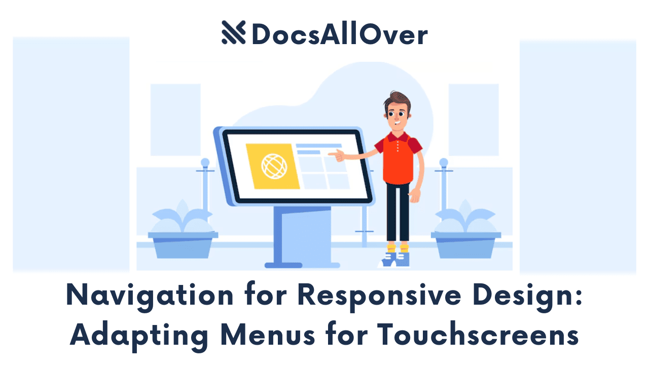
- Mobile-First Mentality: In today's mobile-dominant world, it's crucial to prioritize mobile devices first. Imagine designing a responsive website like building a house. You wouldn't start with the grand entrance and expansive living room; you'd focus on the foundation and core structure. Similarly, with RWD, start by designing the website layout and user experience for mobile screens with smaller viewports. Once you have a solid mobile foundation, you can then expand and adapt the design for larger screens like tablets and desktops. This ensures a strong user experience from the get-go, catering to the ever-growing mobile audience.
- Content is King (and Queen): At the heart of any website lies its content. Responsive design prioritizes clear and accessible content presentation across all devices. This means ensuring your text is readable on small screens, headlines are prominent, and users can easily find the information they need. Avoid complex layouts or excessive elements that might overwhelm users on mobile devices. Focus on a clean, user-friendly hierarchy that guides users through your content, regardless of the screen size they're using.
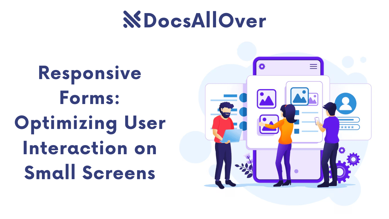
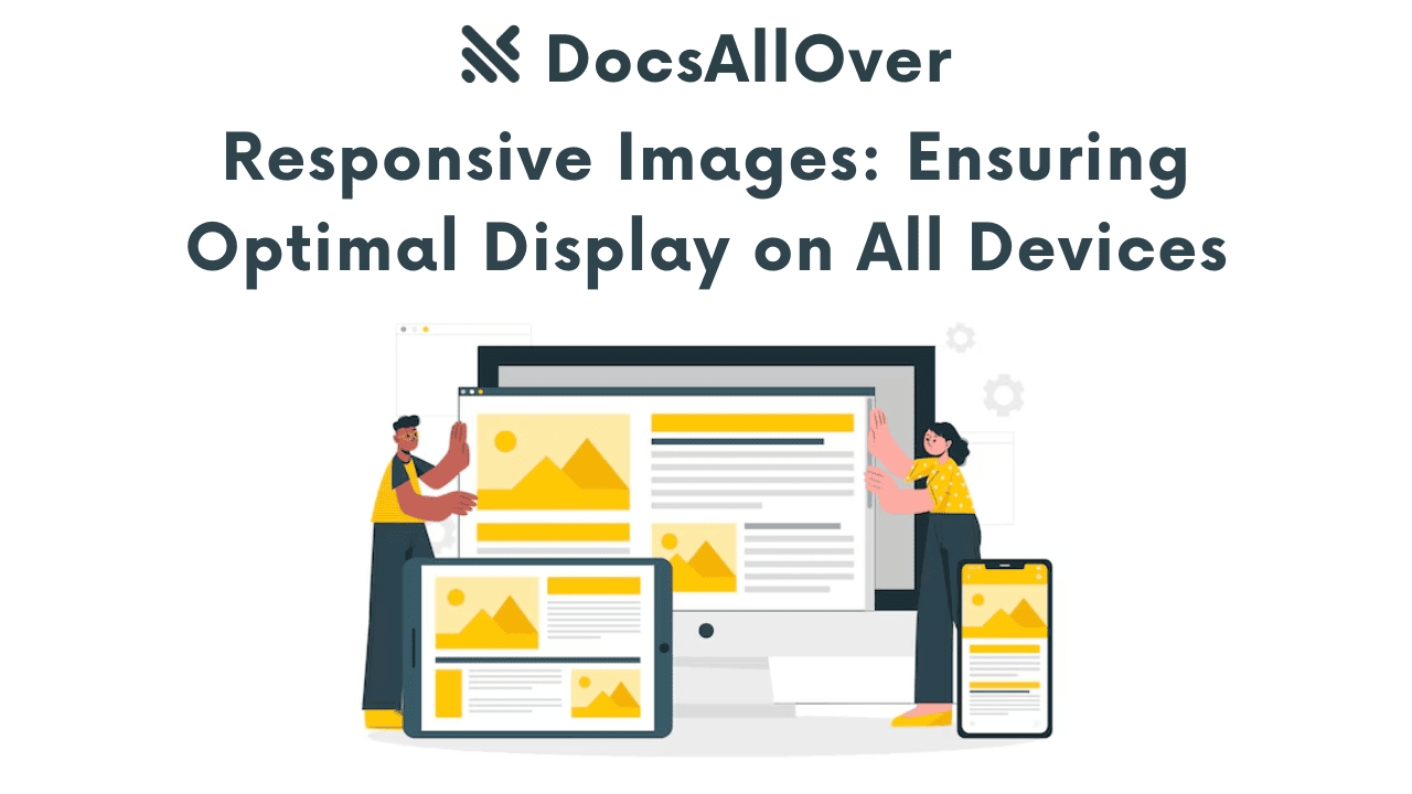
- Responsive Images and Videos: Images and videos are powerful tools for engaging users, but they can wreak havoc on a responsive website if not optimized properly. Large, high-resolution images can lead to slow loading times on mobile devices, frustrating users. The solution is to use responsive images and videos. These are specially formatted media files that can adjust their size and resolution based on the device they're being viewed on. This ensures fast loading times and optimal presentation on all screens.
Here are some techniques for using responsive images and videos:- Image resizing: Techniques like CSS width and height properties can be used to specify how images should scale on different screen sizes.
- Responsive image containers: HTML elements like <picture> and <source> can be used to provide different image versions for various devices.
- Adaptive video players: Video players can be designed to adapt their size and layout based on the screen size.
- Test, Test, and Test Again: Responsive design isn't a one-time fix; it's an ongoing process. The best way to ensure your website looks and functions flawlessly across all devices is by thorough testing. Use browser developer tools to simulate different screen sizes and test your website on a variety of real devices, from smartphones and tablets to laptops and desktops. Look for any layout issues, broken elements, or usability problems on different screen sizes. By proactively testing and refining your responsive design, you can guarantee a seamless user experience for all visitors.
Following these best practices will equip you to build responsive websites that not only adapt to any screen size but also prioritize user experience and engagement across all devices. In today's digital landscape, responsive design is no longer a luxury; it's a necessity for websites that want to thrive in the mobile-first world.


